Home Improvement
20 Ways to Mix Wood Tones Without Making a Room Look Messy
By Anna Wells · · 20 min read
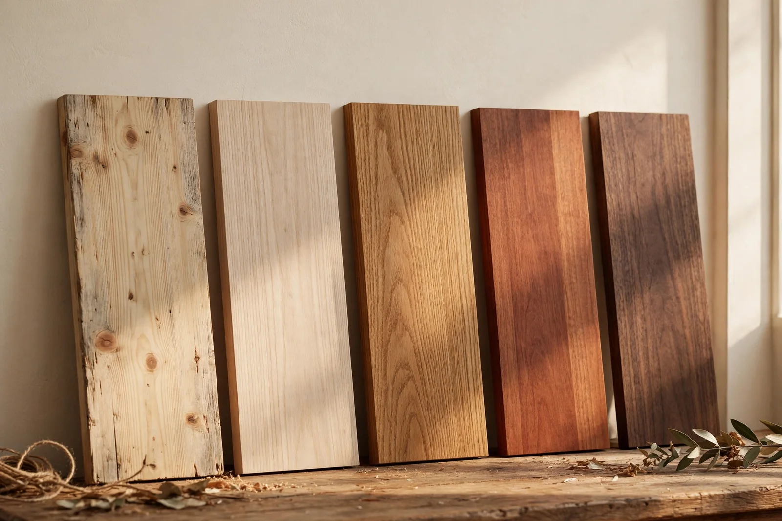
Twenty practical ideas for mixing wood tones with confidence: reading undertones, choosing a dominant wood, bridging clashes, and rescuing rooms that already mix badly.
There is a particular quiet that settles over a living room where every wood tone gets along. Morning light slides across the oak floor, catches the edge of a walnut table and rests on a pine bench by the window, and nothing argues. Most of us inherit our rooms piece by piece, a wedding gift chair here, a second-hand dresser there, and the woods rarely match. This guide turns that happy accident into a plan.
The secret is not matching everything. The secret is giving each wood a reason to be there: a dominant tone that leads, a second tone that repeats, and a bridge between them when they disagree. You will learn to read undertones in daylight, to count how much of each wood your eye actually sees, and to use rugs, paint and metal finishes as peacemakers.
What follows are twenty concrete ideas, each one a small action with sizes, distances and budget tips. Work through them in order or dip into the ones your room needs most, and keep a notebook by your side for the sample tests. By the end, your mixed woods will look collected, not cluttered, and every new piece will have a clear place to land.
1. Read Wood Undertones at the Window in True Daylight
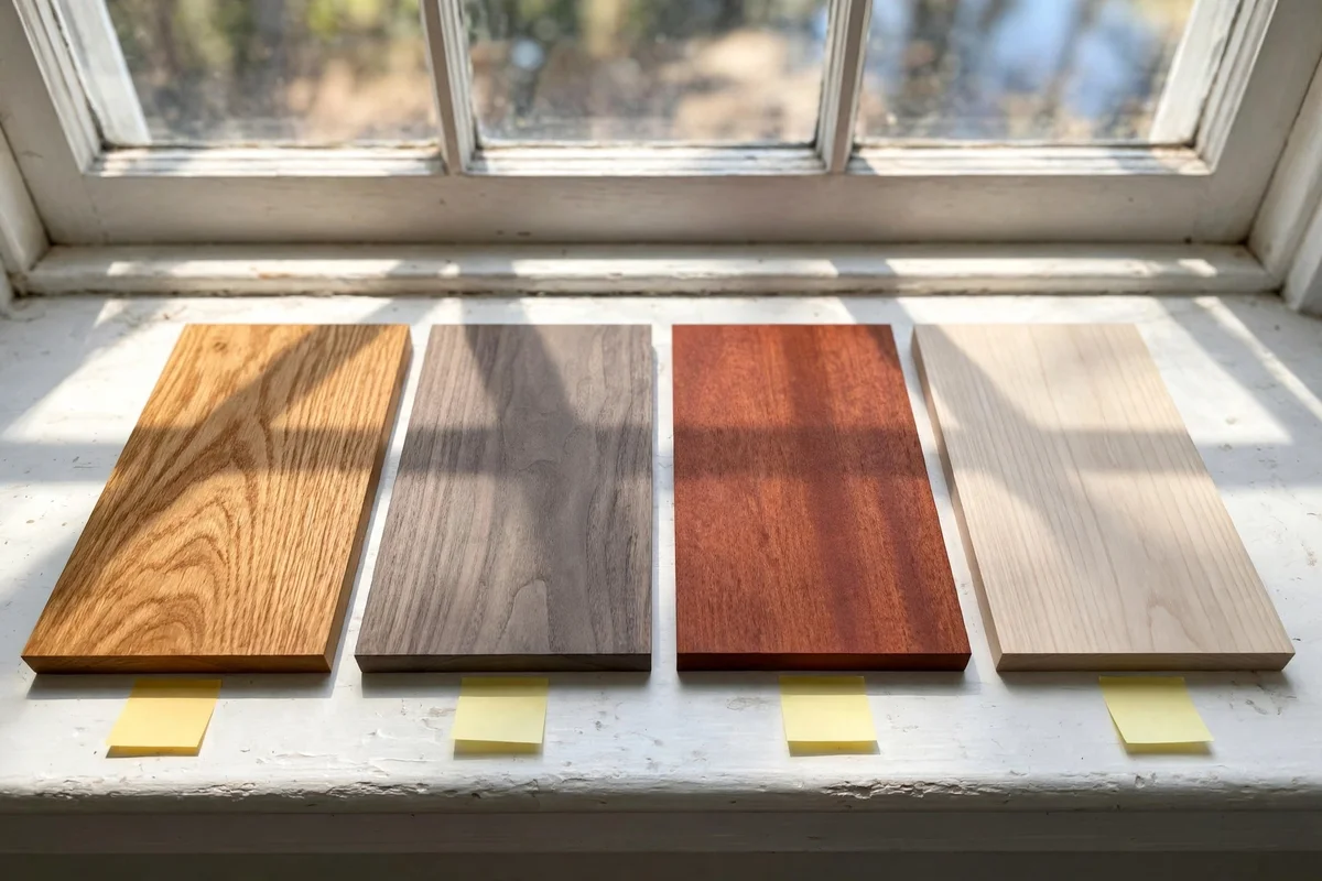
Start every mixing decision at the window, because shop lighting and phone photos lie about colour. Hold each wood piece or sample in natural daylight between 10 a.m. and 2 p.m., when the sun is highest and the light reads most honestly. Look for the undertone beneath the stain: warm woods lean orange, red or golden, cool woods lean grey, green or ashy, and neutral woods stay flat brown without a colour push. Write the undertone on a sticky note and keep it with the sample, since memory fades fast.
The mistake to avoid is judging samples under yellow evening bulbs, which make every wood look warm and friendly. A floor that reads greyish cool at noon can turn strangely warm at night, and that is exactly where clashing rooms begin. Test each candidate against the floor itself, not against a white wall, because the floor is the largest wood surface in the room. Pair warm with warm and cool with cool when you want calm, or bridge a warm-cool pair with a neutral piece between them.
2. Give One Wood Sixty Percent of the Room and Let It Lead
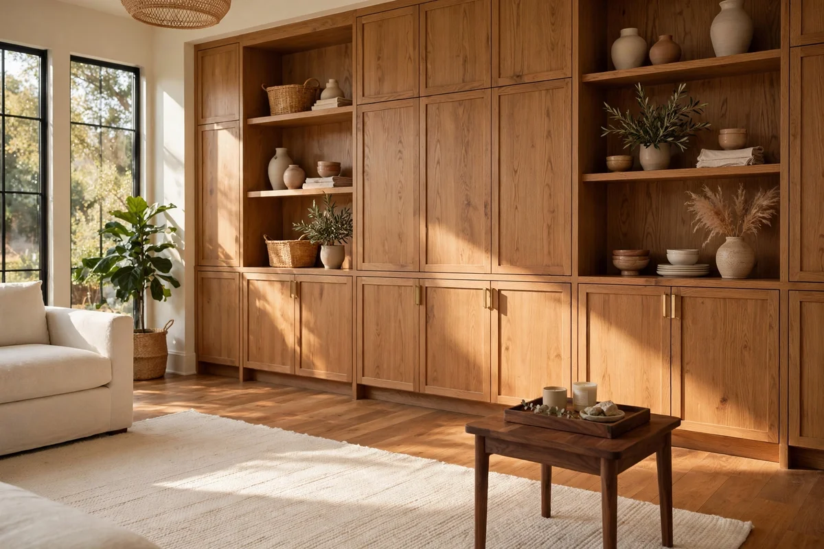
A mixed room only looks deliberate when one wood tone clearly dominates the scene. Give roughly sixty percent of the visible wood to one finish: the floor, the largest furniture piece, or the cabinetry, and let the remaining forty percent be accents. In a bedroom, the oak bed frame and matching nightstands can own the majority while a walnut bench and dark desk play supporting roles. Count visible surfaces, not just pieces, since a full wall of panelling outweighs two small side tables.
When no tone leads, every wood fights for attention and the room reads busy even when it is tidy. Measure dominance by square metres of visible surface at eye level, because that is what the eye registers first. If your floor is a strong oak, treat it as the leader and choose smaller furniture in complementary tones rather than a second big floor-toned piece. The sixty percent rule also works in reverse: if the floor is tiled or carpeted, the largest wooden cabinet or bookshelf becomes the anchor.
3. Repeat Every Wood Tone at Least Twice in the Room
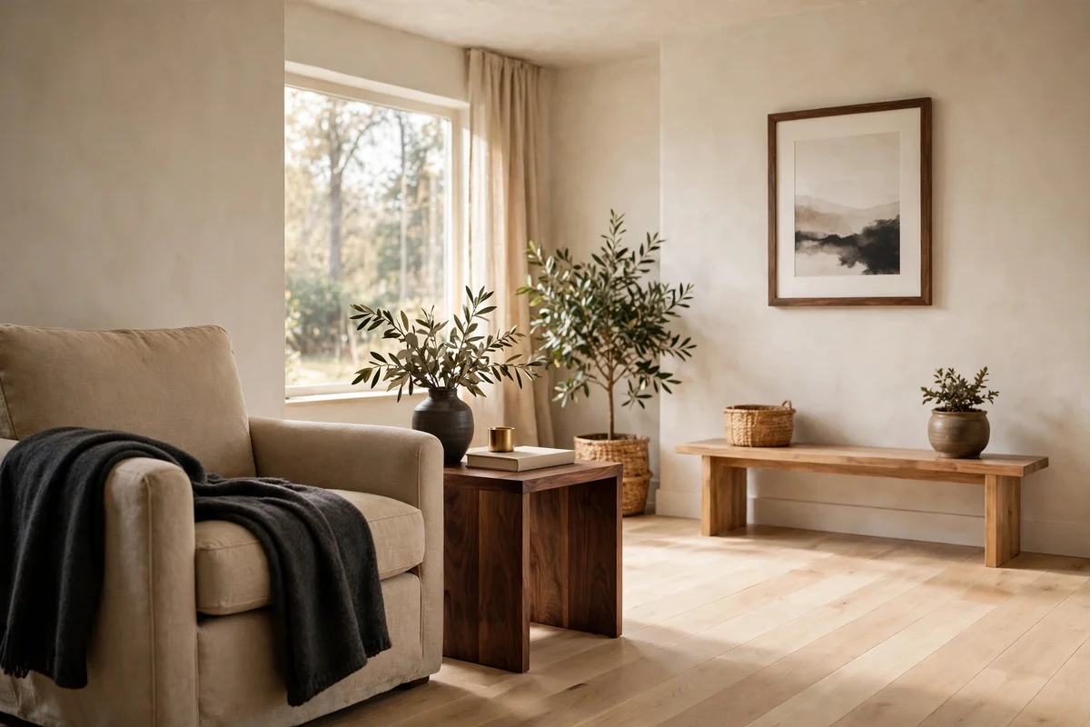
A single lonely wood tone looks like an accident, but two pieces in the same finish look like a choice. If you bring in a walnut side table, add a walnut picture frame, a walnut tray or a walnut lamp base somewhere else in the same room. The repetition can be small; a set of four matching drawer knobs counts just as well as another table. Space the pair across the room rather than clustering them, so the tone travels through the space.
This rule matters most for the darkest and lightest woods, which draw the eye hardest. One black-stained shelf floating alone can feel like a mistake, while two black accents ten feet apart feel like a rhythm. When shopping, photograph the existing piece and compare the undertone on your phone in daylight before buying the match. Budget tip: small repeat pieces such as frames, trays and hooks cost under twenty pounds or dollars and solve a mismatch that a new table never would.
4. Match the Grain Scale So the Woods Speak One Language
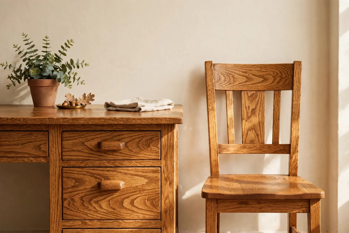
Grain scale is the pattern size in the wood, and mismatched scales clash more than mismatched colours do. A floor with wide cathedral grain beside a desk with tight, fine grain looks restless even if both are medium brown. When pairing pieces, squint at each one from two metres away: the grain should read at a similar boldness. Reclaimed oak with strong open grain pairs well with oak tables of similar character, while sleek walnut with subtle grain suits maple or birch.
If you love a piece whose grain differs from everything else, calm it down with distance and fabric. A rustic bench with heavy grain beside a linen-covered sofa reads softer than the same bench against bare walls. Avoid pairing a knotty pine ceiling with a smooth cherry table, since the texture gap overwhelms the colour. When refinishing, ask for a wire-brushed or matte finish on new pieces so they share a surface character with older wood.
5. Lay a Rug Between Clashing Woods to Bridge the Tones
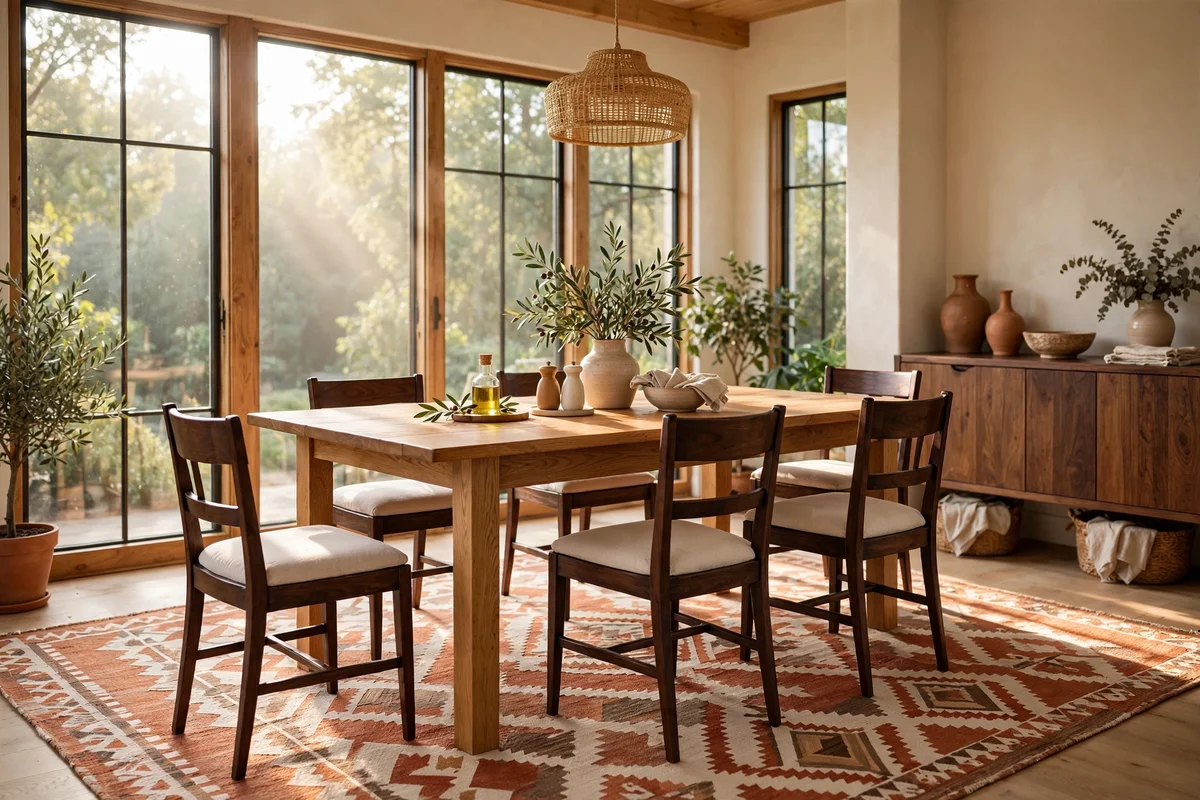
A rug is the fastest bridge between two wood tones that argue. Place a flatweave or low-pile rug of 160 by 230 cm or larger under the furniture so both woods sit on the same fabric ground. Choose a rug whose pattern includes both tones: a terracotta and cream kilim links honey oak to dark walnut, while a sage and sand pattern links grey-washed pine to warm cherry. The rug covers the seam where floor meets furniture, which is exactly where the eye compares tones.
Size matters more than pattern here; a rug that floats under only one chair looks like a mistake of its own. In dining rooms, extend the rug at least 60 cm beyond each chair leg so pulled-out chairs stay on fabric. The mistake to avoid is choosing a rug with a loud pattern that adds a third visual conversation. Keep the rug two thirds plain ground with simple borders or motifs, and let it be the quiet referee between the woods.
6. Paint One Piece to Bridge Two Woods That Will Not Meet
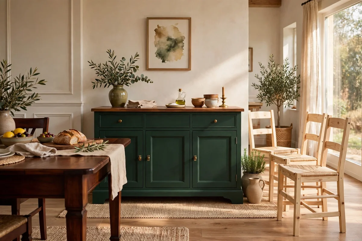
When two wood tones simply will not harmonise, painting one piece in a solid colour ends the argument. A dated orange pine sideboard painted in deep forest green or warm cream stops competing with a mahogany table entirely. Choose the smaller or less valuable piece for the makeover, since its wood contributes less to the room. Satin or eggshell finishes hide brush marks best, and two thin coats plus a light sanding between them give a finish that lasts years.
Pick the bridge colour from the room, not from a catalogue: pull it from the rug pattern, the curtains or a favourite cushion. The painted piece should sit between the two clashing woods, ideally touching neither tone directly. A painted chair at a wood table or a painted dresser beside a wood bed does this work well. Avoid painting an antique or valuable solid piece; sell or rehome it instead, since its worth survives better intact.
7. Treat Floors as the Backdrop, Not as a Matching Target
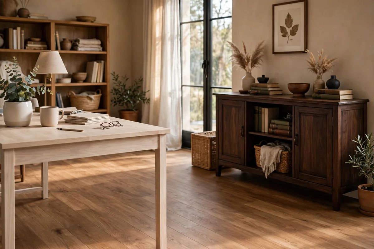
Floors cover the largest surface in the room, so they must be treated as the backdrop rather than a colour to match exactly. Trying to match furniture to the floor shade usually creates a heavy, one-note room or a near-match that looks wrong. Instead, choose furniture woods that sit clearly lighter or clearly darker than the floor by at least two shades. A medium oak floor supports a pale ash desk and a dark walnut sideboard at once, because both stand apart from it.
When the floor is very dark, keep large furniture mid-tone so the room does not sink; when the floor is pale, a dark piece anchors the space and stops it floating. Area rugs reset the equation: a rug over a dark floor lets you place dark furniture without heaviness. The mistake to avoid is buying a stain to match the floor at the shop, since same-species stain names still vary between manufacturers. Contrast with confidence beats near-matching every time.
8. Add a Black Painted Piece as a Visual Full Stop
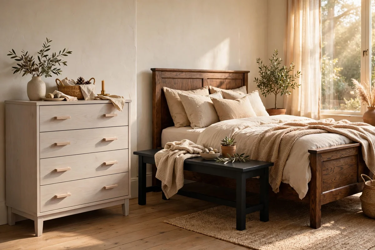
Black is not a wood tone, which is exactly why it works as a break between two arguing woods. One black-painted side table, stool or lamp base acts as a full stop that lets honey oak and grey walnut coexist without touching. Place the black piece between the two tones in the sightline, for example a black bench between a pale ash dresser and a dark oak bed. Matte black reads classic, while satin black suits more formal rooms.
Keep black to ten percent of the room or less, since more than that becomes its own dominating theme. Three small black accents, such as a frame, a hook rail and a stool, can repeat the break across the room without weighing it down. The mistake to avoid is pairing glossy black with rough rustic woods; the finish gap looks more jarring than the tone gap. Hardware in black, such as door handles and curtain rods, can quietly extend the break throughout the home.
9. Use Cream Painted Pieces to Soften a Crowded Wood Palette
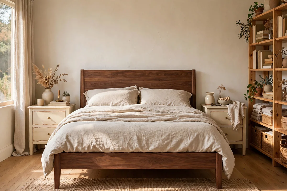
Cream is the gentlest bridge in a room that already holds three or four wood tones. A cream-painted bookcase, nightstand or chair lets the eye rest, and its soft warmth flatters both warm and cool woods without taking sides. In a living room, two cream-painted side tables beside a leather sofa break up the wood-on-wood conversation without adding another tone. Choose a warm cream rather than stark white, since pure white can turn greyish against golden woods.
Cream works best on pieces with simple lines, because heavy mouldings painted cream can look fussy next to plain modern woods. If you are repainting, test the cream against the largest wood in daylight, since some creams carry a pink or yellow cast that fights walnut. A single cream chair or a painted dresser costs little to make and solves a crowded room faster than replacing a single wood piece. Keep fabrics in the same family: linen, cotton and wool all sit well beside cream.
10. Test Samples Against the Floor at Three Times of Day
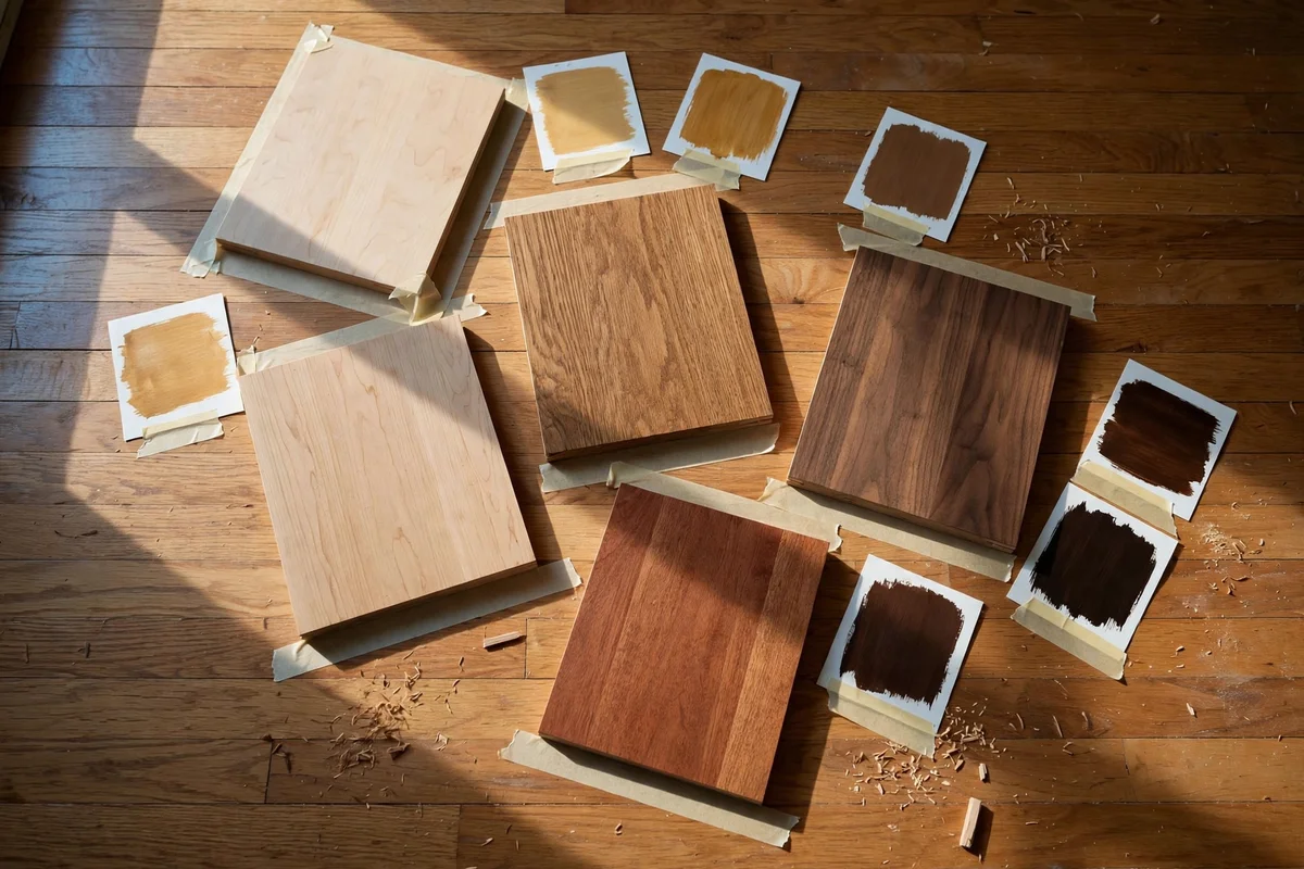
Wood tones shift dramatically as daylight changes, so test every candidate at morning, noon and evening light. Tape or lean a sample board against the floor or the largest piece at 8 a.m., noon and 6 p.m., and photograph it each time with the flash off. Morning light is cool and honest, midday light is bright and flattening, and evening light runs warm and flattering. A tone that harmonises at all three will harmonise always.
Keep a testing kit in a bag: three or four stain cards, a small offcut of each wood you own, and painter’s tape. Test near the wall where the piece will actually sit, not in the middle of the room, since corners and windows change light. The mistake to avoid is deciding under shop spotlights, which are far brighter and cooler than any living room. If a sample passes all three times of day, buy with confidence; if it fails one, keep looking.
11. Balance Light Woods With at Least One Deep Tone
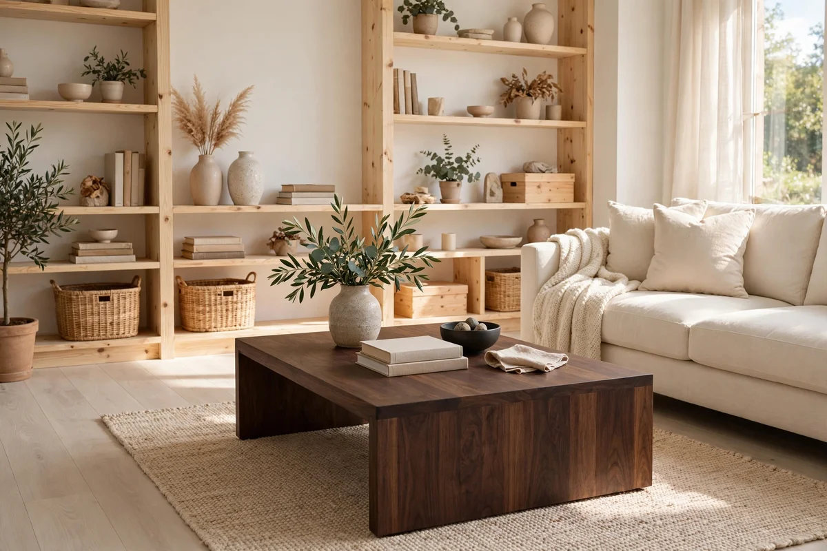
A room of only pale woods looks washed out, while a room of only dark woods feels heavy. The most restful rooms balance light woods such as ash, pine or birch with at least one deep tone like walnut, wenge or dark-stained oak. In a light-floored room, a walnut coffee table or a dark bookshelf of about 120 cm wide anchors the space. The dark piece should hold roughly fifteen to twenty percent of the visible wood, enough to ground without overwhelming.
Spread the dark tone, not the light one: the eye tolerates pale expanses better than dark ones. Two smaller dark pieces, such as a side table and a framed mirror, usually work better than one massive dark wardrobe. If the room already has dark floors, add the contrast through medium tones and black or cream painted pieces instead of more dark wood. Test the balance by photographing the room in black and white; you should see a clear range from light to dark, not one grey block.
12. Keep the Wood Palette to Three or Four Tones at Most
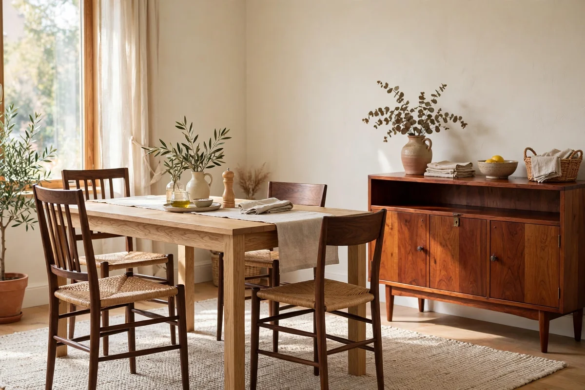
Four wood tones are the practical ceiling for a calm room, and three is easier still. Count your tones honestly, grouping only woods whose undertone and depth look identical from two metres away. A dining room with an oak table, walnut chairs, a cherry sideboard and a pine hutch is already at the limit; adding a fifth tone needs either a unifying rug or a painted piece to absorb it. Open-plan spaces can stretch the count, since the kitchen and sitting area read as separate zones.
When you are over the limit, remove rather than add: sell, gift or repaint the smallest piece in the odd tone out. Small accessories like picture frames and baskets do not count toward the limit if they stay under five percent of visible wood. The mistake to avoid is treating every new purchase as a free addition; each new tone raises the visual noise of the room. Before buying, ask which tone it repeats or bridges, and skip it if the answer is none.
13. Rescue a Badly Mixed Room With a Four Step Audit
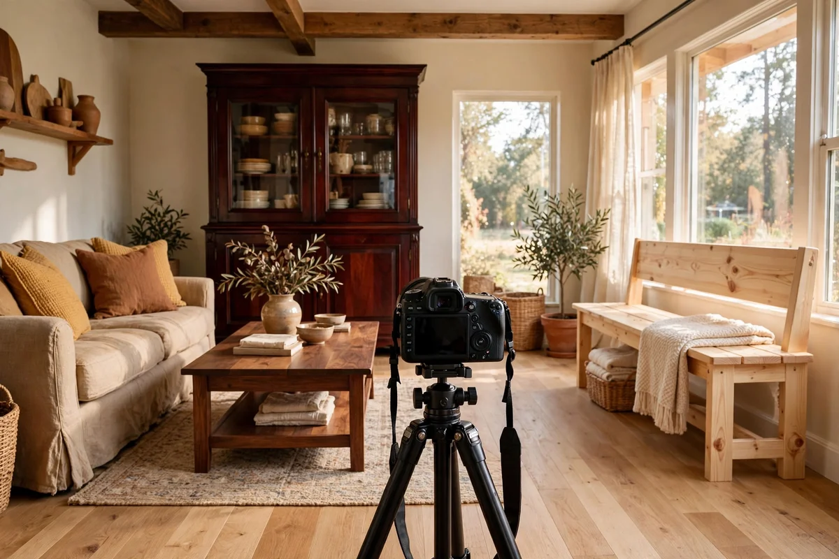
Start the rescue by photographing the room in daylight and printing the photo or viewing it large, because distance reveals clashes the eye accepts in person. List every wood visible in the photo and group them by undertone and depth. Circle the worst offenders: the lone tone that appears once, the near-match that almost but does not match, and the biggest surface in the oddest tone. Most bad mixes come down to one piece causing eighty percent of the trouble.
Fix in this order: first paint or relocate the single worst piece, then add a repeat of any tone that appears only once, then lay a rug to bridge what remains, and finally edit small accessories down to three tones. This sequence costs least and changes most. Give each change two days before judging it, since the eye needs time to adjust. The mistake to avoid is starting over completely; most badly mixed rooms need one painted piece and one rug, not a new room.
14. Let Hardware and Metal Finishes Unite the Woods
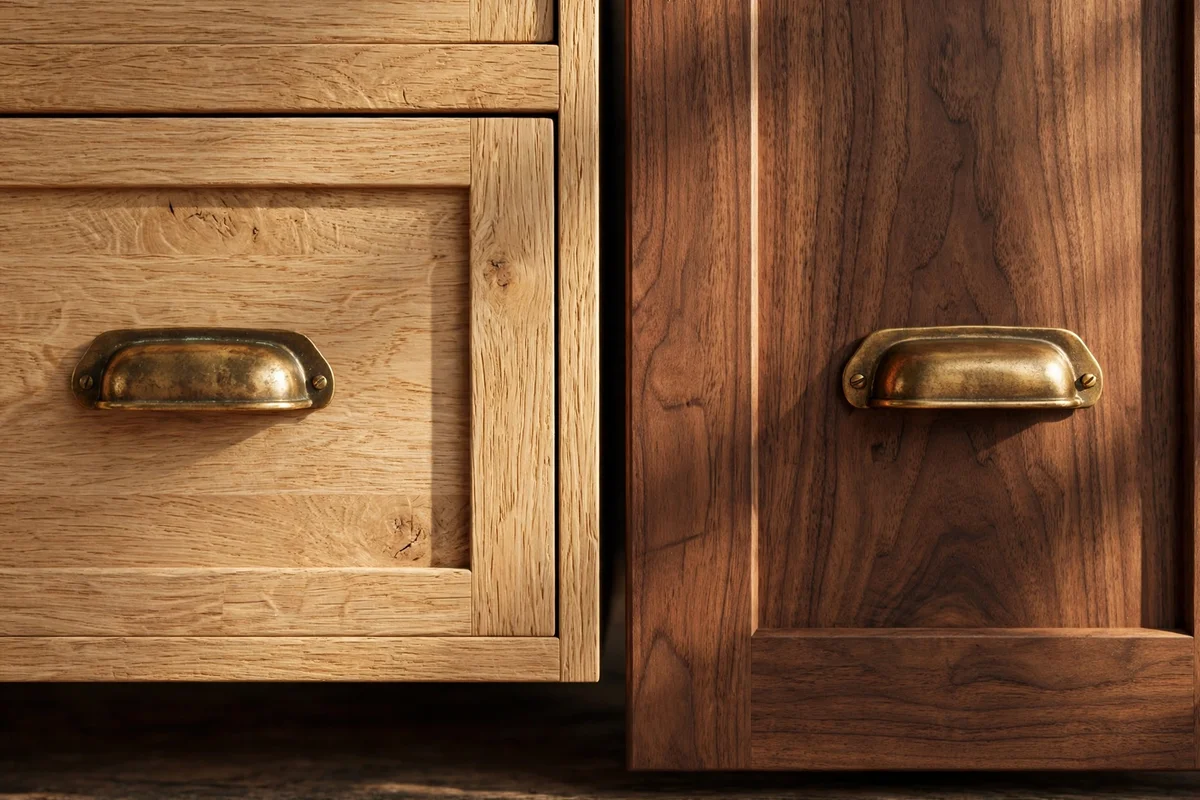
Handles, hinges, curtain rods and lamp bases carry more visual weight than people expect, and matching metals give mixed woods a common thread. If the room holds oak and walnut, brass or aged bronze hardware on both pieces ties them together without changing either wood. Replace mismatched chrome, nickel and brass handles with one finish across the room; a set of ten cabinet pulls costs less than one new side table and transforms the space.
Choose the metal by undertone: warm brass and bronze suit warm woods, while brushed nickel and black suit cool or grey woods. Keep every visible metal in one family, including the curtain rod, the floor lamp and the switch plates if the budget stretches. The mistake to avoid is mixing shiny chrome with aged brass, which reads as clutter faster than any wood combination. In kitchens and studies, even the kettle and desk accessories can quietly join the metal family.
15. Keep Small Rooms to Two Wood Tones or Fewer
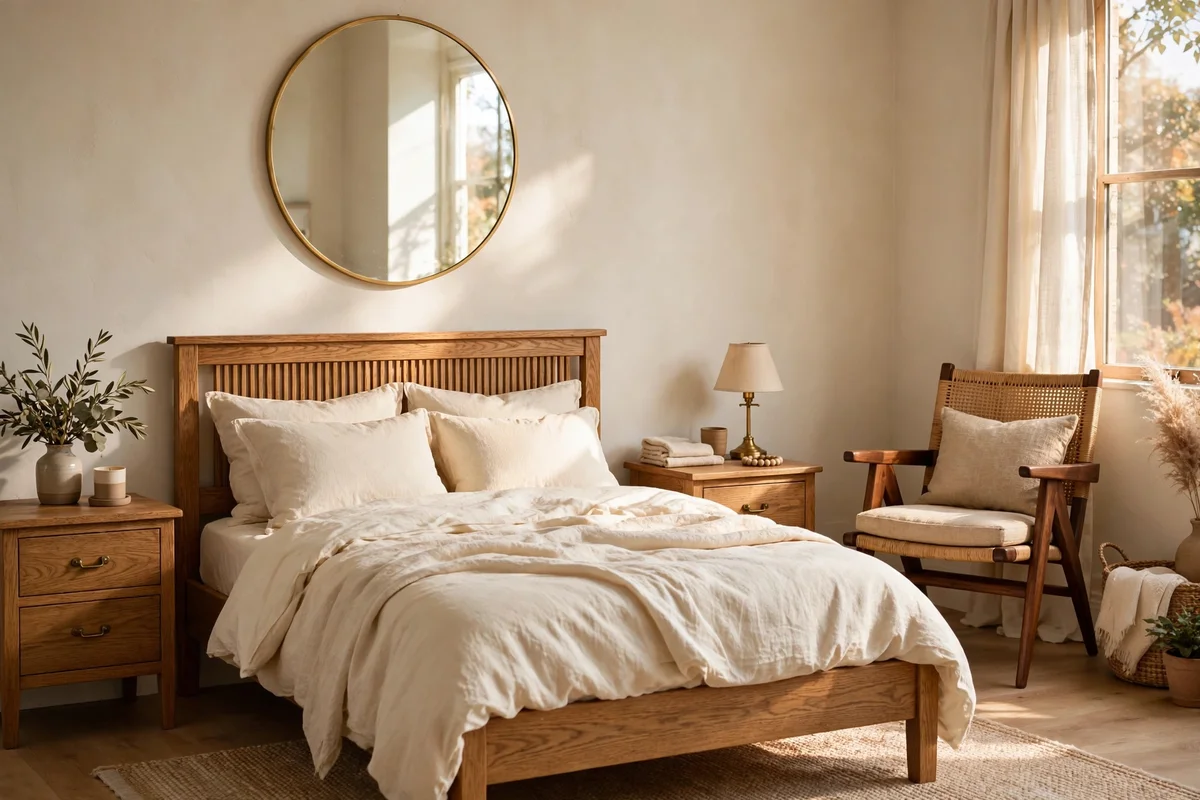
Small rooms amplify every clash because each wood is always in view, so keep them to two tones or fewer. In a box bedroom, match the bed and nightstands in one wood and allow only one accent tone, such as a walnut chair beside an oak bed. Hallways and powder rooms work best with a single wood repeated: a row of oak hooks, an oak mirror frame and an oak bench read as one calm line. Mirrors help, since they bounce light and visually widen the space.
In small rooms, floors count double because they wrap the whole space. A dark floor in a small room needs mostly light furniture, while a pale floor can carry one darker anchor piece. Painted pieces do heavy lifting here: a cream-painted dresser in a small oak bedroom adds variety without a third tone. The mistake to avoid is using three full-size wood pieces in different finishes in a room under ten square metres; at least one of them should be painted or replaced.
16. Pair the Dining Table With Chairs That Echo, Not Match
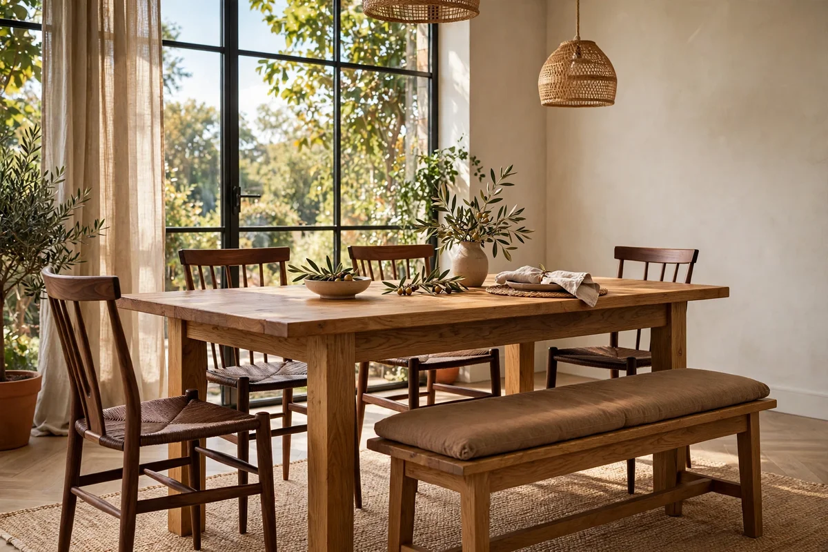
Dining chairs that match the table exactly look dated; chairs that echo the table look collected and warm. If the table is warm oak, choose chairs in walnut or a painted finish with oak-toned legs, or simply paint all the chairs one colour and let the table stand alone. The chairs should be clearly different from the table, not a near-miss of the same stain, since near-matches look like failed matching. Keep all chairs identical to each other so the set reads as one decision.
A bench on one side of the table adds a second echo point and seats extra family comfortably. Test the combination in daylight before committing, since dining rooms often sit near big windows. Budget tip: a second-hand chair set painted in one satin colour costs far less than new matching chairs and looks more intentional. The mistake to avoid is buying chairs in a tone that only appears on the chairs; add a frame, tray or shelf in that tone somewhere else in the room.
17. Anchor the Bedroom With the Bed Frame as the Wood Leader
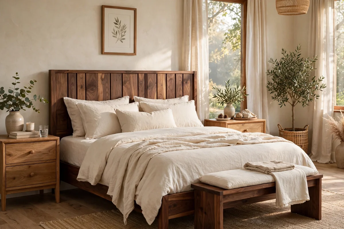
In the bedroom, the bed is the largest wooden surface, so it must be the sixty-percent leader. Choose the bed frame wood first, then select nightstands and dressers that either repeat it or contrast with it clearly. A walnut bed with oak nightstands looks calm when both tones repeat elsewhere: a walnut bench at the foot and an oak-framed mirror above the dresser. Keep the headboard uncluttered so its tone reads cleanly against bedding.
Bedding softens every wood decision, since duvets and throws cover most of the frame. Layer cream or oatmeal linen over dark wood beds to keep them from weighing the room, and use warm white or sage over pale wood to add depth. The mistake to avoid is introducing a third wood through the headboard alone, such as a reclaimed-wood headboard with a painted bed; the two woods never get a repeat. If the bed is upholstered, the largest wood dresser becomes the leader instead.
18. Match Finish Types, Matte to Matte and Sheen to Sheen
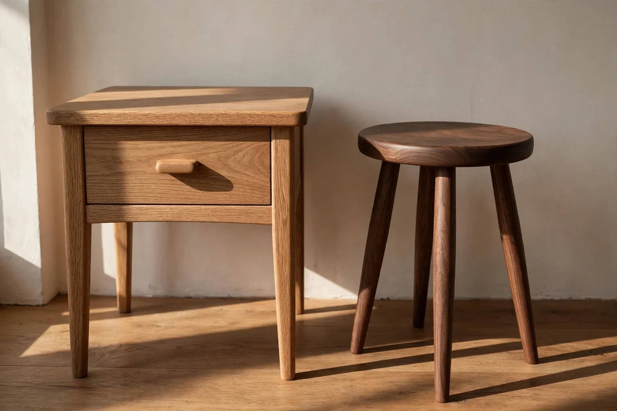
Finish type changes how a wood reads: a matte oak and a glossy oak can look like different tones entirely. When mixing, keep finishes in the same family: matte with matte, satin with satin, oil with oil. A room of oiled walnut, matte black metal and soft wool feels coherent, while one glossy lacquered piece among matte woods looks like a leftover from another room. Check finish in raking light by standing the sample near a window and viewing along its surface.
If you love a glossy piece in a matte room, tone it down with a matte topcoat or place it where it catches little direct light, such as a hallway corner. Refinishing is a budget fix: a tin of matte water-based varnish and an afternoon of sanding unifies two mismatched pieces for under thirty pounds or dollars. The mistake to avoid is judging finish in the shop, where overhead lights make everything shinier than it is at home. Touch matters too: similar textures invite the hand equally.
19. Scatter Wood Accessories to Stitch Tones Together
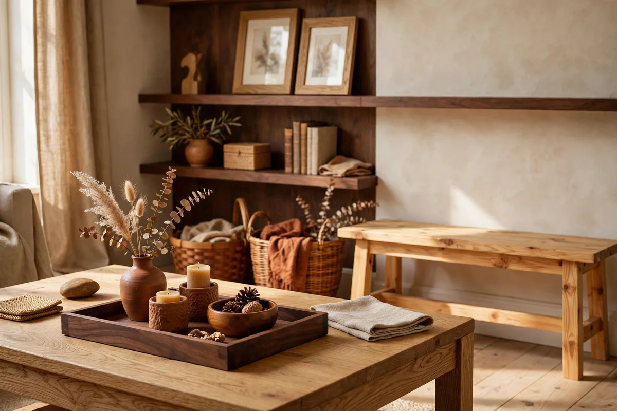
Small wooden accessories stitch different tones into one story without major purchases. A walnut tray on an oak coffee table, oak frames around walnut-stained shelves, and a cherry basket beside a pine bench all create quiet echoes. Keep accessories between 10 and 40 cm so they read as accents, not furniture, and group them in odd numbers of three or five for a natural look. Each accessory should repeat a tone that already appears in furniture, never introduce a brand-new one.
Rotate accessories seasonally: swap in darker trays and baskets in winter and lighter woven pieces in summer, and the room shifts with the light. Charity shops and wood offcut bins supply these pieces for a few pounds or dollars each. The mistake to avoid is scattering ten small pieces in ten tones across open shelves; group accessories by tone on each shelf instead. Two tones per shelf, repeated across three shelves, looks curated while five mixed tones per shelf looks cluttered.
20. Live With Each New Piece for Two Days Before Judging
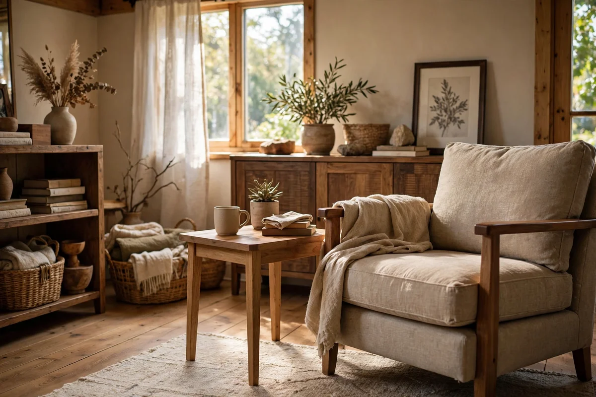
Wood tones look different after the eye adjusts, so give every new piece a full two days before deciding it clashes. Place the piece where it will live, keep the room’s normal lighting and curtains, and simply use the room. Photograph it on day one and again on day three in the same daylight; if the photo looks calmer, the piece is settling in. Rushing to return or repaint on day one wastes the most common fix, which is time.
Use the two days to test small shifts: move the piece 30 cm, turn it toward or away from the window, or add a book or tray in a familiar tone on top. If it still jars after three days, run the rescue audit from section thirteen and paint or relocate it. The mistake to avoid is judging a piece against the memory of the shop, where lighting and neighbours were different. Most perceived clashes soften by half within a week of ordinary family life.
Mixed wood tones reward patience more than spending. A dominant wood, a repeated second tone and one quiet bridge piece do more work than any catalogue set, and the room you already own is closer to calm than it feels. Start with the daylight test this weekend: line up your samples by the window, note their undertones, and let the room tell you which tone should lead.
The easiest first move is also the cheapest. Choose one wood that appears only once and repeat it in a small accessory: a frame, a tray or a set of hooks for under twenty pounds or dollars. That single echo often settles the whole room, and you will feel the difference the same evening. Live with the change for a week, then decide what the room still needs.
Frequently Asked Questions
How many different wood tones can one room handle?
Three tones are comfortable in most rooms, and four is the practical ceiling before the space feels busy. Count only furniture and floors, not tiny accessories, and give the dominant wood about sixty percent of the visible surface. Small rooms should stay at two. If you are over the limit, paint or move the smallest piece in the odd tone rather than buying anything new.
Can I mix warm and cool wood tones together?
Yes, when you give them a bridge. Warm woods carry orange or red undertones and cool woods carry grey or green ones, so place a neutral wood, a patterned rug or a cream painted piece between them. Read every undertone in daylight first, since evening bulbs hide the difference. Without a bridge, warm and cool tones fight; with one, they look intentionally collected.
Should my furniture match my wood floor?
No, contrast beats matching. Choose furniture clearly lighter or darker than the floor by at least two shades, because near-matches look like failed attempts. A medium oak floor pairs well with a pale ash desk and a dark walnut table at once. Use a rug under furniture groupings to soften the meeting point where the two tones touch.
What is the cheapest way to fix clashing wood tones?
Paint one piece and buy a rug. A litre of satin furniture paint costs under thirty pounds or dollars and removes the worst offender from the argument, while a second-hand kilim or flatweave rug bridges the remaining tones. Add two or three small accessories, such as frames or trays, in the tone that appears only once. The whole rescue usually costs under one hundred.
Do the rules change for open-plan living spaces?
Slightly. Each zone, such as the kitchen side and the sitting side, can carry its own dominant wood, which lets the whole space hold four or five tones without trouble. Keep the metal finishes consistent across zones and repeat one wood in both areas, perhaps through frames or baskets, so the zones feel connected rather than separate rooms.