Home Improvement
22 Blue House Front Door Ideas That Make Your Entrance Unforgettable
By Anna Wells · · 20 min read
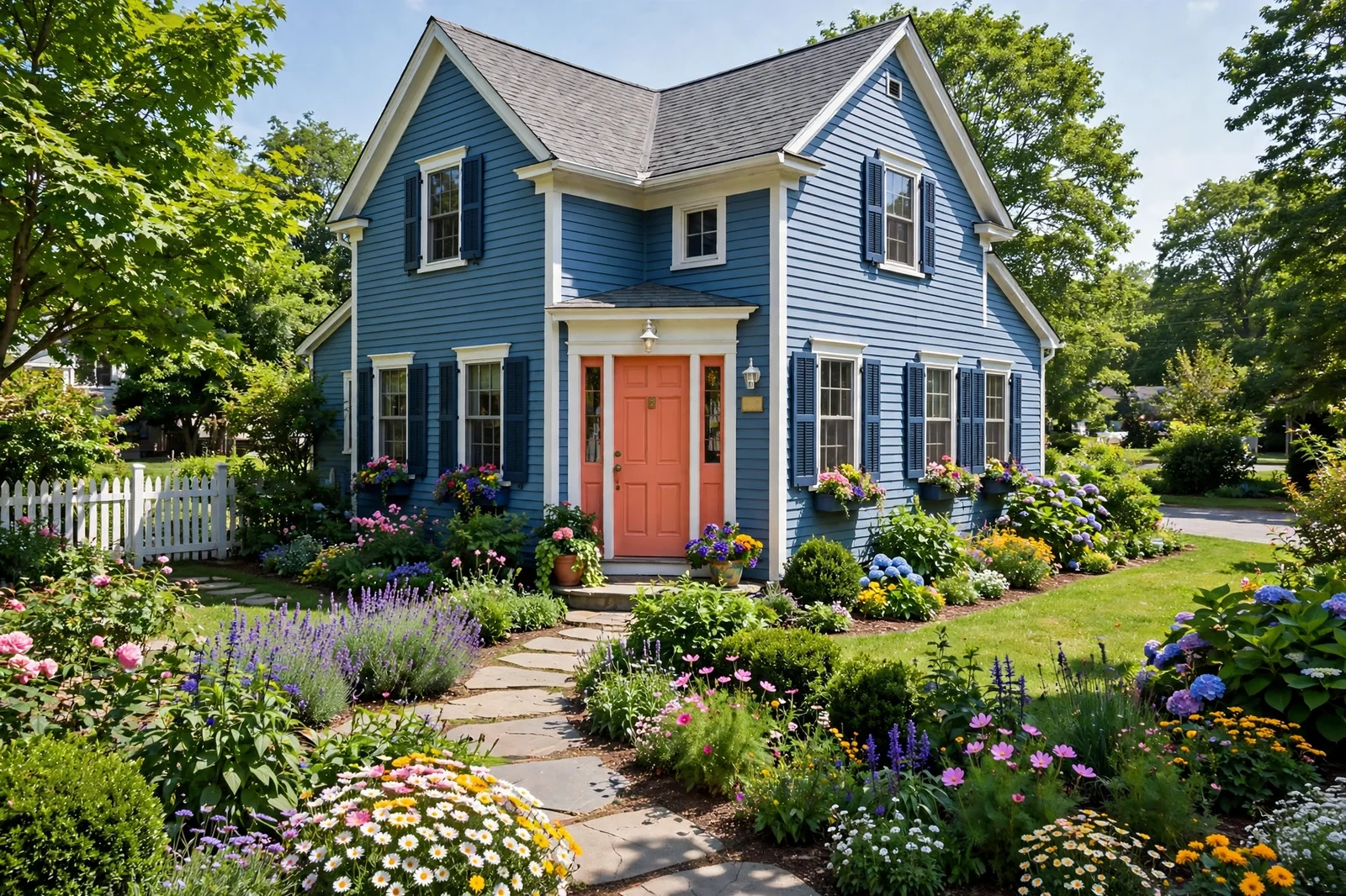
A blue house already has character, but the front door decides whether that character whispers or sings. The right color turns the entrance into a focal point, lifts the whole facade and makes guests feel expected before they even knock. These twenty-two pairings, from bold complementary contrasts to quiet tonal harmonies, show exactly how to choose a door color that flatters your shade of blue.
The front door is the handshake of your home. On a blue house, where the siding already sets a distinctive mood, the door color is the detail that completes the sentence. Get it right and the whole facade clicks into place: the trim looks crisper, the garden looks tidier, and the house gains that elusive quality estate agents call kerb appeal. Here are twenty-two colors that love blue houses, and how to wear each one well.
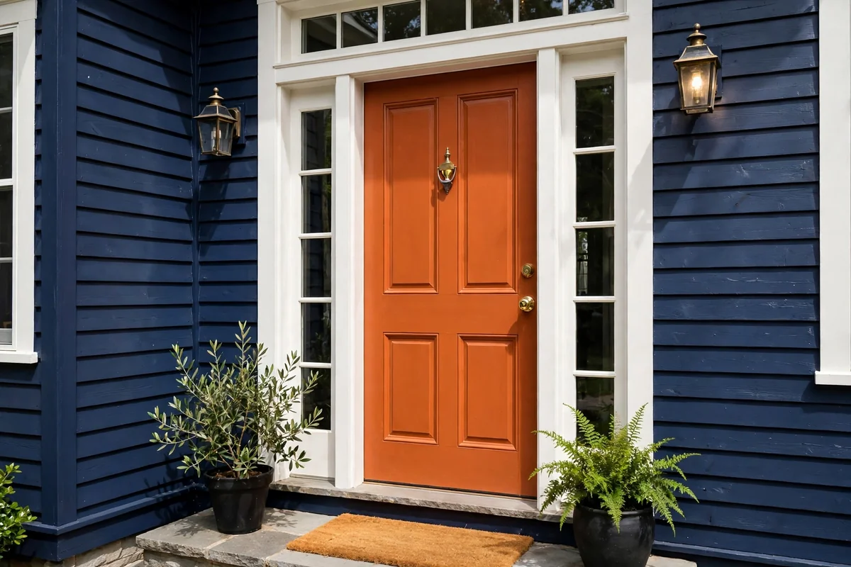
1. Burnt Orange Against Navy
Orange sits directly opposite blue on the color wheel, which makes burnt orange the most naturally striking partner for a navy house. The warmth of the orange ignites against the cool depth of navy, and the entrance becomes impossible to miss from the street. Choose a burnt, earthen orange rather than a bright tangerine for a sophisticated rather than sporty effect.
Keep the supporting cast quiet so the contrast stays elegant: crisp white trim, black or bronze hardware, and simple green planting. A burnt orange door fades gracefully too, since its earthy pigment weathers more kindly than brighter hues. Paint it in satin exterior paint for a soft glow, and expect delivery drivers to never miss your house again.
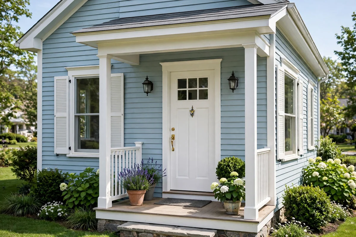
2. Crisp Classic White
Some pairings endure because they simply cannot fail, and white on blue is one of them. A crisp white door against blue siding, whether navy or powder, looks fresh, coastal and eternally tidy. It is the equivalent of a white shirt: appropriate everywhere, flattering to everything around it, and the perfect backdrop for beautiful hardware.
The secret to a white door that stays beautiful is preparation and paint quality. Use a stain-blocking exterior primer, two topcoats of durable satin paint, and wash the door each spring to keep it luminous. Dress it with polished chrome or brass, a simple wreath in season, and planters of white flowers for a monochrome moment. Understated, but never boring.
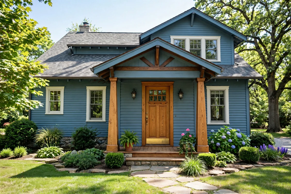
3. Warm Natural Oak
A natural oak door brings organic warmth that painted colors cannot imitate, and it sits beautifully against every shade of blue. The honeyed grain softens navy siding and adds a craftsman richness to lighter blues, giving the entrance a handcrafted, established feel. It is particularly lovely on houses with stone or brick detailing that echo the wood’s earthiness.
Protect the investment with a marine-grade exterior oil or varnish, reapplied every two to three years, since sun and rain will silver unfinished oak. Choose simple black ironmongery to let the timber be the star, and keep the porch styling natural: a coir mat, terracotta pots, nothing fussy. Wood against blue is a timeless material conversation.
4. Buttery Yellow Welcome
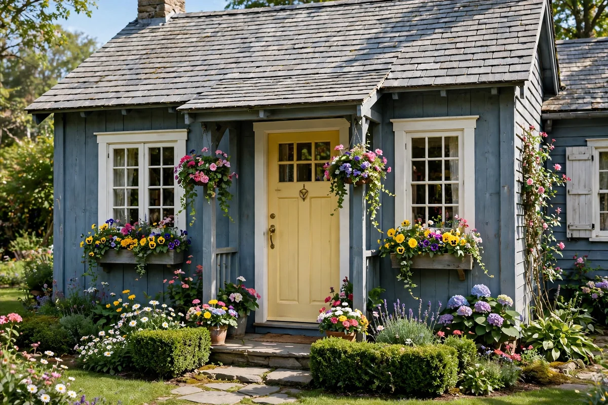
Buttery yellow is pure hospitality in paint form. Against a blue-grey or navy house it glows like lamplight, and the combination has a cheerful, storybook quality that makes the whole street smile. It suits cottages and family homes best, where its optimism feels completely at home. Few colors announce a happy household quite so clearly.
Because yellow is a high-energy color, keep it soft and buttery rather than neon, and balance it with calm surroundings: white trim, grey stone or simple planting. Yellow fades faster than most colors in strong sun, so choose a quality exterior paint with good UV resistance and expect a refresh a little sooner. Style the step with a simple black lantern and white-flowering pots to keep the look crisp. The reward is the happiest entrance on the street.
5. Soft Sage Green
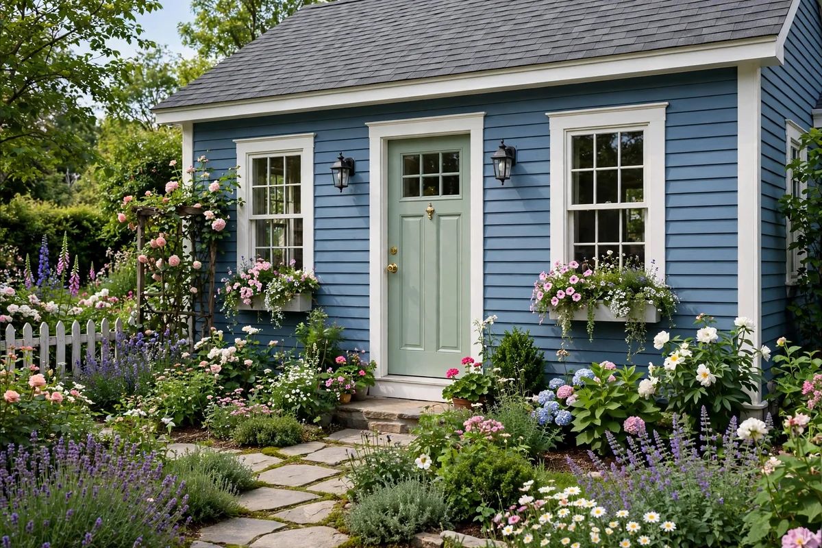
Sage green is the diplomat of door colors: gentle, natural and agreeable with almost everything, including blue. Its grey-green softness bridges the cool siding and the garden planting, making the entrance feel like a natural extension of the landscape. On a mid-blue house with white trim, it is quietly perfect.
This is an ideal choice if you want character without commitment to boldness. Sage looks beautiful with bronze or black hardware and cream or stone planters. It weathers gracefully and suits both traditional and contemporary facades. If your blue has green undertones, sage will harmonise; if it leans violet, sage provides a lovely, calming contrast.
6. Deep Burgundy Elegance
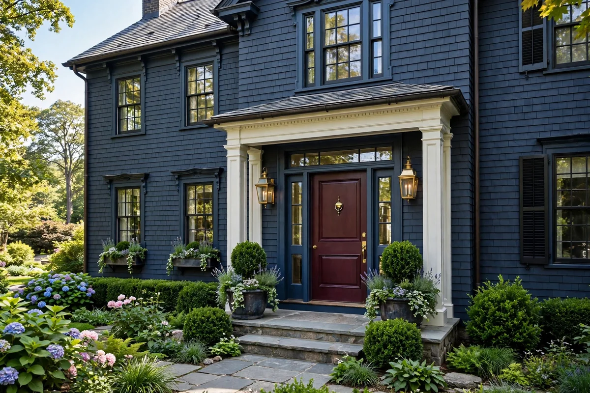
Burgundy brings a wine-dark richness that makes a blue house look distinguished and established. The deep red-brown has enough blue in it to harmonise with navy siding while offering enough warmth to stand apart, creating a layered, sophisticated entrance. It is the color of old libraries and fine dining rooms, translated to the facade.
Pair it with polished brass, which glows against the dark red, and keep the trim a clean white or soft cream for definition. Burgundy in a satin finish looks expensive and hides dust well. It is a particularly good choice for formal or period houses where a brighter color might feel out of place. Quietly luxurious, always appropriate.
7. Cheerful Coral Pop
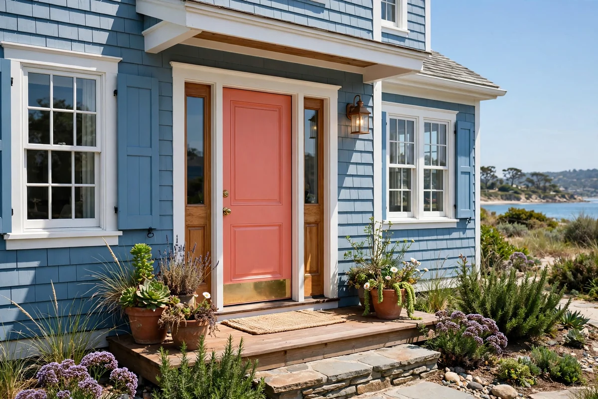
Coral is joy with sophistication: pink enough to be playful, orange enough to complement blue beautifully. On a coastal blue or light navy house, a coral door feels like a permanent holiday, welcoming and full of light. It photographs wonderfully too, which matters more than ever in the age of the property listing.
Balance coral’s energy with crisp white trim and simple, unfussy planting so the entrance stays chic rather than sugary. A satin finish keeps it fresh, and black lantern-style sconces give it structure after dark. Coral suits homeowners who want their house to feel happy; it is very hard to come home to a coral door in a bad mood.
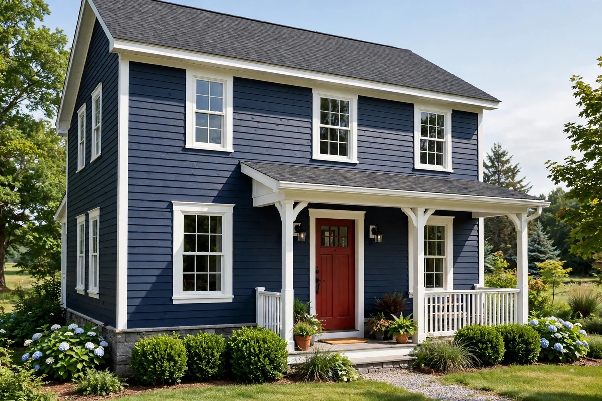
8. Classic Barn Red
Barn red is Americana at its most confident, and against navy siding it is magnificent. The deep, earthy red has colonial roots, which makes it perfect for traditional, farmhouse and shaker-style blue houses. It carries a sense of heritage and solidity, as though the house has stood proudly for a century.
White trim is barn red’s natural partner, sharpening the contrast and giving the facade its classic definition. Choose iron-black hardware and a simple wreath or lantern to complete the heritage look. Barn red is also practical: its deep pigment covers well and weathers evenly. It is a bold choice that never feels trendy, only timeless.
9. Sophisticated Charcoal Black
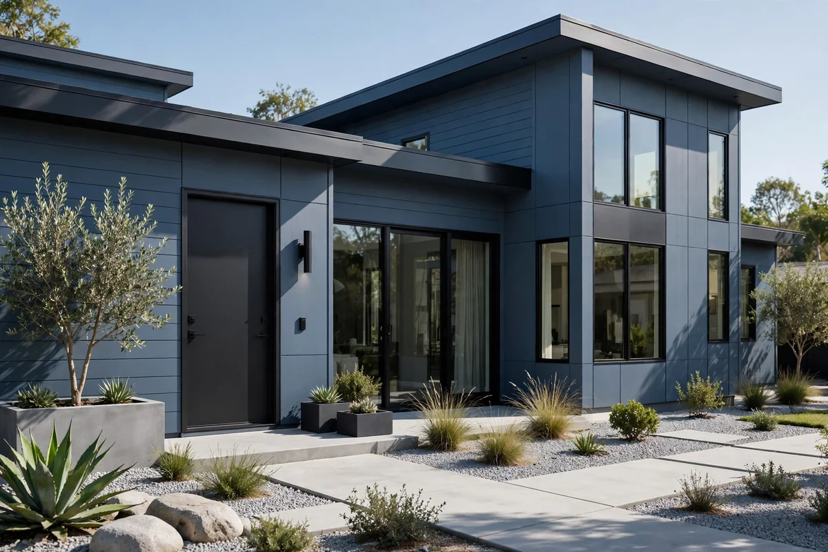
Charcoal black is the tuxedo of door colors: formal, slimming and appropriate everywhere. Against blue siding it adds instant gravitas, sharpening the architecture and making the entrance feel considered and expensive. It works with every blue from powder to midnight, and with every style from modern to colonial. Few colors carry a facade with such quiet authority.
The drama comes from contrast, so keep the trim bright white and the hardware polished: brass, chrome or matte black all work beautifully. A black door shows dust, so choose a satin finish and give it a quick wipe when you water the planters. Flank it with symmetrical topiary or lanterns for a truly tailored entrance. It is the safest bold choice you can make.
10. Sea Glass Turquoise
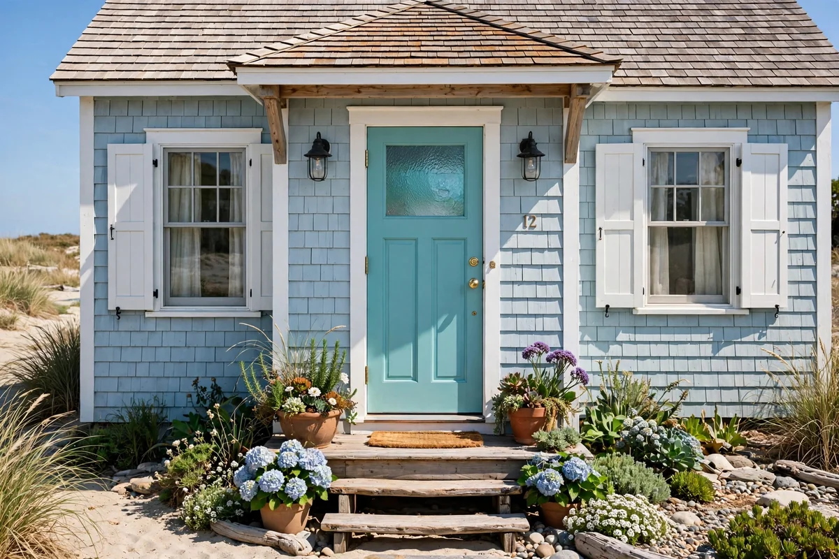
Turquoise carries the calm of shallow water to your doorstep, and on a blue coastal cottage it feels utterly inevitable. The color bridges the siding and the seaside spirit, creating an entrance that is relaxed, friendly and full of light. It is particularly lovely on weatherboard cottages with white trim and sandy gardens.
Keep the palette beachy: whitewashed pots, rope details, dune grasses. Turquoise fades in fierce sun, so a quality exterior paint and a north or east-facing aspect will keep it vivid longest. It is a color that makes visitors exhale; the house equivalent of opening a window to the sea breeze. Playful, but never frivolous.
11. Creamy Off-White Calm
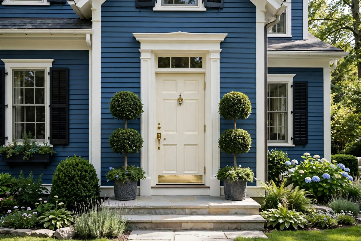
Off-white offers all the freshness of white with a little more soul. Its whisper of warmth, whether creamy, greige or faintly green, keeps the entrance from feeling stark against blue siding and gives the facade a soft, heritage glow. It is the color of well-loved country houses that have mellowed gracefully.
Pair it with aged brass or bronze hardware and natural stone or brick detailing for a collected-over-time feel. Off-white is forgiving of dust and pollen, which makes it practical as well as pretty. Style the step with terracotta pots and trailing greenery. It is quiet luxury for the entrance: nothing shouts, everything welcomes.
12. Dusty Teal Balance
Dusty teal sits between blue and green in that satisfying middle ground, giving a door that harmonises with blue siding while adding its own quiet personality. It is muted enough for traditional streets yet distinctive enough to be remembered, the introvert’s bold choice. Against a mid-blue house, it reads as tonal and deeply calming.
This color loves natural materials: oak planters, stone steps, black iron lanterns. In a satin finish it has a soft, chalky depth that looks hand-painted. Dusty teal is also kind to gardens, echoing foliage without disappearing into it. If you want interest without risk, this is the color that delivers both.
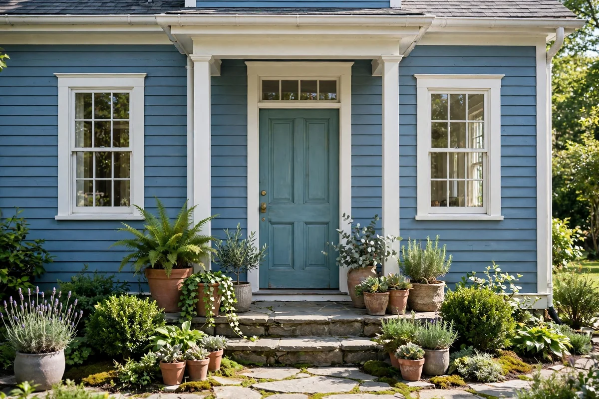
13. Forest Green Heritage
Forest green is the color of old country estates, and it brings instant heritage to a blue house. Deep, traditional and utterly dependable, it pairs beautifully with navy and mid-blue siding, especially when the trim is white and the hardware is polished brass. It is the door color of houses that host long, happy lives.
This is a color that rewards good paint: a full-gloss finish on a panelled door in forest green is one of the great sights of domestic architecture. Keep the surrounding planting classic, box topiary, lavender, roses, and the entrance will look established from the first week. Dignified, enduring and quietly confident.
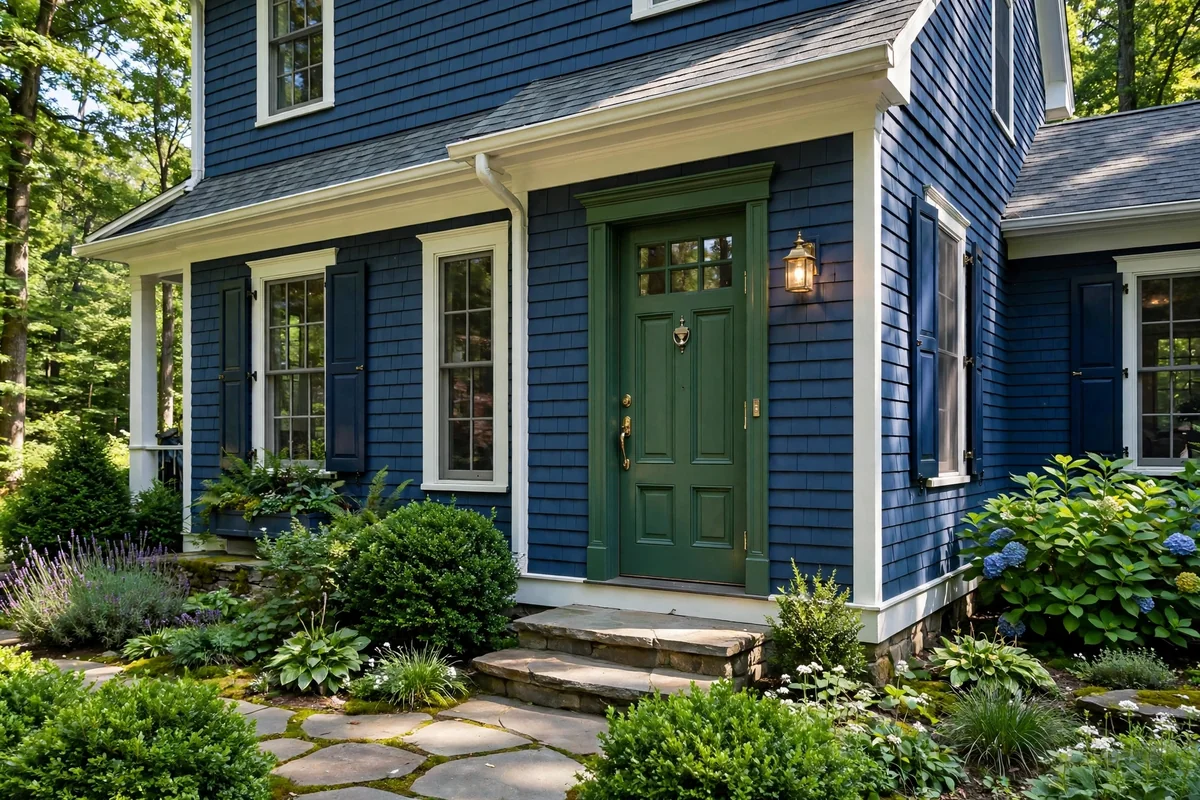
14. Mustard Gold Statement
Mustard gold is retro confidence in a tin. Against blue-grey siding it pops with a mid-century warmth that feels both nostalgic and current, turning an ordinary entrance into a design statement. It is bold without being brash, golden without being glittery, and it makes grey-blue houses look instantly more expensive.
Let the door be the star: keep trim white, planting simple and hardware dark bronze or black. Mustard suits modern and ranch-style houses best, where its graphic punch feels intentional. It will fade in strong sun faster than darker colors, so buy the best exterior paint you can. For the brave, it is pure joy every time you come home.
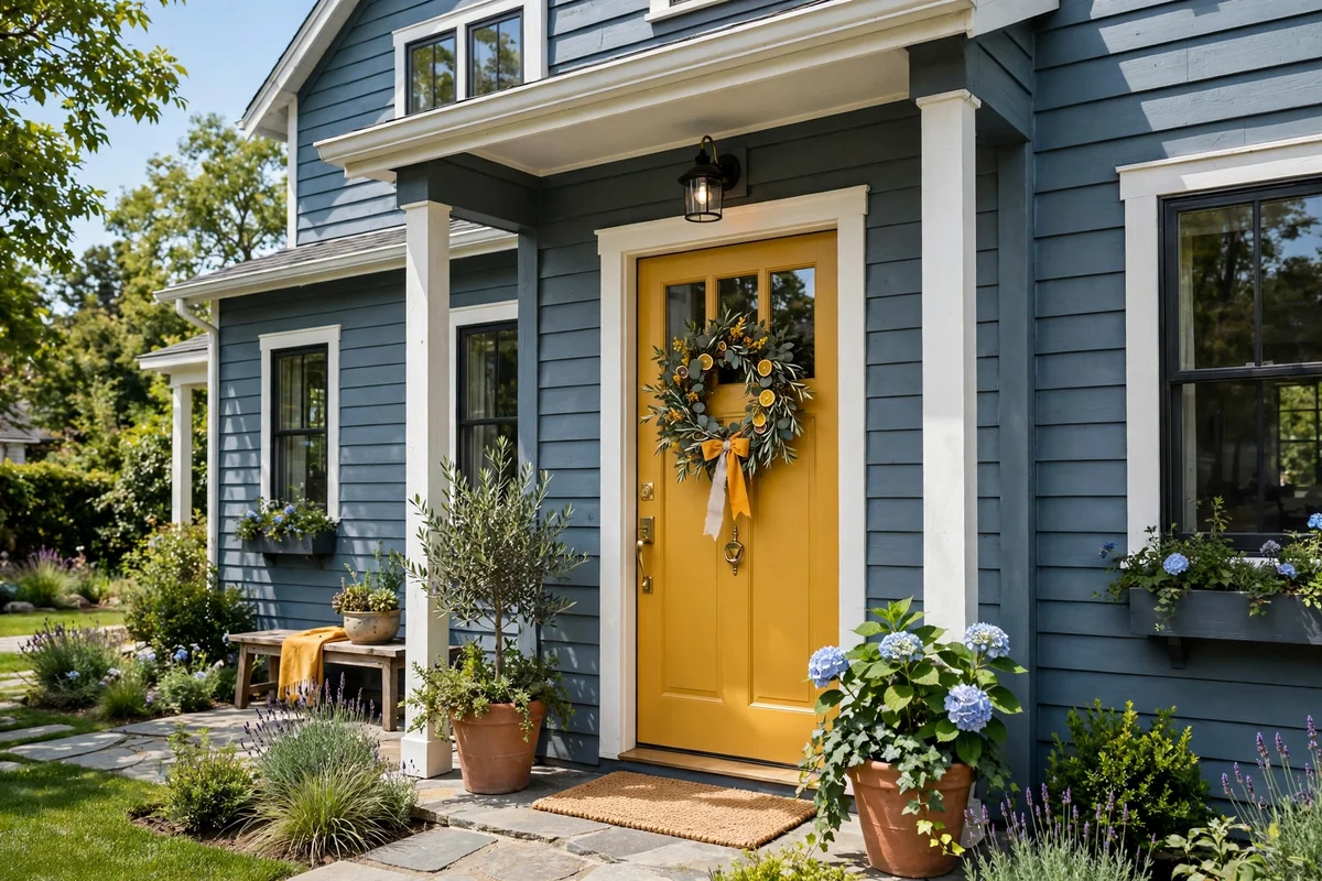
15. Powder Blue on Blue
A tonal blue-on-blue scheme is the connoisseur’s choice: subtle, sophisticated and deeply calming. Pair a powder-blue cottage with a door two or three shades deeper, or a navy house with a lighter steel-blue door, and the facade gains depth without any contrast shouting. The effect is like a well-tailored tonal outfit.
The key is getting the step between shades right: too close and it looks like a mistake, so aim for a clear but gentle difference. Test large swatches on the door and view them at different times of day. White trim keeps the layers crisp, and silver or chrome hardware suits the cool palette. Understated, but unmistakably designed.
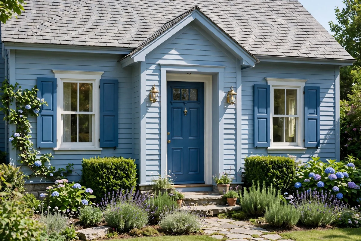
16. Rich Espresso Brown
Espresso brown is warmth with gravitas: deep, roasted and quietly luxurious against blue siding. It has the earthiness of natural wood with the polish of paint, making it perfect for homeowners who love timber but want a flawless, low-maintenance finish. Against navy it glows; against lighter blues it grounds. It is a color that feels both modern and timeless at once.
This color adores brass, which picks up its warm undertones beautifully. Keep the trim creamy white rather than brilliant white for a softer, more expensive pairing. Espresso in satin is forgiving of imperfections and weathers evenly. It is a color that suggests the people inside appreciate the finer, quieter things.
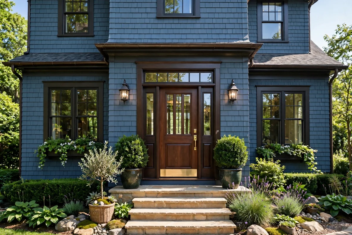
17. Blush Pink Charm
Blush pink on a pastel blue cottage is pure storybook charm. The soft, rosy tone against powder blue creates a confectionery pairing that feels joyful and romantic, perfect for country cottages and garden settings. It is a color that makes passers-by smile, and there is real value in that. Few combinations capture hearts quite so effortlessly.
Keep it sophisticated by choosing a muted, greyed blush rather than bubblegum, and pair it with white trim and climbing roses for the full cottage effect. Blush suits smaller houses best, where its sweetness feels intentional rather than overwhelming. It is not for everyone, but for the right house it is absolutely perfect.
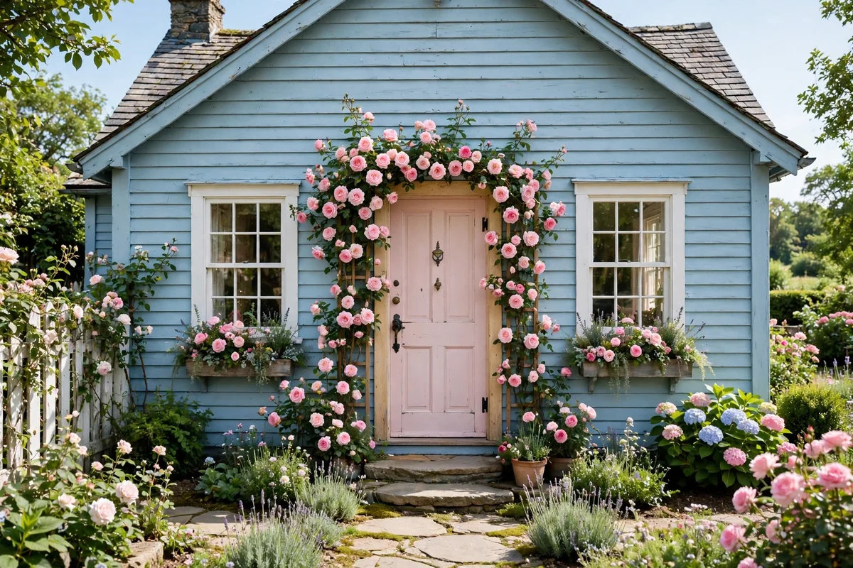
18. Deep Plum Drama
Deep plum is burgundy’s moodier sibling: dark, velvety and full of intrigue against a dark blue house. The violet undertones create a rich, layered facade that feels luxurious after dark, especially under the warm pool of porch lanterns. It is a color for houses with personality and owners with confidence.
Pair it with aged brass or copper hardware and keep the trim a soft, warm white to stop the scheme feeling cold. Plum looks magnificent in full gloss on a panelled door, though satin is more forgiving day to day. It is an unusual choice, which is exactly why it is memorable: the entrance guests describe to friends.
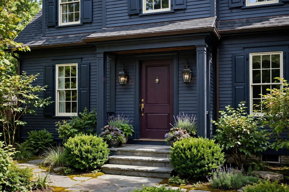
19. Bright Teal Energy
Bright teal is unapologetic joy: vivid, tropical and full of bounce against a bright blue house. This is the door for modern homes, beach houses and anyone who believes the facade should make people grin. The blue-green vibrancy harmonises with blue siding while adding a shot of pure energy. It is a color with its sleeves rolled up.
Because the color is loud, everything else should be calm: white trim, simple concrete or stone steps, minimal planting in green and white. A satin finish keeps it fresh rather than plasticky. Bright teal will fade in harsh sun, so face it wisely or embrace the repaint as a ritual. Choose quality paint and the color will stay vivid for years. It is the most fun you can have with a paintbrush.
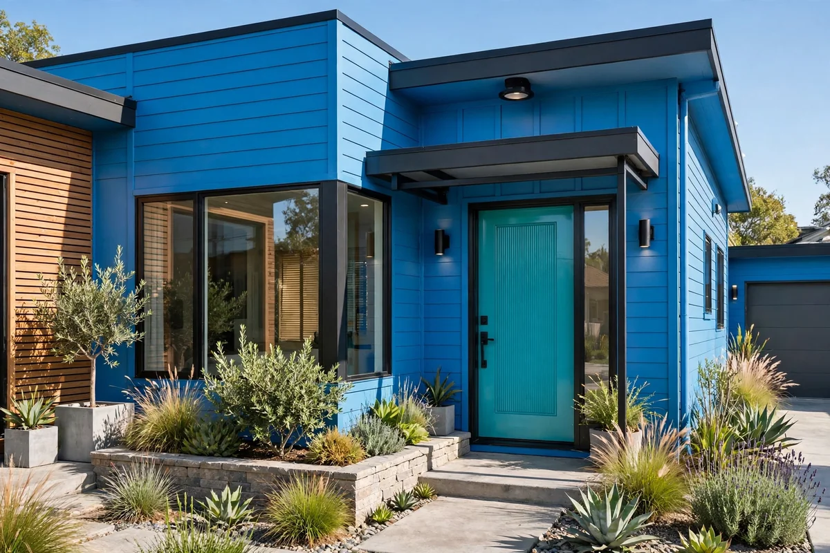
20. Warm Terracotta Glow
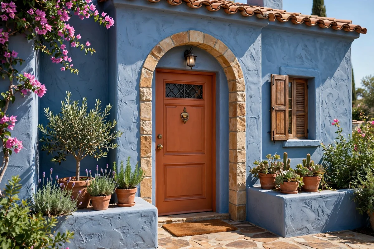
Terracotta brings sun-baked Mediterranean warmth to a blue facade, and the pairing feels like a holiday that never ends. The earthy orange-pink glows against both navy and mid-blue, especially in golden afternoon light, giving stucco and clapboard houses alike a relaxed, resort-like welcome. It is an inviting, soulful color that suits relaxed family homes beautifully.
This color loves natural textures: terracotta pots, woven mats, olive or citrus planting. Keep the trim a warm white and the hardware dark bronze for an authentic Mediterranean feel. Terracotta’s earthy pigment weathers gracefully, developing a soft patina rather than fading harshly. It is warmth you can see from the end of the street.
21. Slate Grey Understatement
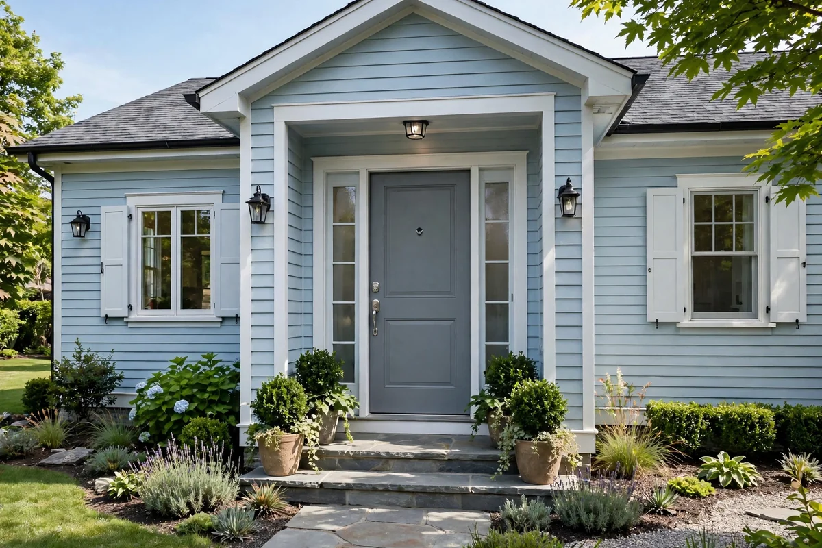
Slate grey is the quiet achiever: calm, architectural and effortlessly chic against light blue siding. It adds definition without drama, making it perfect for minimalist and Scandinavian-inspired facades where restraint is the whole point. The cool grey echoes the blue while adding a layer of sophisticated neutrality. It is elegance expressed in the softest possible voice.
Pair it with black or stainless hardware and keep the landscaping architectural: grasses, clipped box, pale gravel. Slate grey is practical too, hiding dust and weathering evenly. It will never be the loudest door on the street, but it might be the one architects photograph. Understated is not the same as uninteresting.
22. Glossy Racing Green
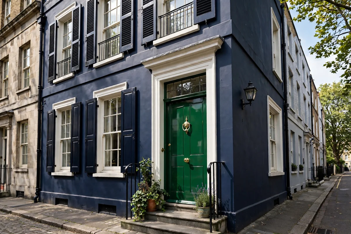
Racing green in full gloss is the aristocrat of door colors. Deep, polished and unmistakably British, it turns a navy townhouse entrance into something truly distinguished. The mirror-like finish reflects the street and sky, giving the facade a jewel-like depth that satin simply cannot match. It is heritage style at its most self-assured.
Commit to the look properly: meticulous preparation, a specialist exterior gloss, and polished brass furniture including a knocker, letterbox and numerals. Keep the surround immaculate, swept steps, polished fanlight, because gloss shows everything. It is high maintenance and utterly worth it: the entrance against which all others are judged. Maintain it well and it will reward you for decades.
The Door That Says Welcome Before You Do
A front door is a small surface with an outsized job, and on a blue house the right color makes the entire facade feel intentional. Whether you choose the confident contrast of burnt orange, the quiet heritage of racing green or the pure joy of coral, paint it well, dress it with care and keep it clean. Your entrance is the first and last thing guests see: make it unforgettable for all the right reasons.
Frequently Asked Questions
Should the front door be lighter or darker than a blue house?
Contrast is what makes an entrance memorable. A dark navy house usually sings with a lighter door, such as buttery yellow, coral or classic white, while a pale powder-blue cottage can carry a deep, grounding door like charcoal, racing green or burgundy. When the siding sits in the middle of the range, either direction works, so let the trim and roof tones tip the decision.
What is the most welcoming front door color?
Warm, sunny colors read as the most welcoming: buttery yellow, coral and warm terracotta all signal hospitality from the street. That said, a beautifully kept door in any color feels inviting when the entrance is clean, the hardware gleams and a pair of healthy planters flanks the step. Welcome is as much about care as it is about color.
How do I choose between a bold and a neutral door color?
Look at the street first. If neighboring houses are restrained, a bold door gives yours a confident identity without clashing. If the street is already colorful, a refined neutral like charcoal, espresso or off-white keeps your facade elegant. Also consider how long you will love it: neutrals are a safe decade-long choice, while bold colors are perfect if you enjoy repainting every few years.
What paint finish is best for a front door?
A satin or semi-gloss exterior paint is the sweet spot for most doors: it resists weather, wipes clean and gives a soft sheen that flatters the color. Full gloss looks stunning on panelled doors in dark colors like racing green or black, but it shows every imperfection, so the preparation must be meticulous. Always use paint rated for exterior woodwork or uPVC as appropriate.
How often should a front door be repainted?
A well-prepared exterior door typically holds its finish for five to eight years, though south-facing doors in strong sun may need attention sooner as UV fades bold colors fastest. Wash the door annually with mild soapy water, touch up chips promptly so moisture cannot creep under the paint, and recoat when the sheen dulls or the color chalks. A light sand and one fresh topcoat is often all a tired door needs.