Crafts
21 Canvas Painting Ideas That Bring Handcrafted Charm to Bare Walls
By Anna Wells · · 17 min read
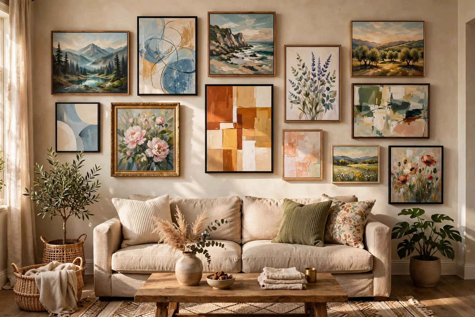
You do not need art school to fill a bare wall with paintings that look considered and calm: you need simple shapes, a restrained palette, and techniques that forgive a wobbly hand.
A blank canvas looks intimidating only until you learn the secret shared by almost every impressive beginner painting: the design is simple, and the effect comes from layers, colour and restraint. None of the twenty-one ideas below asks for realistic drawing. Each one builds a finished, hangable piece from basic shapes, a short list of colours and a technique you can practise on paper first.
Keep a few habits across all of them. Work from the background forward, let layers dry before judging them, and step back across the room every ten minutes, because paintings are read from a distance. Choose the idea that matches the wall you want to fill, note its palette and canvas size, and enjoy how quickly a bare room starts to feel handcrafted.
1. Layered Ridgelines in Fading Blue Haze
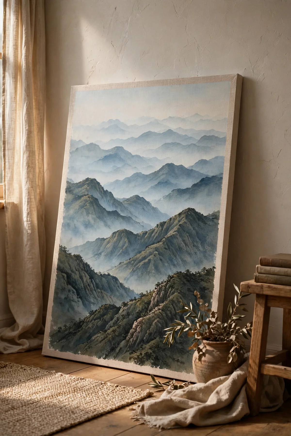
Depth without detail is the whole trick here. Sketch four or five uneven ridge lines across the canvas, then fill each band with a blue grey that grows darker as it comes forward: palest at the back, deepest at the front. The change in tone alone convinces the eye that miles of hazy distance separate the ridges.
Keep edges slightly ragged by using the side of a flat brush rather than a careful outline. While the paint is still damp, drag a whisper of white along the base of one middle ridge to fake drifting mist. Resist adding trees, houses or birds; the calm of this piece lives in its emptiness, and a matte varnish protects that quiet mood.
2. Knife-Spread Plaster Tones in Warm Neutrals
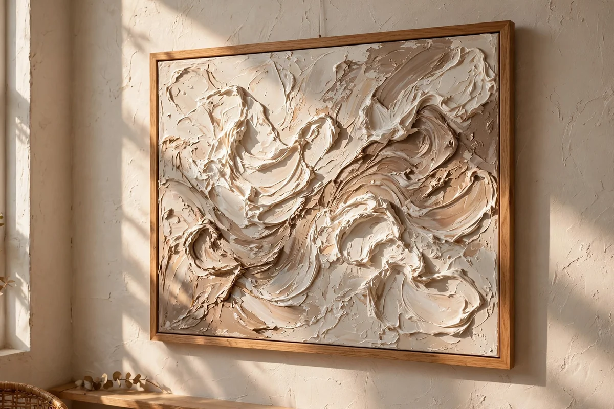
Neutral textured abstracts look like expensive gallery pieces yet need no drawing at all. Coat the canvas in warm white, then spread thick acrylic with a palette knife in slow arcs and overlapping blocks of cream, taupe and soft stone. Mixing a spoon of modelling paste into the paint gives ridges that catch the light beautifully.
Limit yourself to three closely related tones, because too many colours turn texture into noise. Leave a few areas smooth so the raised passages have contrast, and consider one thin dragged line of muted bronze or charcoal through the busiest area. Hung in a plain wood frame against a warm wall, the finished piece reads serene and quietly luxurious.
3. Dotted Wildflower Drifts Over a Soft Sky
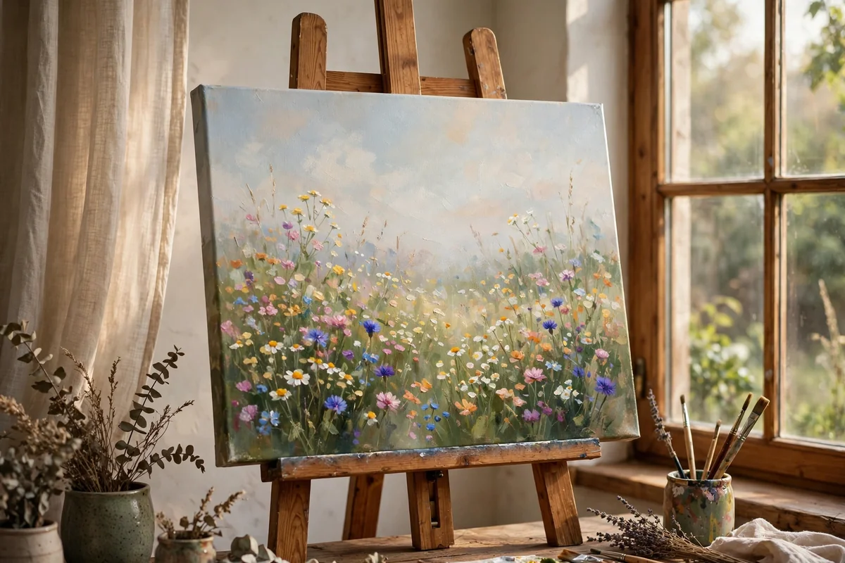
A wildflower meadow forgives everything, because real meadows are gloriously irregular. Brush a loose sky in pale blue or blush, add a soft green base, then dab flower clusters with the tip of a round brush, a cotton bud or even a fingertip. White, butter yellow, coral and dusty purple feel natural when the shades stay slightly muted.
Place bigger, clearer blooms low on the canvas and let them shrink and blur as they climb, which suggests distance. Thread a few thin stems and curved grass strokes through the dots to hold the drift together. Leave pockets of plain background so the eye can rest; a meadow painting should feel like a held breath, not a crowd.
4. A Single Olive Branch on Warm White
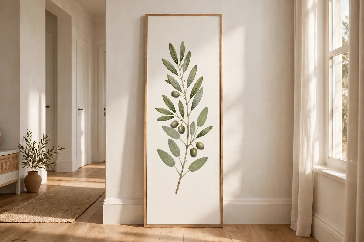
One graceful branch on a warm white ground is the easiest route to a calm, classic botanical. Lightly pencil the main stem curving up the canvas, then paint each leaf with a single loaded stroke of a round brush: press, lift, and let the brush tip form the point. Two greens, a deep olive and a muted sage, are all you need.
A tall narrow canvas, such as 30 by 90 centimetres, flatters the upward flow and suits hallways and the space beside a door. Overlap two or three stems at most, and let generous empty background do the elegancing. Small variations in leaf size and angle keep the branch alive rather than stamped.
5. Horizontal Sunset Bands Mirrored in Water
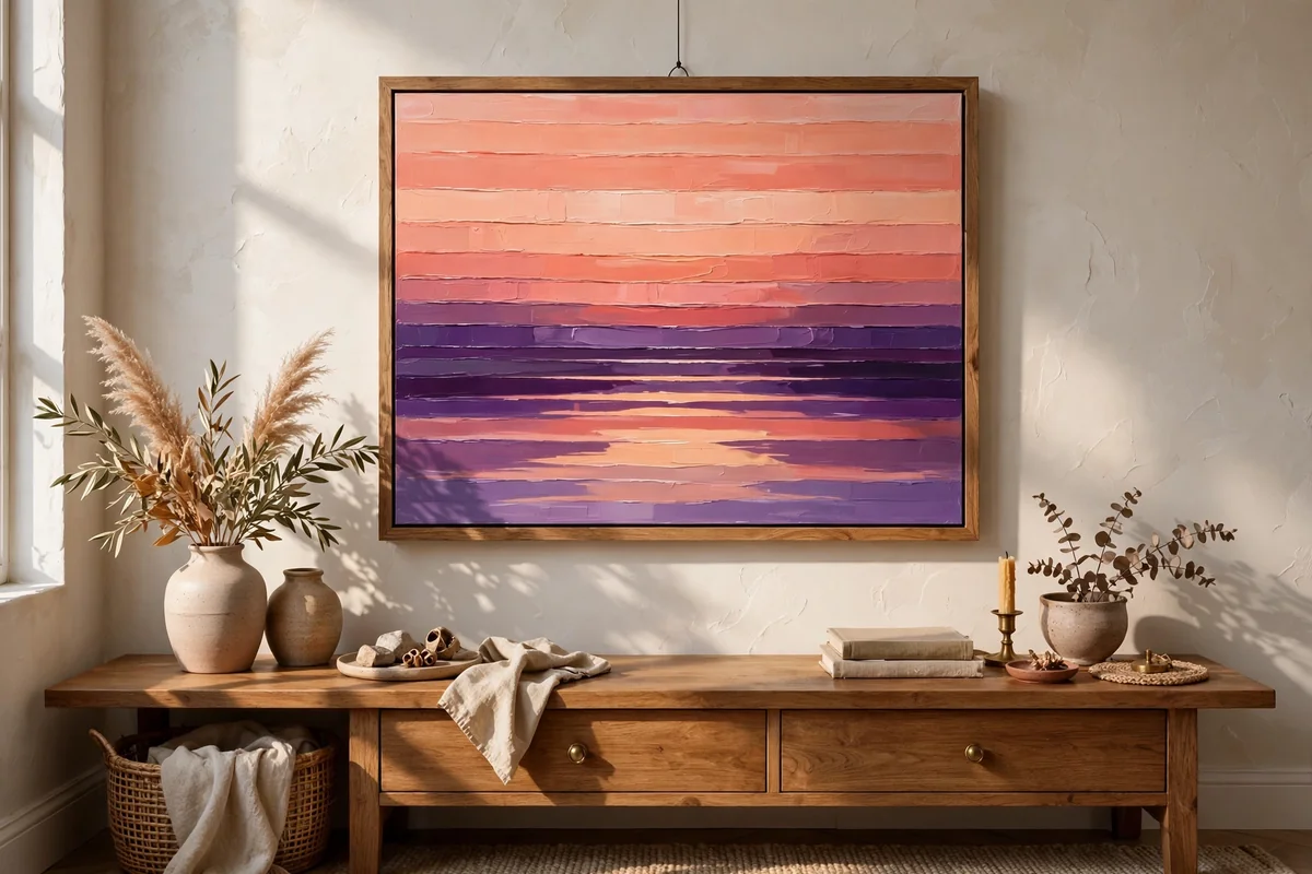
A sunset over water is pure band management. Paint the sky in horizontal stripes that melt from pale gold at the horizon through peach and coral into dusty violet at the top, keeping the paint damp so a wide flat brush can soften every join. Below the horizon, repeat the same colours in reverse order for the reflection.
Once the bands dry, flick in short horizontal strokes of light and dark to suggest ripples, concentrating them under the brightest part of the sky. A simple dark silhouette, a strip of distant land or one small boat, gives the eye a resting place. Keep silhouettes crisp and plain; the glowing gradient does all the dramatic work.
6. Taped Arches and Circles in Earthy Blocks
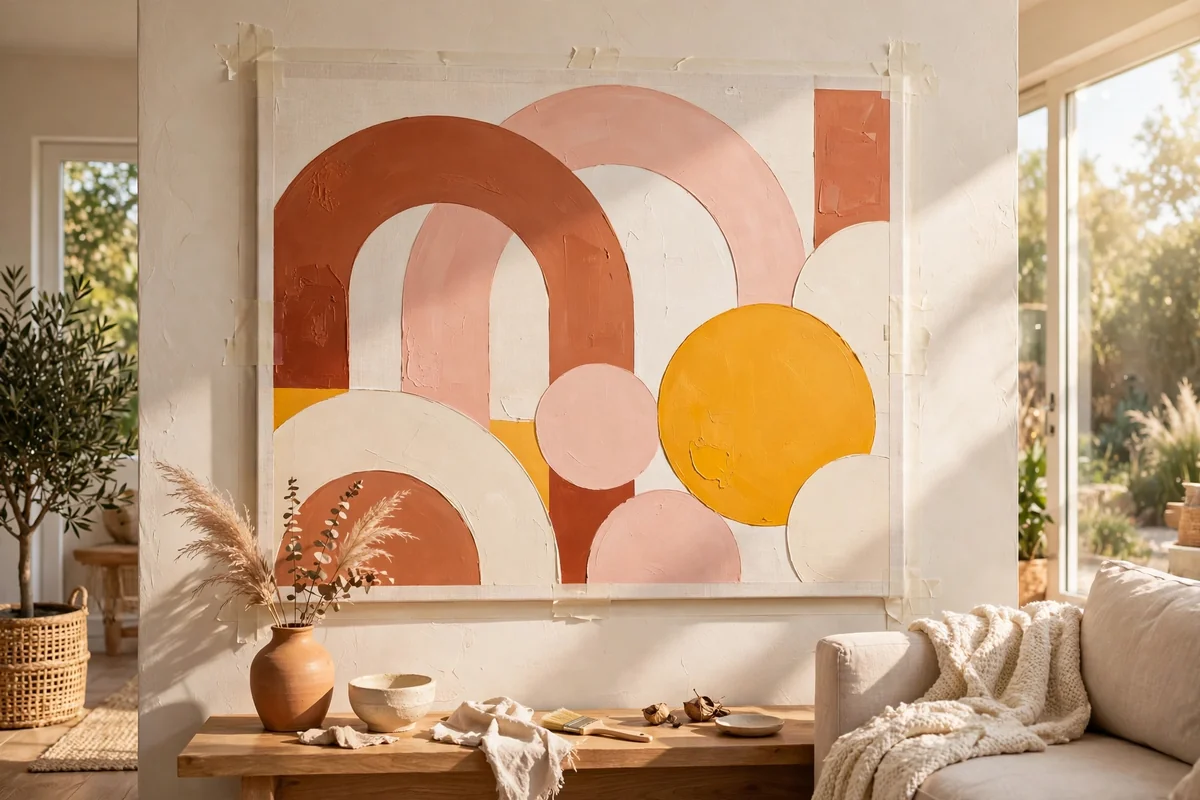
Colour blocking delivers bold modern art with zero freehand risk. Plan large overlapping arches, circles and rectangles, trace curves around plates and bowls, and mask straight edges with painter’s tape. Terracotta, blush, ochre, cream and olive make a warm, grounded palette that suits most living rooms and never dates quickly.
Balance one dark shape against lighter ones and avoid giving every shape the same size, because variety creates the rhythm. Two thin coats beat one thick coat for flat, saturated colour. Peel the tape while the final coat is just tacky for the crispest edges, then stand back and enjoy how professional simple geometry can look.
7. A Row of Moons From Crescent to Full
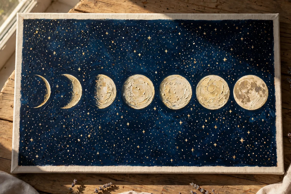
A moon phase row is calm, graphic and almost entirely tracing. Paint the ground deep navy, charcoal or dusty plum and let it dry fully. Mark a straight guideline, trace five or seven equal circles with a jar lid, and paint each moon in cream, silver or pale gold, revealing a little more of the circle each time from crescent to full and back.
Measure the spacing twice: even gaps are what make this design look polished rather than homemade. A dry sponge dabbed inside the full moon adds gentle crater texture, and a few tiny, sparse stars keep the night feeling spacious. This piece works beautifully above a bed or reading chair, anywhere a quiet rhythm is welcome.
8. Dragged Palette-Knife Surf and Foam
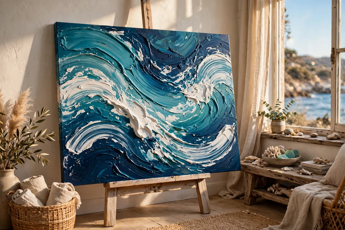
Abstract surf is built from movement rather than accuracy. Lay a base of pale aqua or sandy beige, then drag broad curved strokes of turquoise, sea green and deep navy across it with a palette knife or a strip of stiff card. Broken, scraped edges are a gift here, because they read instantly as churned water and spray.
Let some layers dry before adding the next so colours stay distinct instead of muddying. Save pure white for last and use it sparingly along wave crests and in a few thin foam streaks. A whisper of sand colour at the lower edge hints at a shoreline. The result hums with energy while asking almost nothing of your drawing skills.
9. One Terracotta Arch Framing a Leafy Stem
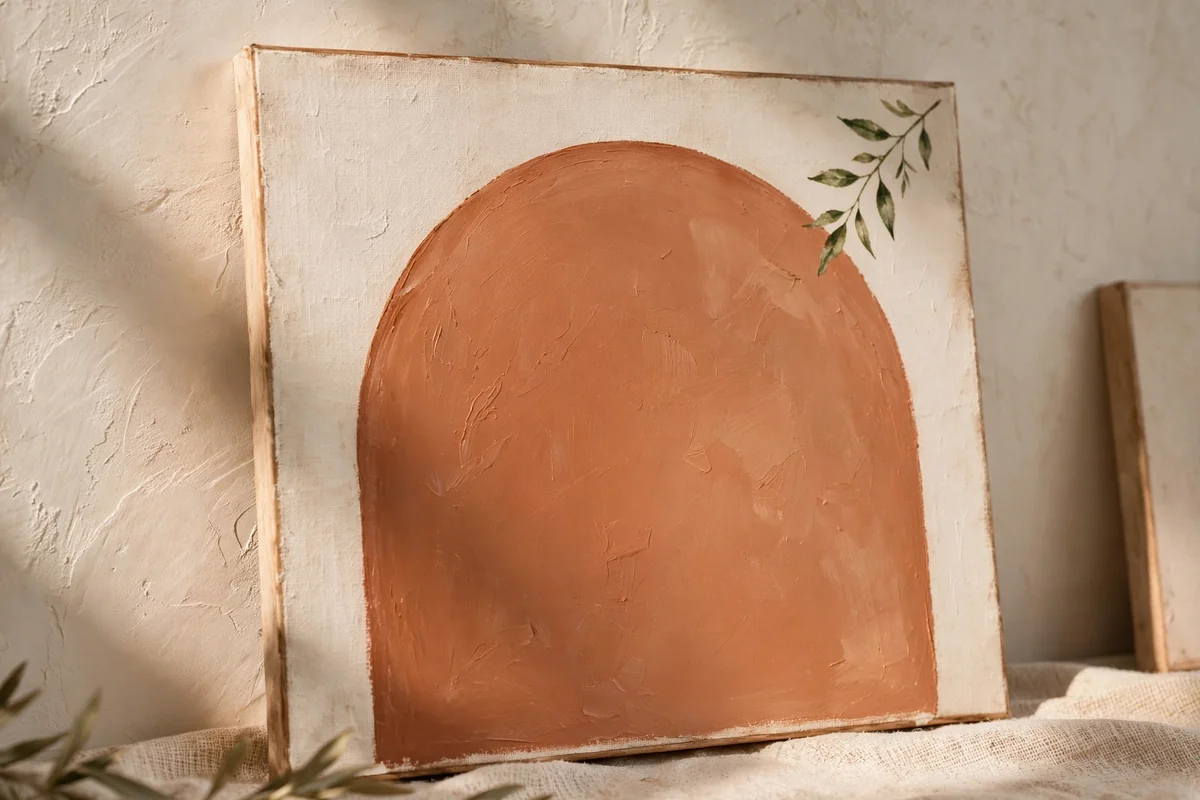
An arch gives any canvas instant architecture. Trace the curve with a plate, tape the straight sides, and fill the shape with terracotta, deep green or dusty blue. When it dries, paint one slender stem with teardrop leaves drifting across a single corner, using a lighter tint of the arch colour so the whole piece stays in one family.
Leave most of the arch empty; the restraint is what makes it feel modern rather than fussy. This design loves company, so paint a second canvas with the arch mirrored or in the softer tint and hang them as a pair. Small canvases around 30 by 40 centimetres suit this idea best, grouped at eye level.
10. Pale Birch Trunks Against Misty Sage
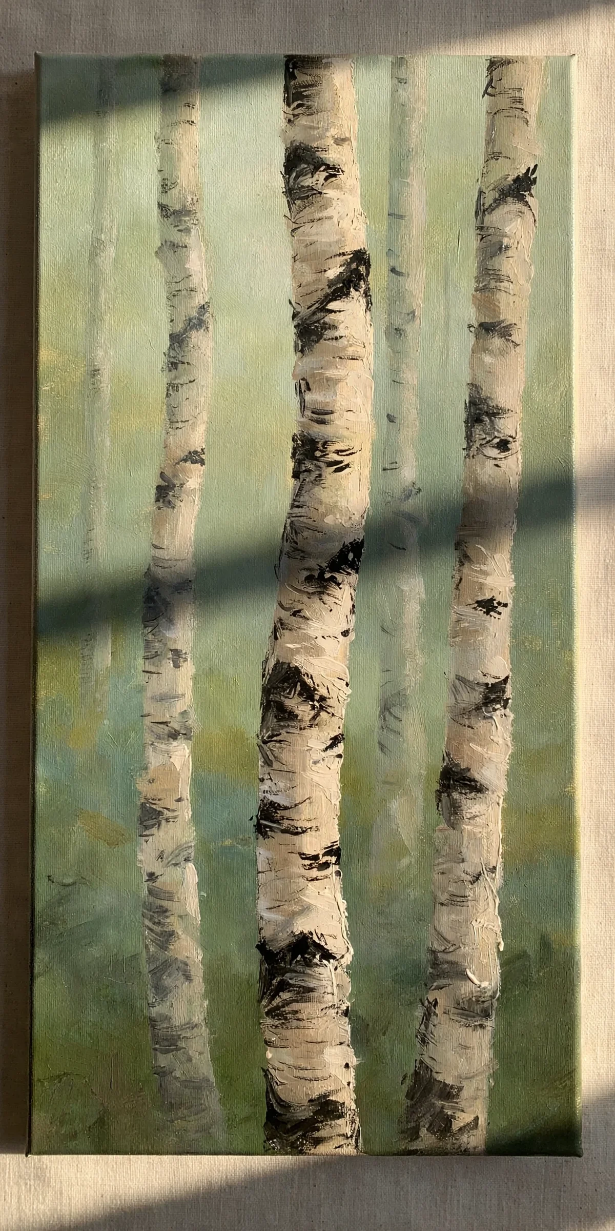
Birch trunks are a gift to beginners: tall, pale and proudly imperfect. Start with a washed background of sage, grey blue or misty lavender. When dry, pull vertical strokes of white and cream in varied widths, letting some trunks run off the top or sides so the grove feels like a glimpse rather than a lineup.
Add bark character with short, uneven charcoal or brown dashes dragged across the trunks with a nearly dry brush, keeping them random and sparse. A few thread thin branches are plenty. For a seasonal turn, dot in small golden leaves for autumn or leave the grove bare and wintry. The strong vertical rhythm makes the finished canvas feel elegant and calm.
11. Loose Dabbed Bouquet in a Simple Jug
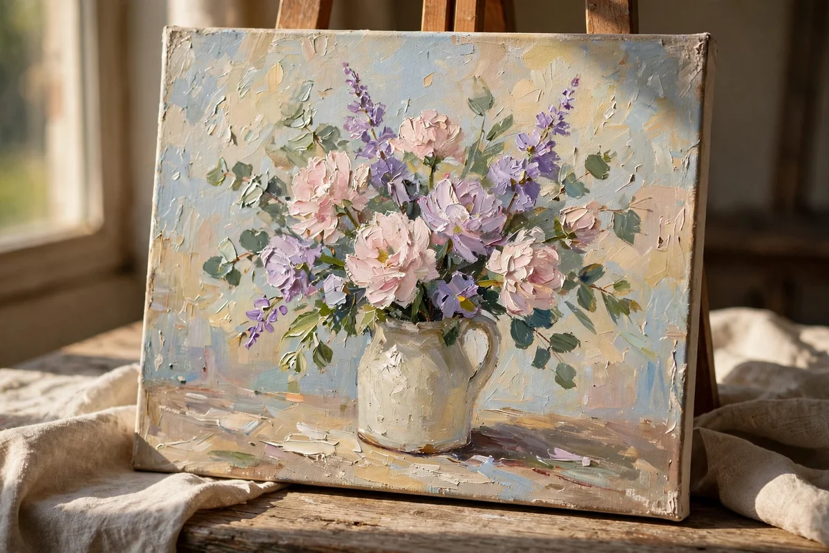
A painterly bouquet looks intricate but is really just organised dabbing. Sketch a plain jug low in the centre and block it in with one colour. Then build the arrangement from dark to light: deep green shadow shapes first, then clusters of medium dabs for blossoms, then the palest highlights on top where light would land.
Roses, hydrangeas and daisies all surrender to the same treatment of layered round marks, so never outline a single petal. Let specks of background peek through the bouquet to keep it airy, and ground the jug with a soft shadow and one faint tabletop line. Step back often; from two metres away the eye assembles flowers you never actually painted.
12. One Flowing Line Drawing of a Leafy Plant
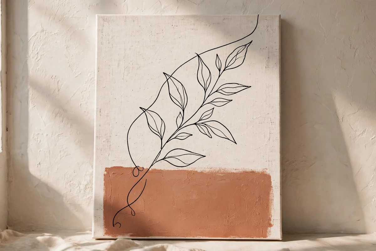
A single unbroken line has a quiet confidence that suits modern, uncluttered rooms. Paint the canvas warm white, add one muted colour block behind where the drawing will sit, perhaps terracotta, dusty pink or olive, and let everything dry. Then draw a leafy plant in one flowing pencil line before tracing it with a fine brush or an acrylic paint marker.
Practise the line on paper until your hand stops hesitating; small wobbles are fine and honestly charming, but fearful scratchy strokes are not. Keep the design free of fussy inner detail. The strong black outline against soft colour does all the work, and the piece pairs beautifully with the arch painting as a gallery companion.
13. Splattered Star Field Above a Pine Silhouette
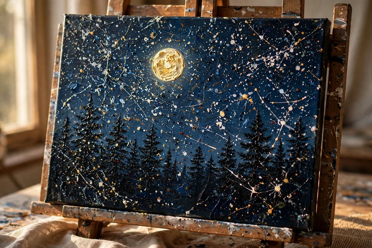
Blend the sky from deep navy at the top into violet and softer blue near the horizon, softening joins with a clean wide brush while the paint stays damp. When dry, load a stiff toothbrush with thinned white paint and flick a scattered star field across the sky, concentrating stars in one sweeping band for a natural galaxy feel.
Finish with a simple black silhouette along the bottom: a pine ridge, gentle hills or quiet rooftops. Keep the silhouette absolutely plain, with perhaps one larger moon as the single focal glow. Because the sky carries the detail and the land is only a shape, the painting looks intricate while remaining one of the easiest in this collection.
14. Radiating Sun Rays in Retro Ochres
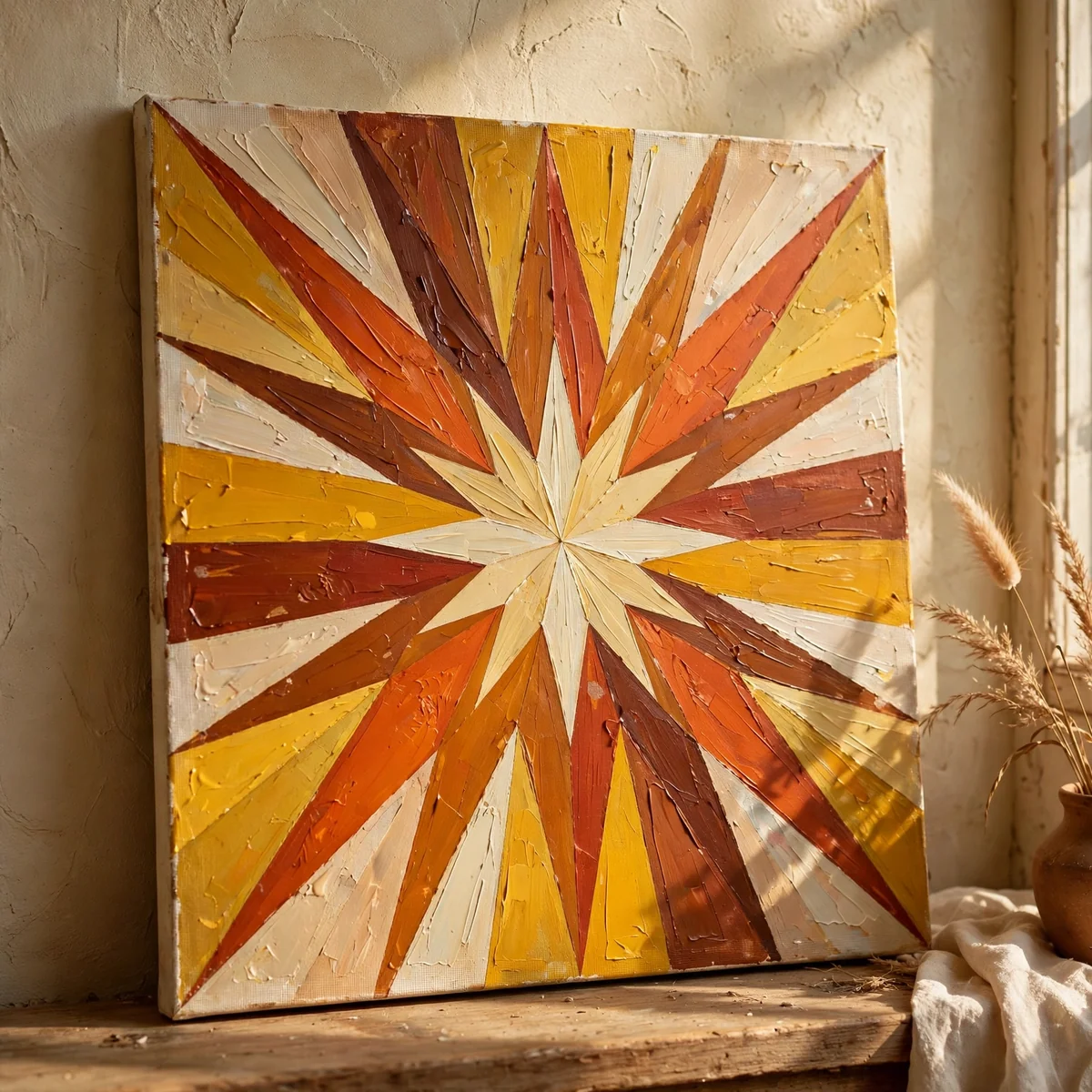
A geometric sunburst brings cheerful energy and suits a square canvas perfectly. Mark a centre point low or central, rule lines radiating to the edges, and tape alternate sections. Paint the rays in a warm retro palette of mustard, rust, cream and burnt orange, or cool it down with teals and greens for a different room.
Alternate two or three colours in a planned rhythm rather than colouring randomly, and give the centre a clean half circle sun. Two coats per ray keep the colours opaque and even. Peel tape while the paint is tacky for razor edges. This is a joyful piece for a hallway, study or child’s room wall that needs waking up.
15. Lavender Rows Receding to a Pale Horizon
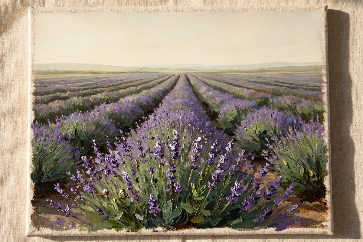
Lavender fields are perspective practice disguised as a pretty picture. Wash in a pale cream or blush sky, then paint converging rows of green strokes running from the bottom corners toward one vanishing point. Dab the rows with purple in three strengths: deep near the front, softer in the middle distance, and barely there lilac where the field meets the sky.
Keep the front flower heads large and textured with the corner of a flat brush, and let them simplify into stripes as they recede. A thin pale horizon line and an empty sky keep the composition serene. This painting brings a gentle countryside calm to bedrooms and bathrooms, and its limited palette makes colour mixing blissfully simple.
16. Rain-Streaked Windowpane With Blurred Lights
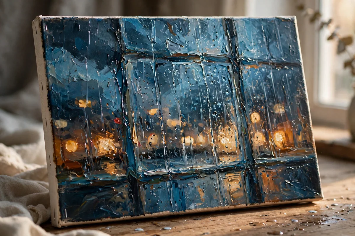
Rainy window paintings are wonderfully forgiving because blur is the point. Paint a loose background of evening blues with soft, out of focus circles of amber, cream and rose for distant lights, using a dry brush and almost no detail. Let it dry, then glaze the whole canvas with a thin, slightly milky wash to push everything further away.
Finally, drag vertical streaks downward with a damp flat brush and dot in a few bright droplet highlights with the tip of a round brush. Darken the edges a touch so the centre glows like a lit street. The mood is cosy and nostalgic, and any accidental smudge simply becomes more weather.
17. Dune Curves and a Low Desert Sun
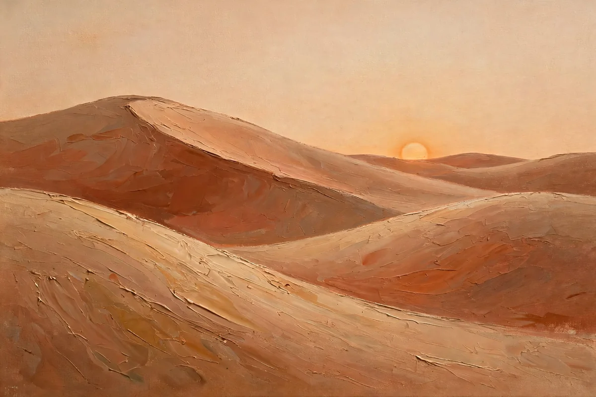
Desert dunes reduce landscape to its calmest elements: three or four sweeping curves and one round sun. Block the sky in warm cream, set a low sun in soft apricot, then layer dune shapes in sand, caramel and terracotta, each one darker and warmer as it rolls toward the viewer. Long, confident brushstrokes keep the curves smooth.
Add the thinnest shadow line along each dune crest to sharpen the sense of late light, and stop there. No cacti, no detail: the serenity is the subject. This palette warms neutral rooms beautifully and pairs with natural wood, linen and clay accessories. A wide horizontal canvas above a sideboard suits the composition best.
18. Swirled Marble Veins With a Touch of Gold
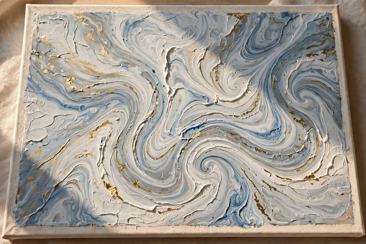
Marble effects look luxurious and happen almost by accident. Tilt and pour thinned white, soft grey and a little dusty blue acrylic across the canvas, letting the colours drift into each other, then drag one fine vein of darker grey through the flow with a cocktail stick or the edge of a card. Less swirling gives a more convincing stone.
When the pour is fully dry, which can take a full day, touch one or two veins with metallic gold paint on a fine brush, following the natural lines rather than inventing new ones. Seal with a satin varnish to mimic polished stone. Each attempt is unrepeatable, which makes this a satisfying gift painting as well as wall art.
19. Folk-Style Garden Birds and Blooms
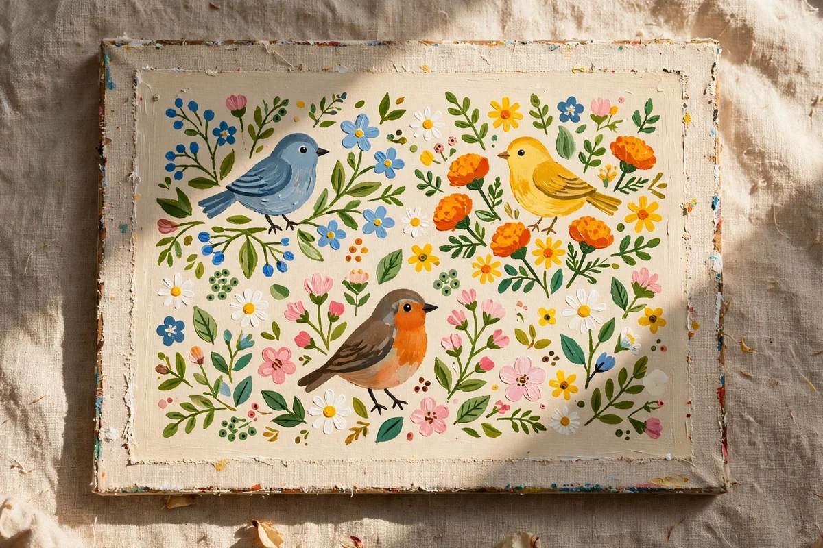
Folk art trades realism for charm: flat shapes, honest outlines and cheerful colour. Sketch simple round bodied birds on curving stems, round blooms and heart shaped leaves, then fill each shape with one flat colour from a friendly palette of brick red, mustard, sage, cream and dusty blue. A fine darker outline around each shape gives the classic storybook finish.
Repeat a small motif, such as a dot trio or a tiny sprig, across the background to create rhythm, and keep the ground a plain warm cream so the colours sing. Folk pieces welcome visible brushwork, so do not chase perfection. Hang this style in kitchens, hallways and craft rooms where its handcrafted warmth feels most at home.
20. Gold Leaf Accents Over Deep Green Layers
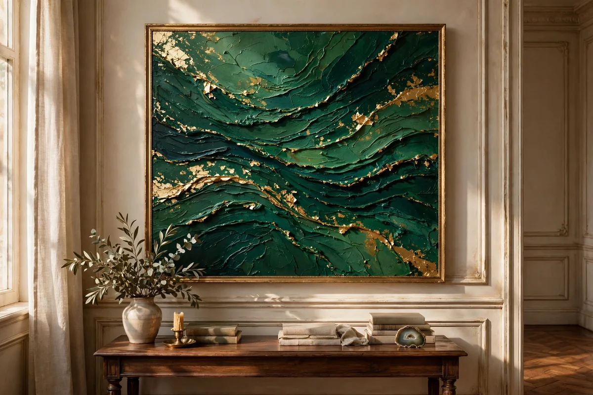
Deep green layered with gold leaf feels rich, classic and quietly dramatic. Build the ground with overlapping washes and strokes of forest, emerald and almost black green, letting the layers show through each other for depth. While the final layer stays slightly tacky in chosen spots, or over a thin line of gilding glue, press on small pieces of gold leaf.
Brush away loose flakes with a soft dry brush once set, and leave the gold broken and uneven rather than solid; restraint keeps it elegant. Seal gently with spray varnish so the leaf does not dull. This painting glows in lamplight and anchors a classic room, especially above a fireplace or a dark wood sideboard.
21. Two-Tone Horizon With One Lone Tree
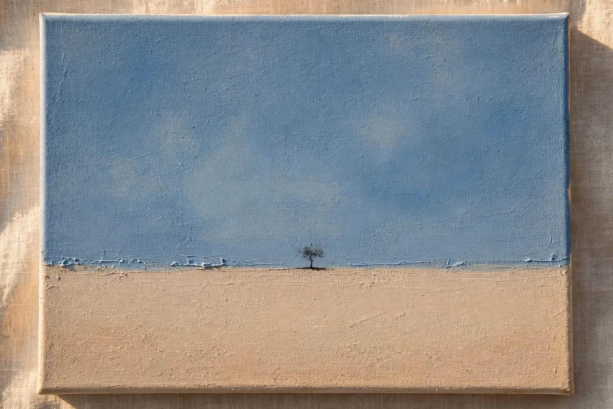
End with the simplest composition of all: two calm fields of colour and one small tree. Paint the lower third in warm sand or sage and the upper two thirds in dusty blue or soft stone, with a clean, level horizon between them. Blend the join ever so slightly so the line feels like distance rather than a stripe.
Place one small tree off centre, around a third of the way across, with a simple trunk and a loose dabbed canopy. Its smallness against the empty land and sky is exactly what creates the serene, thoughtful mood. This piece rewards good colour choices above everything, so mix your two tones from the room it will hang in.
A Few Final Thoughts
Every painting in this collection was chosen to be finishable in an afternoon and worth hanging the same evening. The pattern behind all of them is the same: simple shapes, few colours, patient layers and the confidence to leave space empty. Start with the design that matches your emptiest wall, buy one good canvas and a small set of heavy body acrylics, and let the first finished piece teach your hands what no tutorial can. Handcrafted charm is not a talent; it is a habit.
Frequently Asked Questions
What paint should a beginner use on canvas?
Heavy body acrylic is the most forgiving starting point. It covers in one or two coats, dries within the hour, thins with water for washes and spreads with a knife for texture, so one small set of tubes covers every idea in this article. Add white in a larger tube than the colours, because you will mix with it constantly and it disappears fastest.
How do I stop a painting looking amateur?
Three habits make the biggest difference. First, limit the palette to three or four related colours so nothing clashes. Second, repeat one colour in at least two places to tie the composition together. Third, leave breathing space: crowded canvases look anxious, while confident empty areas make simple shapes feel deliberate and calm.
What size canvas suits a living room wall?
A reliable rule is artwork spanning about two thirds of the width of the furniture beneath it. Over a standard sofa that means one canvas around 90 to 120 centimetres wide, or a balanced pair of 40 by 50 centimetre pieces with a small gap. For hallways and beside doors, tall narrow canvases such as 30 by 90 centimetres feel elegant.
Do I need to prime a shop bought canvas?
Most shop canvases arrive pre-primed and can be painted straight away. Even so, one extra thin coat of gesso, lightly sanded once dry, noticeably improves blending for skies, water and skin-soft gradients, and it makes colours sit richer. It takes ten minutes and is the cheapest quality upgrade in the whole process.
How should I finish and hang my painting?
Let the painting cure for several days before adding a matte or satin varnish, which evens the sheen and protects the surface from dust and sunlight. Sign the back rather than the front for a cleaner look. Hang the piece so its centre sits near eye level, roughly 145 centimetres from the floor, and use two hooks so it stays level.