Living Room
22 Brown and Blue Living Room Ideas That Feel Warm and Balanced
By Anna Wells · · 11 min read
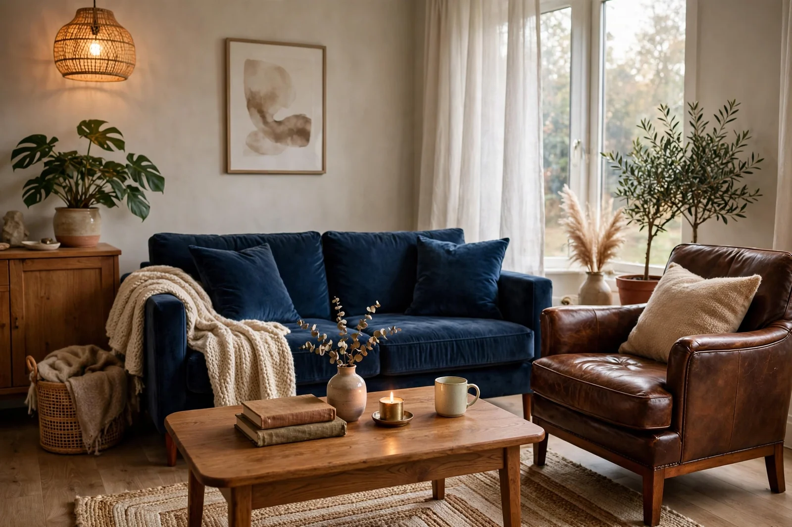
Brown brings warmth and grounding while blue brings calm and contrast, which makes this one of the most livable color combinations for a living room. It works in every style and never feels dated when the tones are intentional. These 22 brown and blue living room ideas show how to pair navy sofas with warm wood, blue walls with leather couches, and rich browns with soft blues, so your living room feels balanced, layered and genuinely comfortable.
Brown and blue might be the hardest-working color combination in decorating. Brown, in wood, leather and woven fibers, brings the warmth that makes a room feel like home. Blue, from deep navy to soft powder, brings the calm that keeps it feeling fresh. Together they handle real life beautifully: brown hides wear, blue adds personality, and neither ever looks dated. These 22 ideas show the combination across furniture, walls, textiles and accents so you can build it around what you already own.
1. A Navy Sofa With Warm Wood
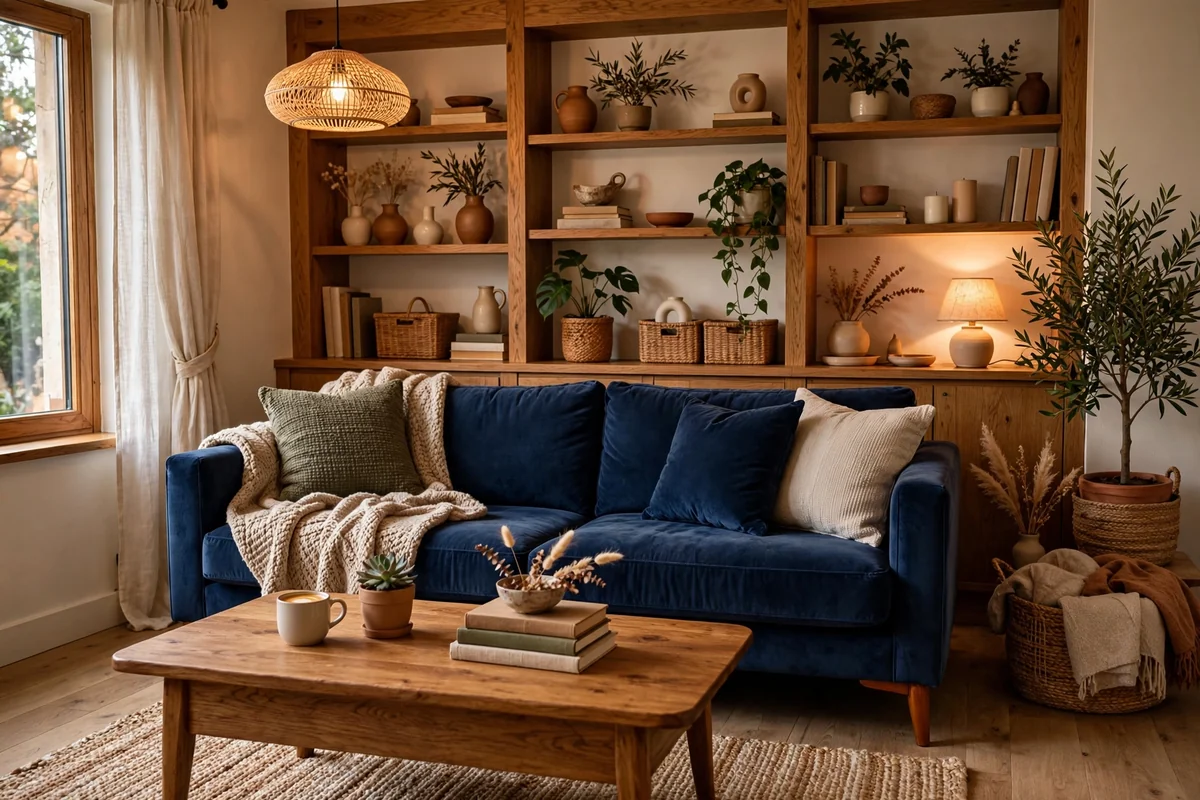
A navy sofa paired with warm brown wood is the simplest way to nail this palette. The deep blue anchors the room while wood tones, in the coffee table, shelves and flooring, add the warmth that keeps navy from feeling cold. Keep the supporting pieces simple: cream pillows, a natural rug and soft lighting let the two main colors shine. Medium wood tones like oak and walnut work best; very dark woods can make the combination heavy.
Choose a navy sofa in performance fabric or a washable slipcover for family life. Style it with a mix of cream, camel and one patterned pillow that blends blue and brown. Echo the navy at least twice more in the room, through curtains, artwork or a throw, so the color feels intentional. The most common mistake is adding too many competing colors; with navy and wood doing the work, restraint everywhere else keeps the room elegant.
2. Blue Walls With a Brown Leather Couch
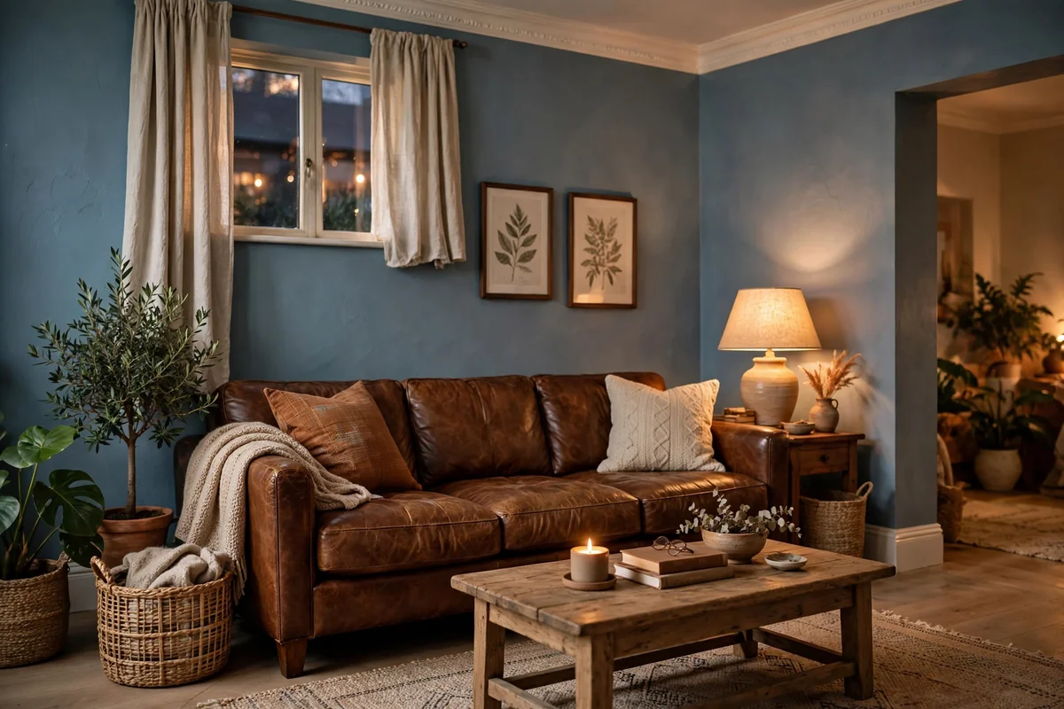
If you already own a brown leather couch, blue walls are the fastest upgrade you can make. Soft dusty blue keeps the room light and relaxed, while deep navy or slate creates a cozy, den-like feel that makes leather glow. Either way, the couch suddenly looks deliberate instead of merely inherited. Test large paint swatches and view them morning and evening, since blue undertones shift dramatically in different light.
Balance blue walls with warm whites on the ceiling and trim, plus plenty of warm lamplight. Leather needs no help looking rich, so keep surrounding textiles simple: cream throws, a natural rug, wood side tables. One caution: in rooms with little natural light, dark blue walls plus a dark leather couch can feel cave-like, so add mirrors and keep at least two warm light sources. In well-lit rooms, this combination is pure comfort.
3. Cognac Leather and Slate Blue
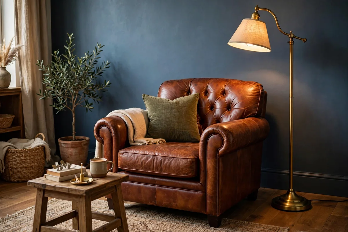
Cognac leather with slate blue is a rich, sophisticated pairing with vintage soul. The warm, honeyed leather glows against the cool, grayed blue, and both materials improve with age: leather gains patina, and the muted blue never shouts. Use it in a reading corner, a home office nook, or as the accent pairing in a larger living room. A cognac armchair, a slate blue wall or curtains, and a brass floor lamp make a timeless trio.
You do not need much of either to get the effect. One leather chair and one blue textile moment can carry a whole corner. Keep surrounding woods medium-toned so they bridge the warm leather and cool blue. Avoid pairing cognac with bright primary blues, which cheapen the leather’s richness. This combination loves books, art and collected objects, so let the room feel personal rather than decorated. It is a palette that looks better every year.
4. Chocolate Brown With Sky Blue
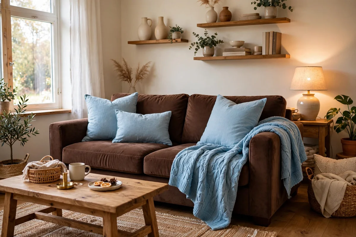
Chocolate brown with sky blue is the lighthearted side of this palette. Deep, warm browns in furniture and wood ground the room while airy sky blue in pillows, throws and art keeps it feeling fresh and open. This works beautifully in family rooms where you want richness without darkness. Use chocolate in larger pieces, the sofa or wood tables, and sky blue in easy-to-change textiles.
The contrast between dark brown and pale blue needs a middle tone to bridge it: camel, tan or warm beige textiles keep the jump from feeling abrupt. Natural light flatters this combination enormously, so keep windows dressed lightly. Chocolate brown is forgiving with stains and wear, making it practical for busy homes. Avoid muddy intermediate tones that blur the contrast; the beauty here is the clear dialogue between deep warmth and airy cool.
5. Wood Beams and Blue Textiles

Exposed wood beams with blue textiles bring rustic architecture into the palette. The beams provide the brown in its most structural form, so the blue can stay soft: dusty blue pillows, a washed indigo throw, pale blue curtains. This works in farmhouses, cabins and any room with natural wood elements. Keep the blue muted and textural rather than bold, so it feels like a natural complement to the wood.
Let the wood be the star and use blue as the supporting color, roughly a 70-30 split. Too much blue fights the beams for attention. Woven textures, linen, wool and cotton, suit the rustic mood better than sleek fabrics. Warm lighting enhances both materials: wood glows and blue softens under 2700K bulbs. If your room lacks real beams, a wood-clad accent wall or chunky wood mantel gives the same grounding effect on a smaller scale.
6. Denim Blue and Walnut
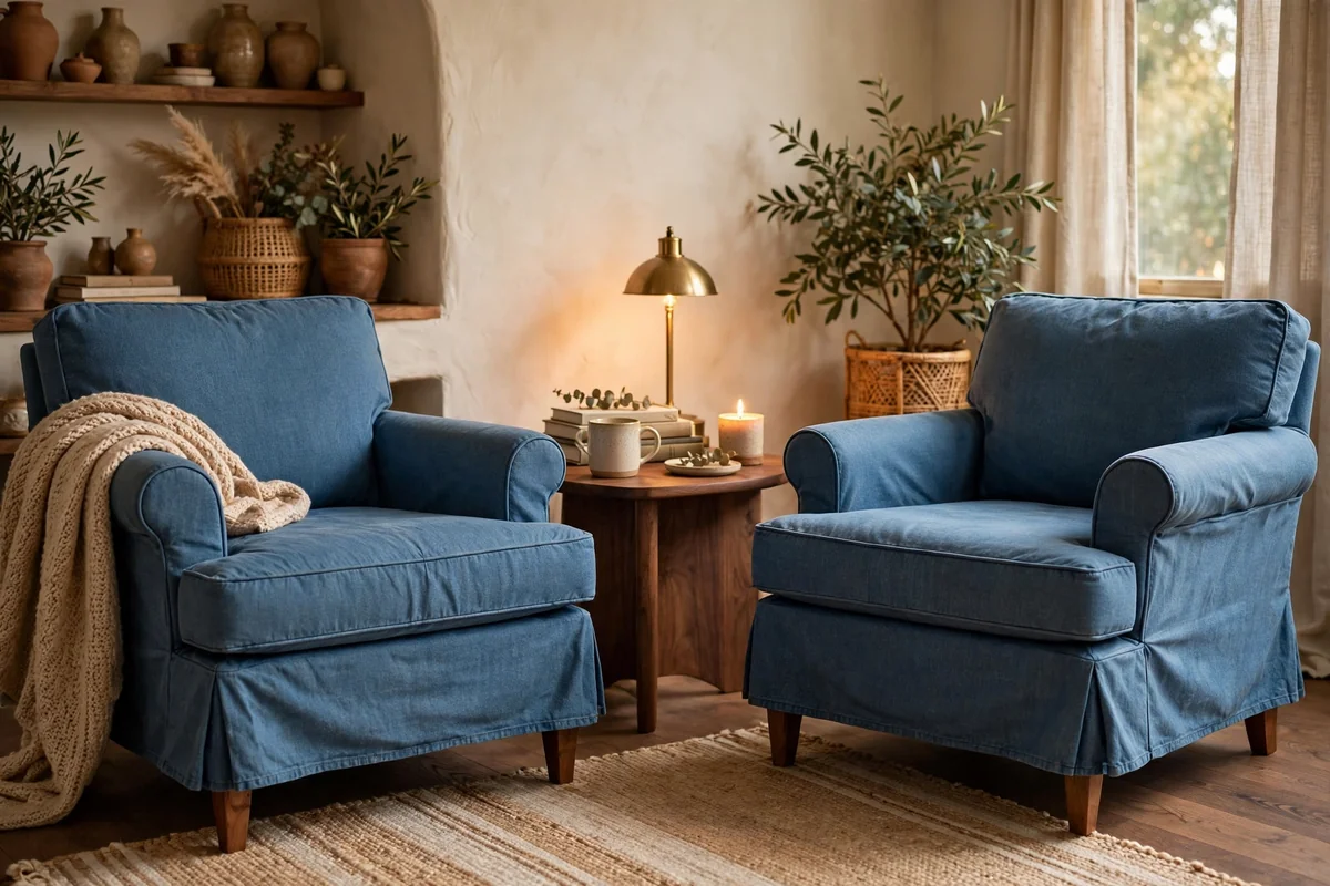
Denim blue with walnut is casual, comfortable and quietly stylish. The faded, lived-in quality of denim blue, in a slipcovered sofa or well-worn armchairs, pairs naturally with walnut’s rich grain. This combination feels like your favorite jeans with a good leather belt: effortless and personal. It suits relaxed modern, Scandinavian and eclectic rooms where comfort outranks formality.
Walnut’s deep tone needs the denim blue to stay soft and washed rather than dark navy, or the room can feel heavy. Balance with light textiles: cream throws, a natural rug, pale wood accents. Denim-look fabrics in performance weaves handle family life well and age gracefully. Keep the styling unfussy: a few good pillows, a simple throw, honest materials. This is a palette that invites people to actually sit down, which is the whole point.
7. A Blue Rug on Brown Floors
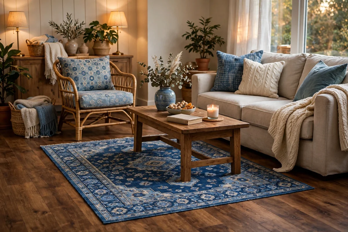
Brown wood floors with a blue rug is a foundation-level win. The rug defines the seating area, protects the floors and introduces blue in the largest possible dose after walls. Vintage-style rugs with faded indigo patterns are forgiving with wear and add character; modern geometrics in navy and cream feel crisper. Size generously: 8 by 10 feet for a standard seating group, with front furniture legs on the rug.
Patterned blue rugs hide crumbs and pet hair better than solid ones, a real advantage in family rooms. If the rug is bold, keep surrounding textiles calm so they do not compete. Layer a smaller natural-fiber rug under the coffee table for extra texture if you like. When shopping, check the rug’s blue in your room’s light; showroom lighting lies, and a rug that looked navy in the store may read teal at home. Brown floors warm up even the coolest blues.
8. A Brown Sectional With Blue Pillows
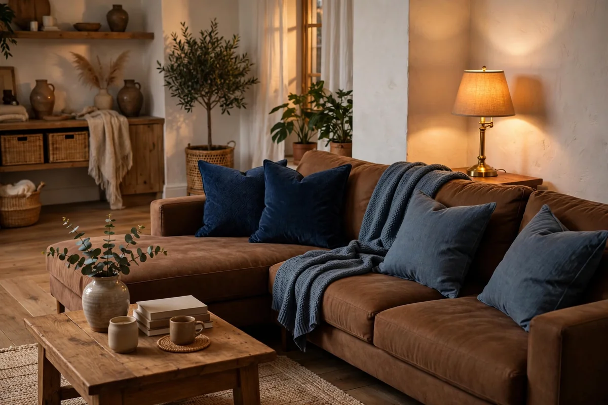
A brown sectional is a big, comfortable commitment, and blue pillows are the easiest way to give it personality. Chocolate or camel sectionals provide a warm, enveloping base; navy, slate and dusty blue pillows in varied textures add the contrast that keeps brown from feeling monotone. Mix sizes and include one patterned pillow blending both colors so the combination looks deliberate.
Because sectionals are large, repeat the blue at least twice more in the room: a throw, curtains, artwork or a rug with blue tones. Otherwise the pillows look isolated. Choose pillow covers with zippers for easy washing, since large sectionals get heavy use. This is also the simplest seasonal update: swap blue pillow tones from deep winter navy to lighter summer chambray while the brown sectional stays constant. Keep walkways 30 to 36 inches around the sectional so the room flows.
9. Teal With Dark Wood
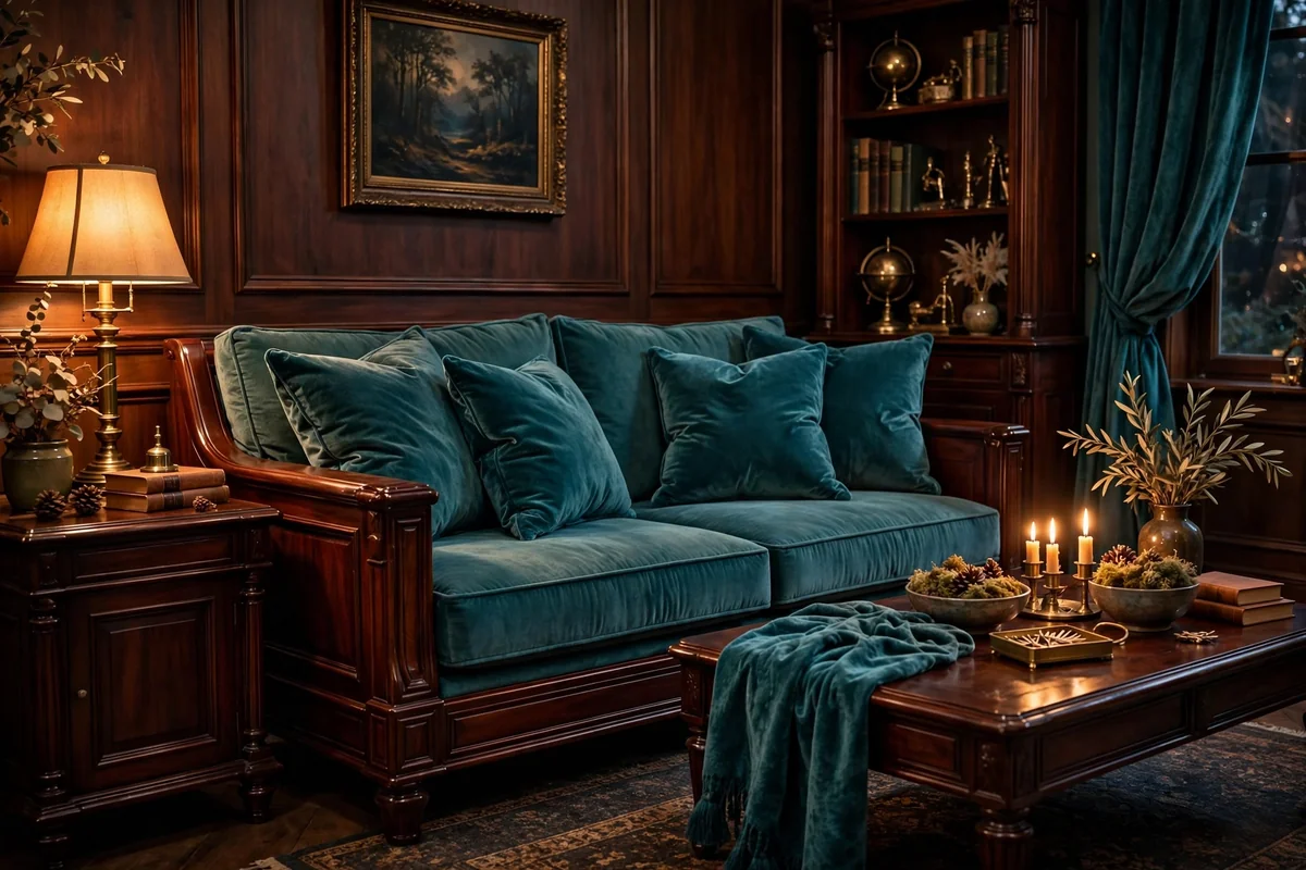
Teal with dark wood is the moody, jewel-toned side of brown and blue. The blue-green depth of teal glows against mahogany, espresso and dark walnut, creating a rich, library-like atmosphere. Use teal in velvet pillows, a statement armchair or curtains, and let the dark wood provide architecture through floors, tables and shelving. This pairing suits traditional, eclectic and dramatic modern rooms.
Dark on dark needs light to breathe: cream walls or curtains, warm lamps and a light rug keep the room inviting. Teal’s green undertone harmonizes with wood’s warmth in a way pure blue sometimes does not. Keep the teal saturated enough to read as a true color; washed-out teal against dark wood can look murky. This is a confident palette, so commit with generous doses rather than timid accents; a single teal pillow gets lost against dark wood.
10. Powder Blue With Light Oak
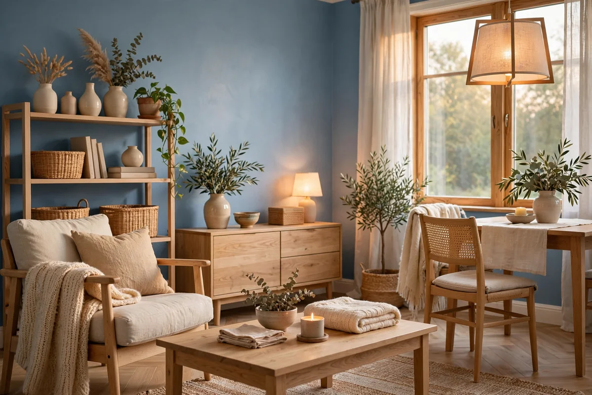
Powder blue with light oak is the airiest version of this palette. Pale blue walls or textiles with light wood floors and furniture feel Scandinavian-fresh while staying warm. This combination is ideal for small or north-facing rooms where dark colors would close in the space. Keep the blue soft and the oak natural rather than stained, and let white trim and ceilings maximize the brightness.
Because both tones are light, add depth with texture: linen, wool, woven fibers and a touch of greenery. A single deeper blue accent, like a navy pillow or a slate vase, keeps the palette from floating away. Powder blue shows marks more than deeper blues, so choose washable fabrics for high-use pieces. This is a wonderfully calm palette for bedrooms-adjacent living spaces and anyone who finds high-contrast decorating stressful.
11. A Leather Ottoman in a Blue Room
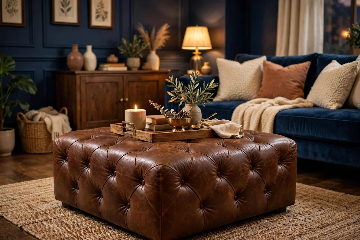
A brown leather ottoman is the perfect ambassador between blue walls or upholstery and the rest of the room. It adds warmth, texture and a patina that improves with age, all in one hardworking piece. Use it as a coffee table with a tray on top, as extra seating, or as a footrest; at around 36 inches square it serves a standard sofa beautifully. Cognac and saddle tones glow against navy and slate blue.
Top the ottoman with a tray to create a stable surface for drinks and books, and choose a tray in wood or brass that echoes the room’s other materials. Leather ottomans are family friendly: they wipe clean, survive feet and toy cars, and look better with wear. Condition the leather once or twice a year to keep it supple. Avoid placing a leather ottoman where direct sun hits it daily, which dries and fades the hide unevenly.
12. Blue Curtains With Brown Furniture
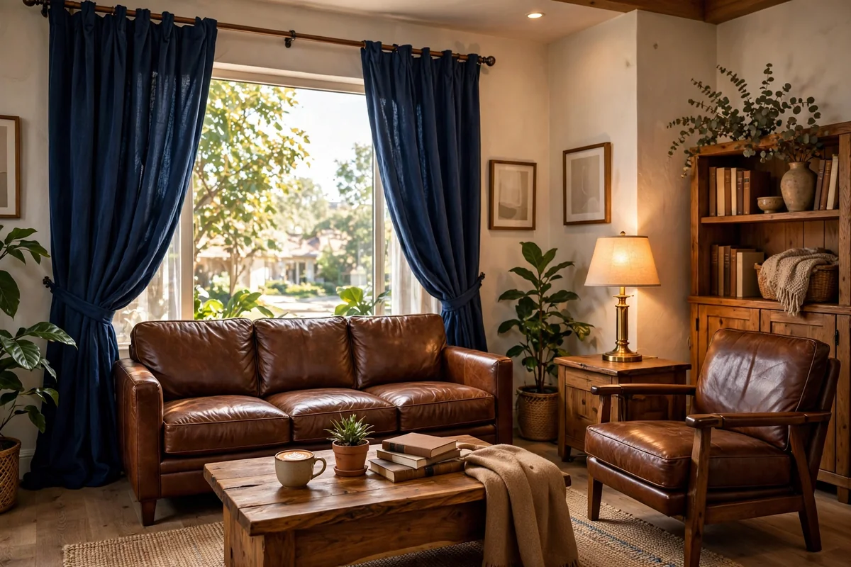
Blue curtains frame brown furniture beautifully, adding color at the windows while wood and leather ground the room. Navy linen panels bring drama and excellent light control; dusty blue sheers add softness and glow. Hang rods 4 to 6 inches above the frame and extend them beyond the sides, using at least twice the window width in fabric for full, luxurious folds.
Match the curtain blue’s depth to the room’s light: deep blues need good daylight, mid-tones work almost anywhere. Echo the blue in one or two more textiles so the windows do not carry it alone. Blue curtains hide dust better than white and lined versions insulate well. Against brown furniture, avoid curtains with strong competing patterns; solid or subtly textured blues let the wood and leather remain the stars. This is a renter-friendly, high-impact move.
13. A Gallery Wall in Blue Tones
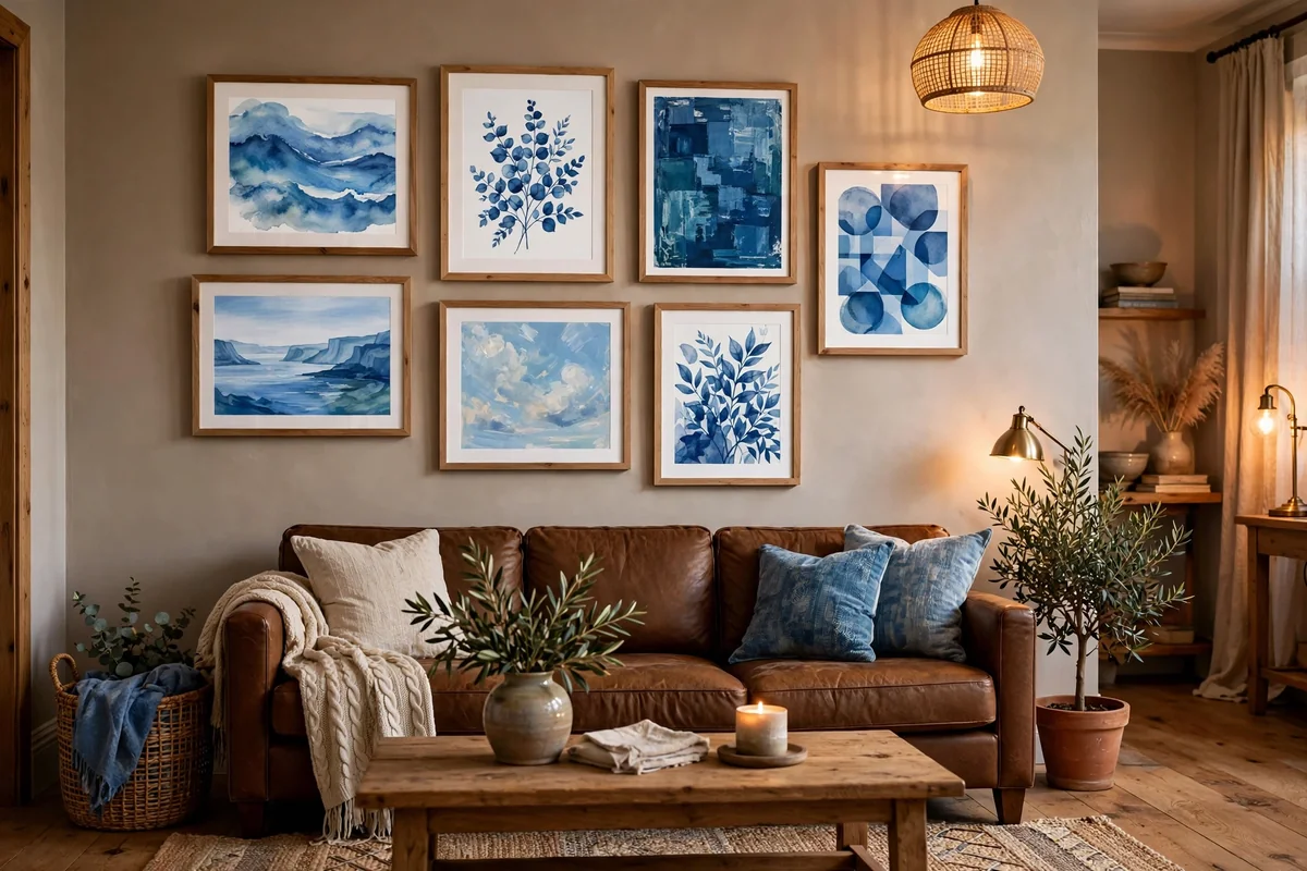
A gallery wall in blue tones ties brown furniture to the walls with art. Mix abstract prints, landscapes and personal photos where blue dominates, unified by consistent mats and a limited frame palette of black, wood or brass. Hang the center at 57 to 60 inches from the floor, starting 6 to 10 inches above the sofa back. Include one larger anchor piece around 24 by 30 inches.
Choose art that includes warm browns as well as blues so it bridges to the furniture rather than floating separately. Frames in natural wood warm the combination; black frames add crisp definition. Lay the arrangement on the floor and photograph it before hanging, keeping 2 to 3 inches between frames. A gallery wall is also the easiest place to experiment: rotate pieces seasonally and the whole room’s mood shifts. Avoid hanging art too high, which disconnects it from the furniture below.
14. Brass With Brown and Blue
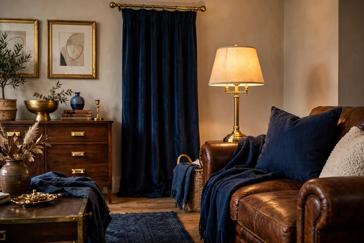
Brass flatters brown and blue simultaneously, warming the blue and gilding the brown. A brass floor lamp arcing over a navy sofa, brass picture frames on brown wood shelves, or a brass tray on a walnut coffee table adds the glow that matte fabrics and wood cannot produce. Brushed and aged brass feel current and relaxed; polished brass leans traditional. Repeat it at least three times so it reads as intentional.
Keep other metals quiet so brass stays the star; black pairs well for contrast but chrome scatters the eye. Brass loves natural companions, so wood, leather and woven textures all harmonize. Vintage brass from thrift stores, candlesticks, trays, frames, polishes up beautifully for a fraction of new prices. Avoid lacquered brass-look pieces that read as plastic; solid brass with a natural patina is the goal. A little brass goes a long way in this rich palette.
15. Brown Throws on a Blue Sofa
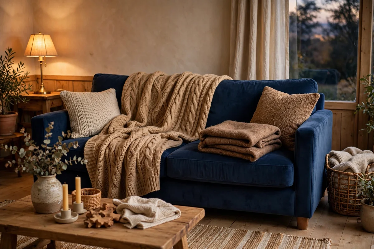
Brown throws on a blue sofa invert the usual formula and it works beautifully. A camel knit throw, a cognac-toned wool blanket or a warm brown faux fur draped over a navy sofa adds the warmth blue craves. The textural contrast matters as much as the color: chunky knits, soft wools and nubby weaves invite touch. Drape casually over one arm or folded across the back; effortful folding looks staged.
Choose throws in washable fabrics since they get constant handling. Wool blends offer warmth without itch, and cotton throws launder easily. Vary the brown tones slightly, camel with chocolate, rather than matching exactly, for a collected look. Keep one throw per seating spot within reach and the room always feels ready for a cozy evening. This is the simplest possible update: one good throw can shift the whole palette’s temperature.
16. Blue Accent Chairs With a Brown Sofa
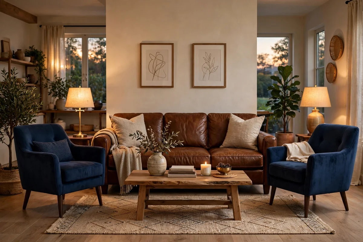
Blue accent chairs with a brown sofa create a balanced conversation area with clear color roles. The brown sofa provides warm, comfortable mass while two blue chairs add structure and personality. Angle the chairs slightly inward opposite or perpendicular to the sofa. Choose blues deep enough to stand up to the sofa’s visual weight; pale chairs can look lost next to a big brown piece.
Unify the pieces with a shared element: wood legs in the same tone, a rug containing both colors, or matching side tables. This layout suits families because the durable brown sofa handles daily life while the chairs can wear a richer fabric like velvet. Measure carefully, allowing 30 to 36 inches of walkway around the group. Two chairs also offer flexible seating that can turn toward the fireplace, the view or the television as needed.
17. Rustic Brown and Indigo
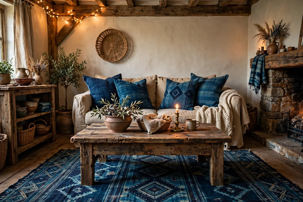
Rustic brown and indigo pair raw wood textures with deep, natural blue. Think reclaimed wood tables, leather seating and indigo-dyed textiles: pillows, throws and rugs with the variegated depth of real dye. The combination feels artisanal and grounded, perfect for cabins, farmhouses and eclectic homes. Keep the indigo pattern-rich and the browns honest and unfinished for the full effect.
Balance rustic roughness with comfort: deep cushions, soft lighting and a few refined pieces keep the room from feeling like a set. Indigo textiles hide wear beautifully and age with character. Avoid mixing in sleek modern pieces that fight the handmade mood unless you are deliberately creating contrast. Natural fibers, wool, cotton, jute and leather, are the material language here. Done well, the room feels collected over years rather than decorated in a weekend.
18. Modern Brown and Blue
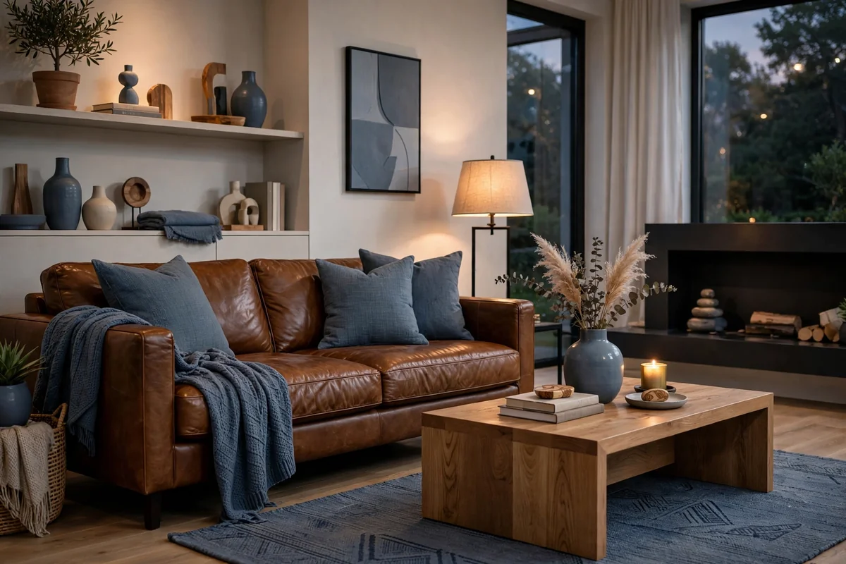
Modern brown and blue is tailored and restrained: a streamlined brown leather sofa, slate blue accents, clean-lined wood tables and minimal ornament. The palette’s sophistication comes from editing, so choose fewer, better pieces and give them room to breathe. Greige or warm white walls keep the look current, while the brown and blue provide all the color the room needs.
Texture should be subtle in modern rooms: smooth leather, low-pile wool rugs, simple linen. Add warmth through wood with visible grain, like white oak or walnut, and one warm metal, usually brass. Lighting should be architectural: a sculptural floor lamp or simple pendants. Avoid rustic or ornate pieces that blur the clean aesthetic; consistency is what makes modern palettes feel expensive. This is brown and blue at its most grown-up.
19. Woven Baskets and Blue Textiles
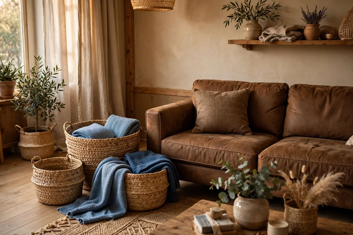
Woven baskets are the quiet workhorses of the brown-and-blue palette. Their warm, natural tones bridge brown furniture and blue textiles while corralling throws, toys, firewood and clutter. Place a large basket beside the sofa for throws, a pair flanking the fireplace, or a lidded hamper-style basket for the things you want hidden. Seagrass, rattan and water hyacinth all work; vary the weaves for a collected look.
Baskets add the organic texture that keeps tailored rooms from feeling stiff. They are inexpensive, durable and endlessly useful, which makes them the easiest styling upgrade in this list. Keep the blue connection visible: a blue throw spilling from the basket or a navy pillow on the nearby chair ties them into the scheme. Avoid plastic-look woven bins; natural fibers with visible variation are what make baskets beautiful. Every living room needs at least one.
20. Artwork Mixing Brown and Blue
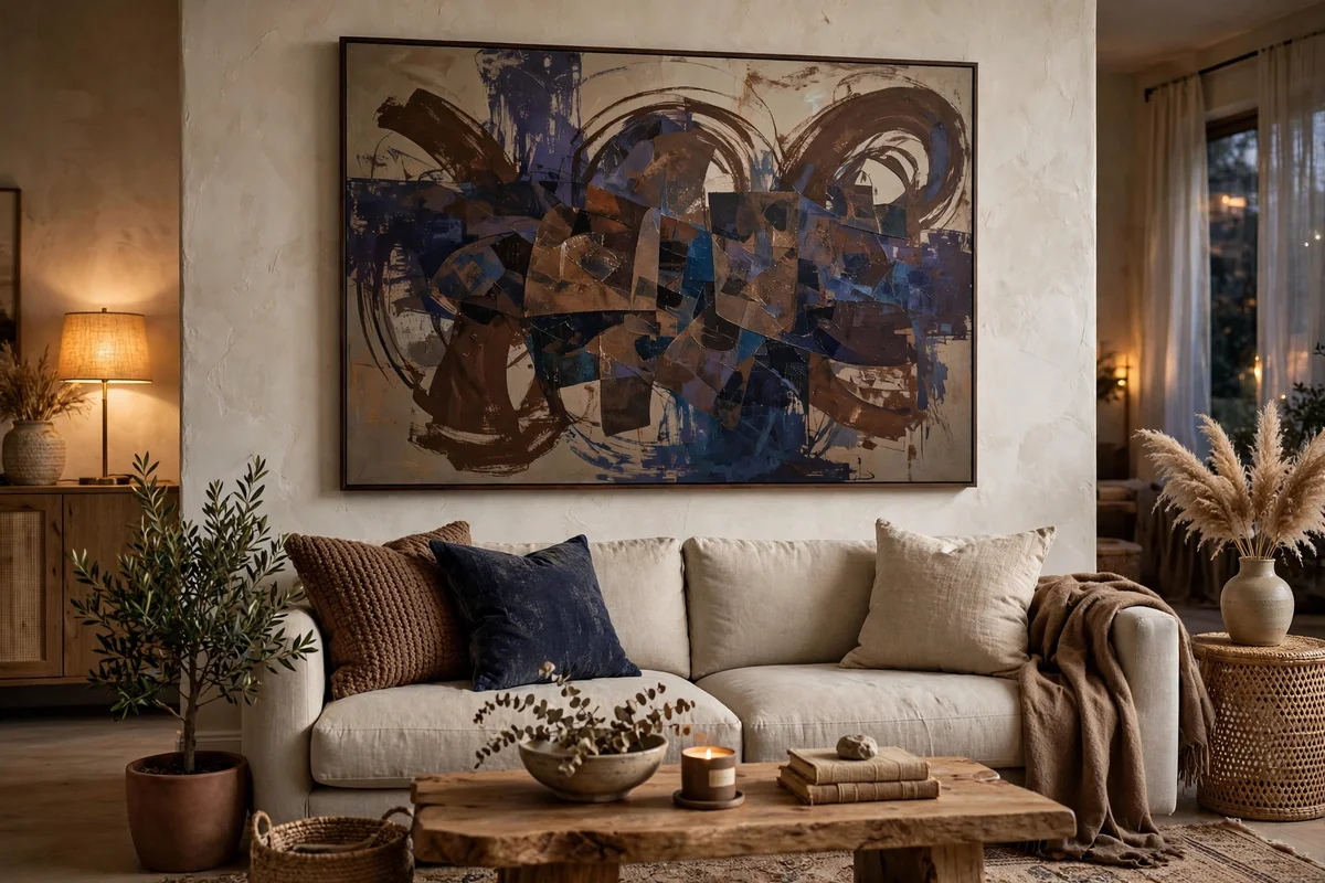
A single large artwork that mixes brown and blue can define the whole palette. An abstract with umber and indigo, a landscape with earth and sky, or a vintage-style print in sepia and blue gives the room a color key that everything else follows. Hang it where it gets attention: above the sofa, over the fireplace or on the first wall you see entering the room. Size it generously, at least two-thirds the width of the furniture below.
Pull the room’s textiles from the artwork’s colors and the scheme designs itself. This is the easiest way to make brown and blue feel intentional rather than accidental. Good frames matter as much as the art: natural wood warms the combination, black adds definition. If original art is out of reach, quality prints in excellent frames look wonderful. Let the artwork be the boss and keep surrounding patterns quiet so it holds focus.
21. Outdoor Blues With Wood Tones
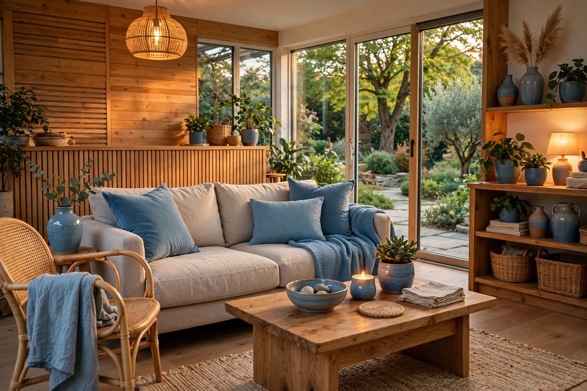
Borrow the palette from outside: sky blues, water blues and slate tones with the browns of wood, bark and earth. These nature-derived colors feel effortless together because our eyes accept them outdoors every day. Use them in textiles and accessories: a watercolor landscape, slate blue pillows on a wood-framed sofa, a sky-blue throw over a leather chair. Keep the blues varied and muted rather than one flat tone.
This approach suits rooms with garden or landscape views, where interior colors can echo the outdoors. Greenery is the natural companion, and plants bridge the indoor-outdoor feeling. Wood tones should look natural rather than stained dark; oak, teak and weathered finishes all harmonize. Avoid electric or neon blues that break the natural spell. Done well, the room feels like an extension of the landscape: calm, grounded and quietly alive.
22. Brown and Blue in a Small Room
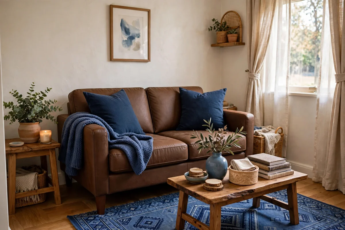
Brown and blue work beautifully in small rooms with the right proportions. Keep walls light, warm white or pale beige, and let the color come from furniture and textiles: a compact brown loveseat, navy pillows, a blue rug that fits the floor. Choose one deeper tone for depth, like a navy chair or slate curtains, but keep the majority of surfaces light so the room feels open.
Scale furniture to the room: a small-scale brown sofa, leggy chairs that show floor beneath, a round coffee table that eases circulation. Mirrors opposite windows double the light and make the palette glow. Avoid heavy, dark pieces that swallow space; a brown leather chair is fine, but a massive brown sectional is not. In small rooms, brown and blue feel cozy rather than cramped when the balance tips toward light, roughly 60 percent light tones to 40 percent deeper ones.
Conclusion
Brown and blue endure because they do what a living room should: brown warms and grounds, blue calms and refreshes. Start with what you own, add the second color through textiles and art, and let texture do the quiet work of making it rich. Keep the tones intentional and the proportions balanced, and this is a palette you will love for decades.
Frequently Asked Questions
Do brown and blue go together in a living room?
Yes, they are a classic pairing. Brown adds warmth and grounding while blue adds calm and contrast. The combination works in traditional, modern, rustic and coastal styles, and it is forgiving with everyday wear.
What shade of blue goes best with brown furniture?
Navy and slate blue create rich contrast with brown leather and wood, while dusty blue and powder blue feel softer and more relaxed. Avoid very bright or electric blues, which can clash with warm browns.
How do you keep brown and blue from looking dark?
Balance the deeper tones with cream or warm white textiles, good lighting and natural wood. Keep at least a third of the room light, through walls, rugs or curtains, so the rich colors feel cozy rather than heavy.
What metal finishes work with brown and blue?
Brass and warm gold flatter both colors beautifully. Black iron adds contrast in rustic rooms, while brushed nickel works in cooler, more modern blue-and-brown schemes. Pick one dominant metal and repeat it.
Can I mix brown leather with a blue sofa?
Absolutely, it is one of the best combinations. A navy sofa with a cognac leather chair is timeless. Keep the leather warm-toned and the blue deep enough to hold its own, and tie them together with a rug that includes both colors.