Living Room
22 Curtain Ideas That Pair Beautifully With Blue Walls
By Anna Wells · · 11 min read
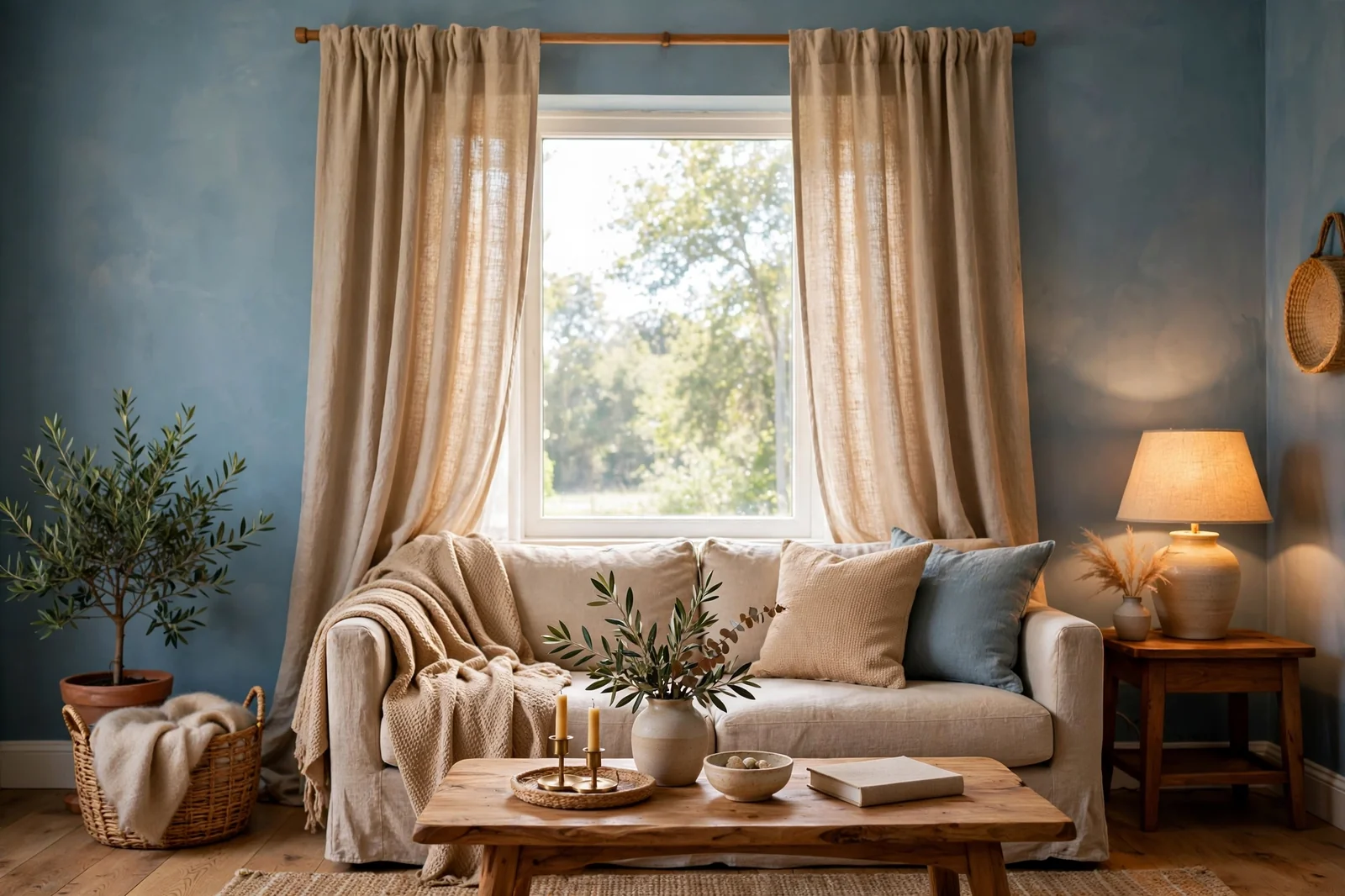
Blue walls bring calm and character to a room, but the wrong curtains can flatten the whole look. The right curtain color either harmonizes with the blue for a serene retreat or contrasts with it for lively, confident style. These 22 curtain colors that pair beautifully with blue walls cover every mood, from crisp white linen to rich terracotta, with practical notes on fabric, length and hanging so your windows look intentional and your blue walls look their very best.
Blue is one of the most loved wall colors because it feels both fresh and timeless. But blue walls ask a question every other wall color answers easily: what goes on the windows? The curtain color you choose sets the temperature of the whole room. Warm tones like mustard, terracotta and beige make blue walls feel cozy and welcoming, while whites, grays and tone-on-tone blues keep them crisp and serene. Work through these 22 pairings with your exact shade of blue in mind, hold fabric swatches against the wall in daylight and lamplight, and you will find the combination that makes your room sing.
1. Mustard Yellow for Cheerful Contrast
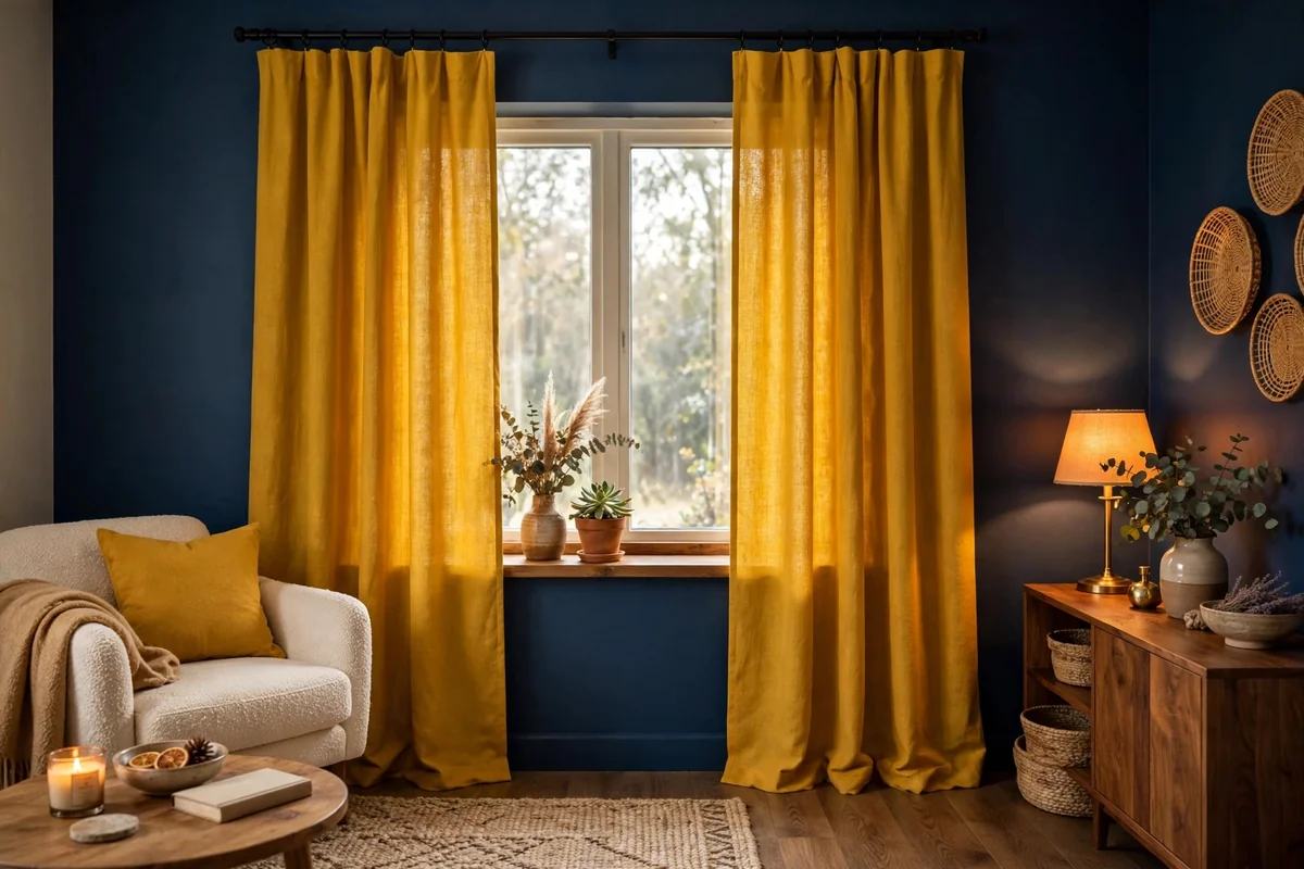
Mustard yellow sits opposite blue on the color wheel, which makes it the liveliest partner a blue wall can have. Against navy or slate blue, mustard curtains glow like late-afternoon sun and instantly lift the mood of the room. Choose a muted, golden mustard rather than a neon yellow; the earthier tone feels sophisticated instead of loud. A cotton or linen weave keeps the look relaxed, while velvet mustard panels add drama for a dining room or study.
Because the contrast is strong, keep the rest of the room calm. Let the curtains be the main color moment and echo the mustard in just one or two small accents, like a throw pillow or a vase. Hang panels full and generous, at least twice the window width in fabric, so the bold color reads as luxurious rather than skimpy. One caution: in a very small room, mustard on every window can overwhelm, so consider using it on one feature window and a quieter neutral elsewhere.
2. Soft Powder Pink
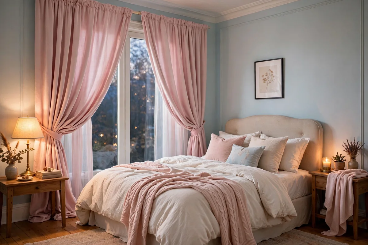
Powder pink with blue walls creates a soft, romantic pairing that works beautifully in bedrooms and nurseries. The gentle warmth of blush pink balances blue’s coolness without the boldness of stronger contrasts. Against pale blue walls, pink curtains feel dreamy and tonal; against navy, they pop like a watercolor accent. Choose a dusty, muted pink rather than bubblegum, and let the fabric be soft: washed linen, cotton voile or a light velvet.
Keep the pink restrained to the window treatment and perhaps one textile echo, like a lumbar pillow. Too much pink can tip the room from elegant to sweet, so ground the pairing with natural wood furniture and white bedding or upholstery. Powder pink shows dust less than white but more than mid-tones, so plan on washing the panels seasonally. In north-facing rooms with cool light, pink curtains add a flattering warmth that blue walls alone can lack.
3. Crisp White Linen
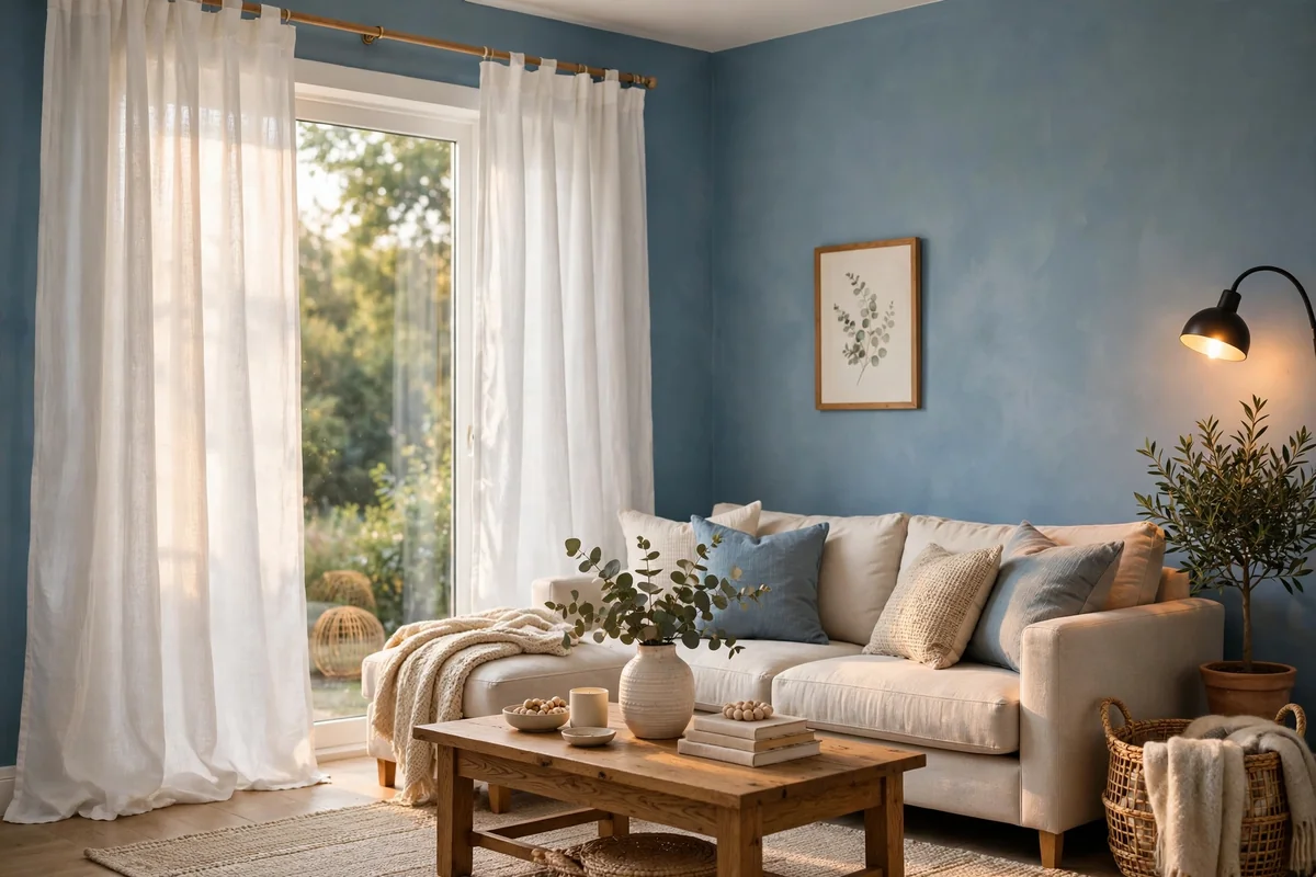
White curtains are the foolproof choice for blue walls of any shade. Against pale blue they feel airy and coastal; against deep navy they create a striking, classic contrast that never goes out of style. Linen is the ideal fabric because its natural slubs and texture keep the white from looking flat or sterile. Choose a warm white rather than a blue-white, which can look harsh next to warm blues and dingy next to cool ones.
Hang white linen panels high and wide to maximize light and the sense of height. Because white shows every mark, pick machine-washable linen or linen blends and wash them twice a year to keep them bright. In a busy family room, consider an off-white or ivory instead of pure white to hide everyday dust. White curtains also photograph beautifully, which matters if you love sharing your home: they bounce light around the room and make blue walls look richer by contrast.
4. Warm Beige
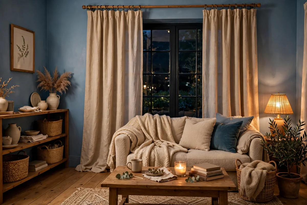
Warm beige curtains are the cozy counterpart to blue walls. Where white creates crisp contrast, beige wraps the room in softness and makes blue feel like a warm den rather than a cool gallery. This pairing shines in living rooms and bedrooms where comfort matters most. Choose a beige with visible warmth, leaning toward oatmeal or camel rather than gray-beige, so it clearly reads as warm against the blue.
Texture matters enormously with beige: a nubby linen, a subtle herringbone weave or a soft chenille keeps the neutral interesting. Match the beige to undertones in your rug or wood furniture so the room feels pulled together. Beige curtains are forgiving with dust and pet hair, making them practical for family homes. One mistake to avoid is choosing a beige so pale it disappears against light blue walls; aim for at least two shades deeper than the wall for definition.
5. Light Gray Layers
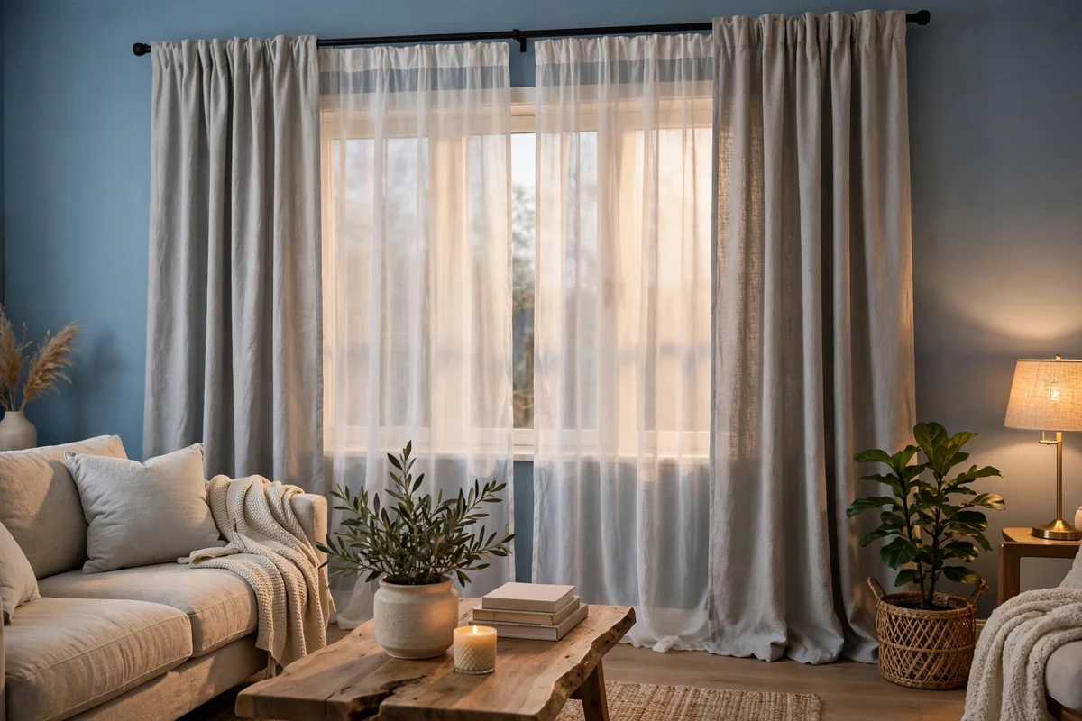
Light gray curtains with blue walls create a calm, tonal look that suits modern and minimalist rooms. The pairing works because gray shares blue’s cool temperament, so the room feels serene and unified. Against medium blues, a soft pearl gray curtain adds subtle depth; against navy, it lightens the mood without introducing a new color. Choose a gray with a hint of warmth if your blue leans teal or turquoise, to avoid a chilly overall feel.
Layer gray curtains over white sheers for the best of both worlds: privacy and softness by day, full coverage at night. Gray is practical, hiding dust well and pairing with almost any accent color you add later, from yellow to blush. Keep the fabrics matte rather than shiny; a satin gray can look cold and formal against blue. If the room starts to feel flat, add warmth through wood furniture, brass accents or a textured rug rather than changing the curtains.
6. Tone on Tone Navy
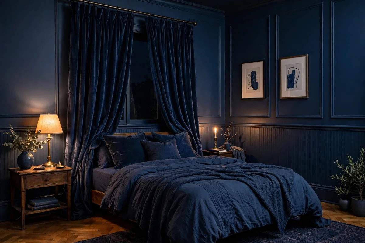
Navy curtains on navy walls create a cocooning, enveloping look that feels luxurious and intentional. The trick is varying the texture so the curtains read as a distinct layer rather than disappearing: velvet, linen or a subtle damask weave catches light differently than flat wall paint. This tone-on-tone approach works best in bedrooms, libraries and dining rooms where a moody, intimate atmosphere is welcome.
To keep the room from feeling like a cave, balance the deep blue with plenty of warm light, cream or beige textiles, and natural wood. A large mirror opposite the window bounces daylight around and doubles the sense of space. Choose curtain fabric with some body so the panels hang in rich folds; limp fabric in a dark color can look sad. Navy shows dust and lint, so keep a lint roller handy and vacuum the panels with an upholstery attachment monthly.
7. Burnt Orange Warmth
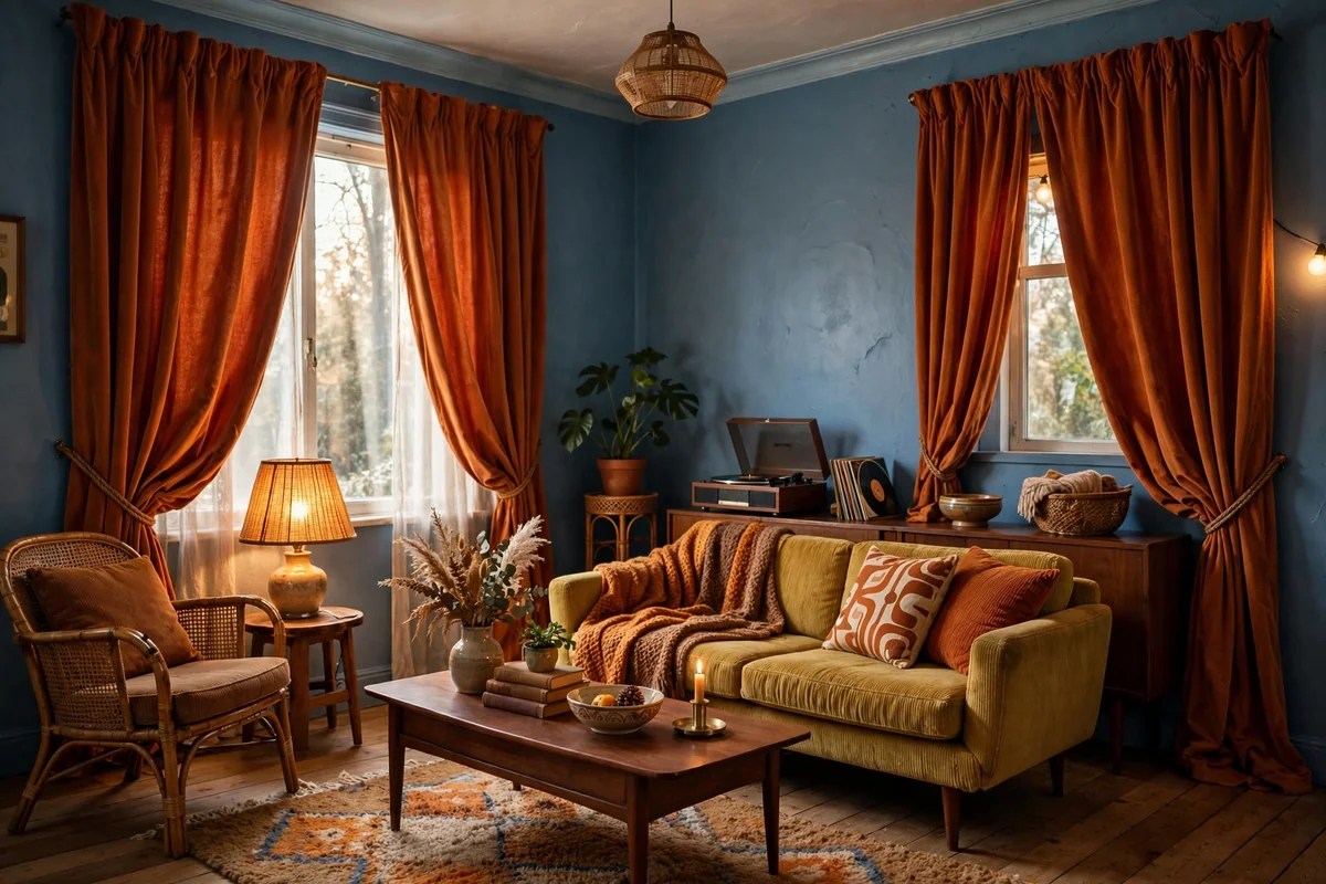
Burnt orange is blue’s natural complement, and against blue walls it feels like autumn sunlight. This pairing has a retro warmth that suits mid-century, bohemian and eclectic rooms. A muted, clay-like burnt orange reads as sophisticated; a brighter pumpkin orange feels playful. Cotton velvet in burnt orange is especially beautiful, catching light with a soft glow that flat weaves cannot match.
Use burnt orange confidently but sparingly in the wider room. The curtains can carry the color almost alone, with small echoes in artwork or a throw. Against pale blue walls the contrast is gentle and sunny; against dark blue it is dramatic and rich. Burnt orange curtains can dominate a small room, so in compact spaces consider using the color on a single window or as a valance over neutral panels. The warm tone flatters skin tones beautifully, which makes it lovely in rooms where people gather.
8. Sage Green Calm
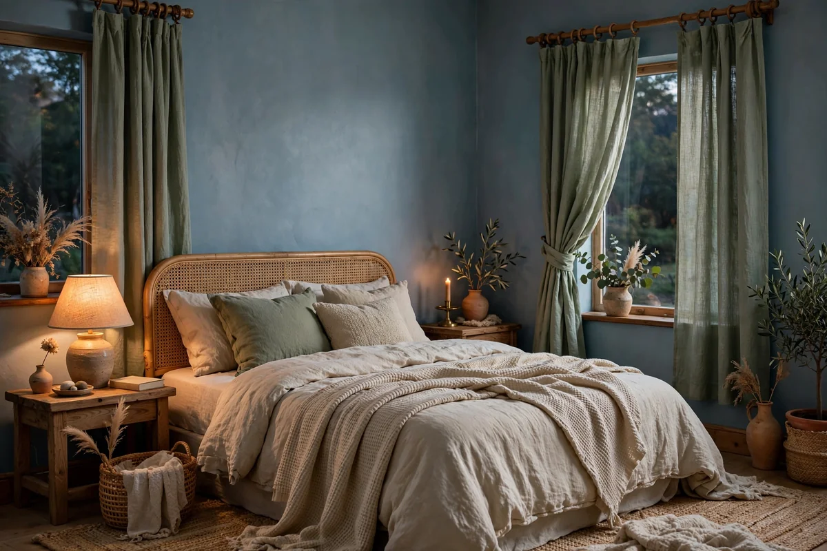
Sage green and blue are neighbors in nature, think sea and shore, so they pair with effortless calm. This combination suits bedrooms, bathrooms and any room where you want a restful, organic feeling. A soft, grayed sage keeps the palette muted and sophisticated; it never shouts. Linen and cotton in sage drape beautifully and suit relaxed, unfussy interiors.
Because both colors are cool and muted, add warmth elsewhere: natural wood, rattan, cream textiles or brass accents keep the room from feeling chilly. Sage curtains look particularly good against dusty blue or slate walls where the undertones harmonize. The color hides dust well and ages gracefully, fading softly rather than looking worn. Avoid pairing sage with very bright, primary blues, where the muted green can look muddy; this pairing loves soft, complex blues best.
9. Cream Linen Simplicity
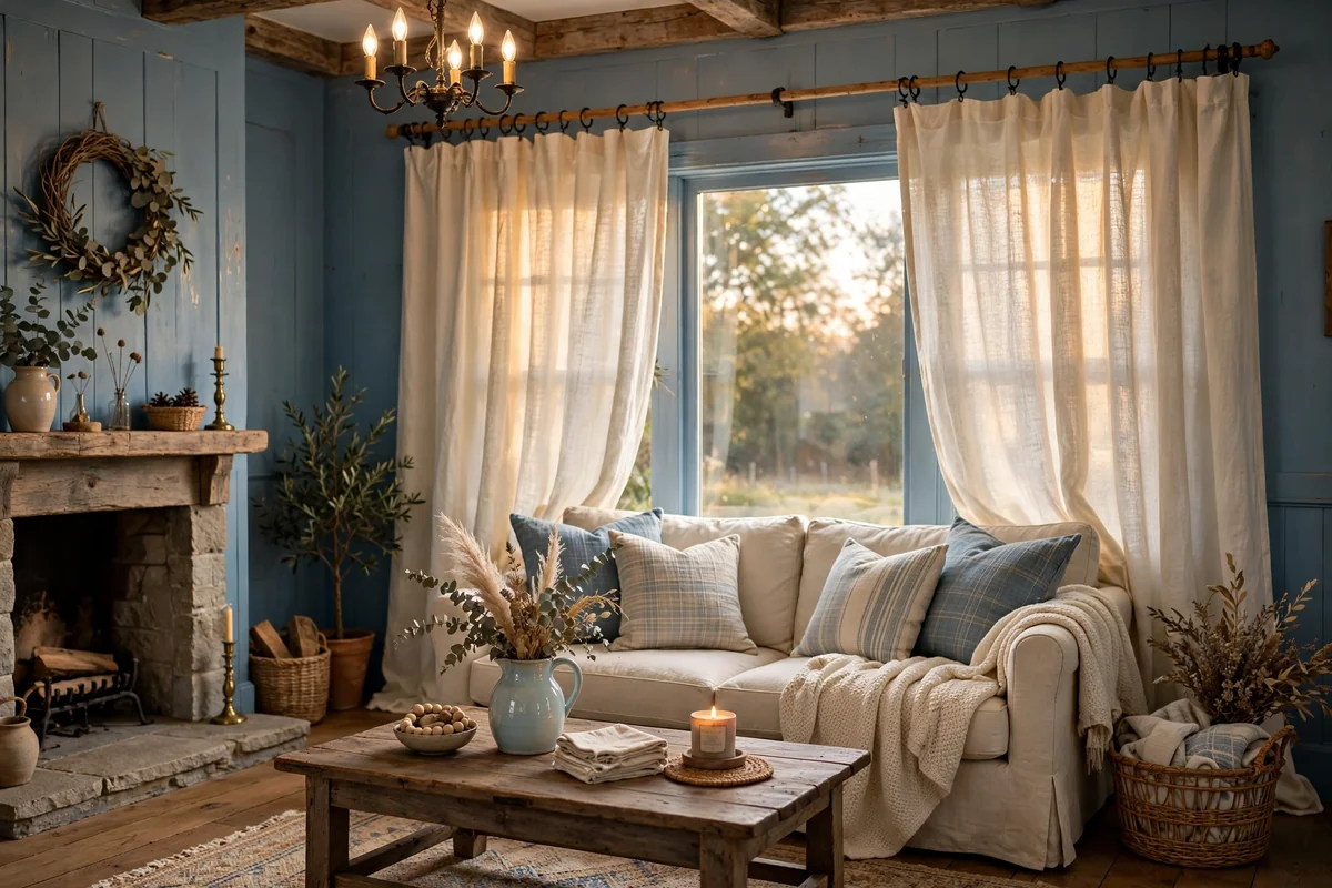
Cream linen curtains are the softer sibling of white, bringing warmth that pure white sometimes lacks. Against blue walls, cream feels like sunlight on water: gentle, natural and timeless. This pairing suits farmhouse, coastal and classic rooms beautifully. The visible weave of linen adds texture that flat cotton cannot, and cream’s yellow undertone flatters both warm and cool blues.
Choose a medium-weight linen that drapes in soft folds rather than stiffening; pre-washed linen is ideal. Cream shows marks less than white but still benefits from seasonal washing. In rooms with lots of natural wood, cream curtains tie the wood tones to the blue walls and make the whole palette feel intentional. Keep the styling simple: cream linen needs no pattern or trim to look complete. If you want a little more interest, choose panels with a subtle woven stripe in a slightly deeper tone.
10. Soft Gold Elegance
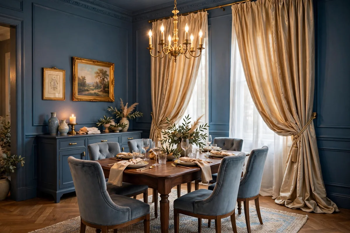
Soft gold curtains bring a quiet luxury to blue walls, like candlelight against evening sky. This pairing has a classic, slightly formal elegance that suits dining rooms, master bedrooms and traditional living rooms. Choose a muted, champagne gold rather than a brassy metallic; the softer tone reads as refined instead of flashy. Silk-look polyester or a linen with a subtle sheen gives the luminous quality without the cost or care of real silk.
Gold curtains catch both daylight and lamplight beautifully, so they look good around the clock. Keep surrounding metals in the same warm family: brass and gold accents harmonize, while chrome can clash. Because gold is a statement, let the curtains be the star and keep walls, rugs and upholstery calm. In small rooms, use gold on lined panels that can be drawn fully to the sides during the day so the color does not overwhelm; the gathered folds still add a warm glow at the window edges.
11. Earthy Terracotta
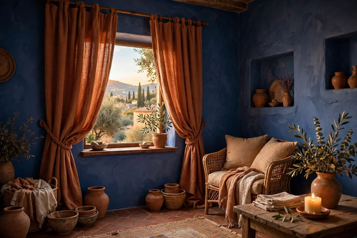
Terracotta curtains against blue walls feel sunbaked and soulful, a pairing borrowed from Mediterranean and Southwestern landscapes. The warm clay tone makes blue walls feel richer and more complex, especially deep navy or slate. Matte cotton or linen in terracotta suits the earthy mood; avoid shiny fabrics that fight the natural character of the color. This combination loves natural materials, so pair it with wood, rattan and handmade ceramics.
Terracotta is strong, so balance it with plenty of neutral breathing room: cream walls elsewhere, a natural rug, simple furniture. The color can read differently in different lights, sometimes more orange, sometimes more brown, so test a swatch at home before committing. Terracotta curtains fade gracefully in sun, developing a soft patina rather than looking damaged. If full terracotta panels feel bold, try a terracotta border or trim on neutral curtains for a gentler version of the look.
12. Blush and Coral
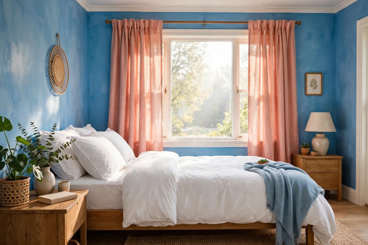
Blush and coral curtains add a fresh, lively warmth to blue walls without the intensity of stronger oranges. Coral, with its pink-orange balance, feels cheerful and modern; softer blush leans romantic. Both flatter blue beautifully because they warm up its coolness. These colors shine in bedrooms, creative spaces and sunrooms where a happy, energetic mood is welcome. Lightweight fabrics like cotton voile or washed linen keep the look breezy.
Keep the coral or blush as the room’s main warm accent and echo it sparingly, perhaps in a piece of art or a small cushion. Against pale blue walls the effect is soft and pretty; against dark blue it is vibrant and confident. These mid-tone colors hide everyday dust reasonably well. One caution: very bright coral can look dated quickly, so choose slightly muted, dusty versions for longevity, and avoid pairing with other strong brights that compete for attention.
13. Charcoal Gray Drama
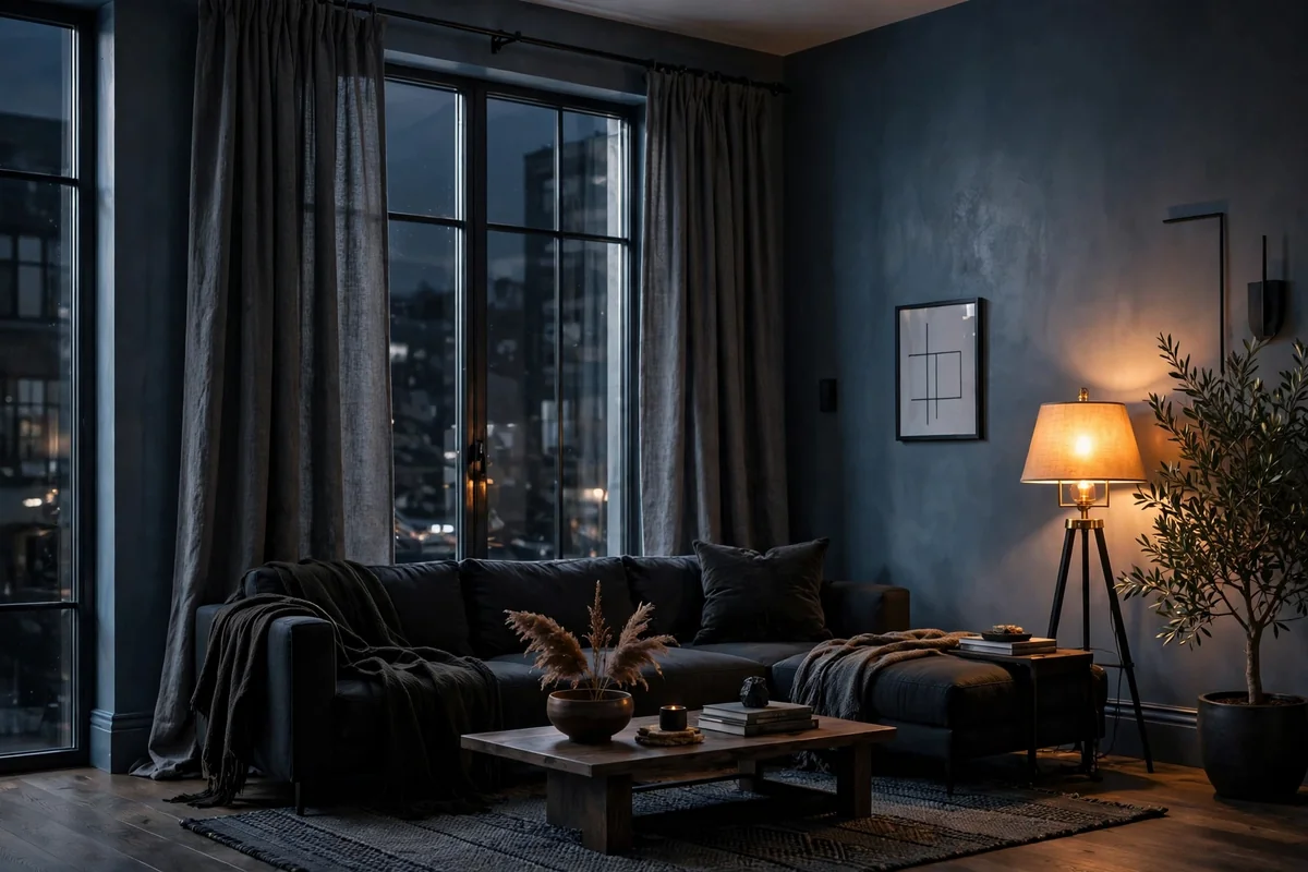
Charcoal gray curtains with blue walls create a moody, sophisticated look with real depth. The dark neutral lets blue walls glow by contrast, especially medium and steel blues. This pairing suits modern living rooms, home offices and bedrooms with a masculine or dramatic edge. Choose a charcoal with soft texture, like a wool blend or heavy linen, so the dark color has dimension rather than reading as a flat void.
Balance the darkness with light: cream or white bedding, a light rug, warm lamplight and perhaps brass accents keep the room inviting. Charcoal curtains provide excellent light blocking when lined, making them practical for bedrooms and media rooms. They hide dust and marks well, a real advantage in busy homes. Avoid pairing charcoal with very dark navy walls unless you deliberately want a cave-like den; the combination needs strong lighting and pale furnishings to avoid feeling heavy.
14. Sky Blue Lightness
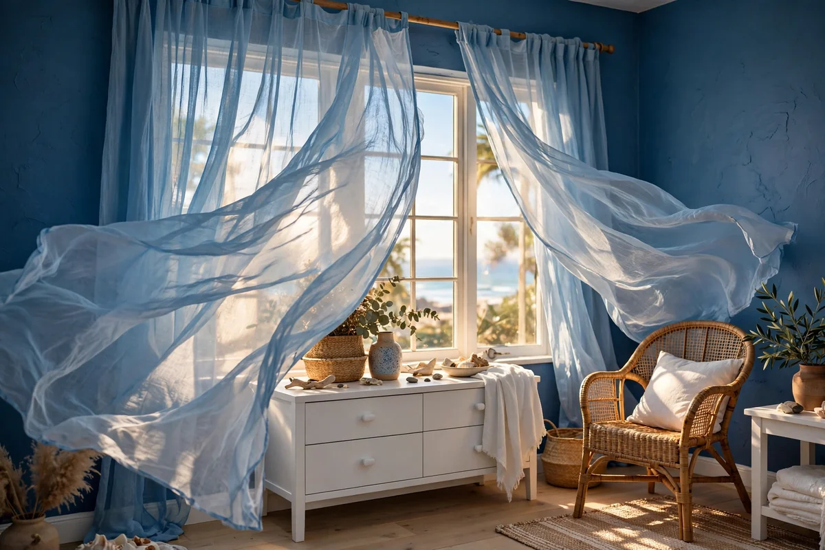
Sky blue curtains on deeper blue walls create a breezy, ombre effect that feels like looking up through water. This tonal layering works beautifully in coastal, Scandinavian and serene modern rooms. Choose a sky blue several shades lighter than the wall so the curtains read as a distinct, luminous layer. Sheer or semi-sheer fabrics enhance the airy feeling and let daylight pour through.
Keep the rest of the palette light and simple: white, sand and natural wood let the blue gradient be the story. This is one of the best pairings for small or dark rooms because the light curtains maximize every bit of brightness. Avoid exact matching; curtains the identical shade as the wall disappear and waste the opportunity for depth. Wash sheers regularly since light blue shows dust, and consider a UV-protective lining if the window gets strong sun, as pale blues can fade.
15. Olive Green Depth
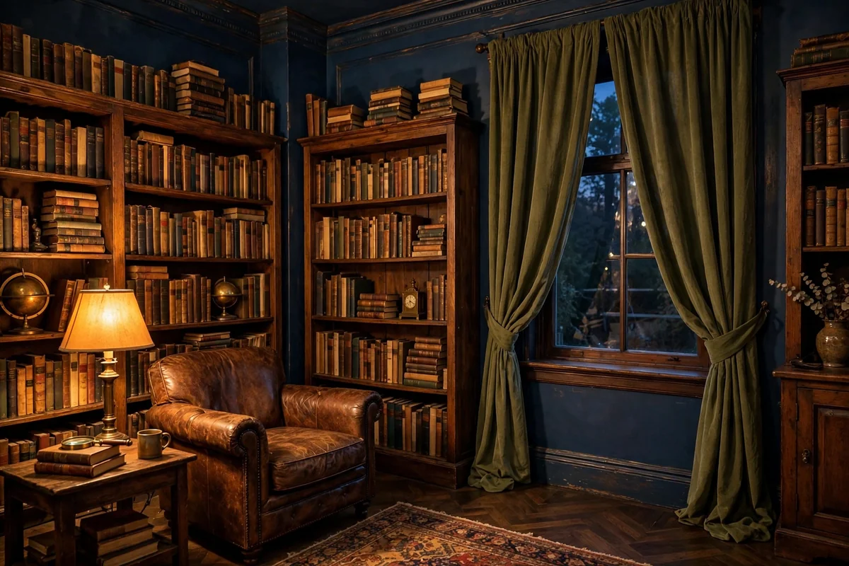
Olive green curtains bring an earthy, collected depth to blue walls. The pairing feels natural and slightly vintage, like a well-loved library or a garden room. Olive’s yellow undertone warms up blue beautifully, and the combination suits traditional, eclectic and nature-inspired interiors. Velvet olive panels are stunning in dining rooms and studies; washed linen olive suits relaxed living spaces.
Ground the pairing with warm neutrals: cream, camel and natural wood keep olive and blue from feeling heavy. Brass or aged gold accents harmonize with olive’s warmth. This is a forgiving color for family homes since it hides dust and minor marks well. Avoid olive with very bright, electric blues, where it can look muddy; it partners best with deep navy, slate and dusty blues. Test the combination in your room’s light, as olive shifts noticeably between warm and cool lighting.
16. Rust Red Richness
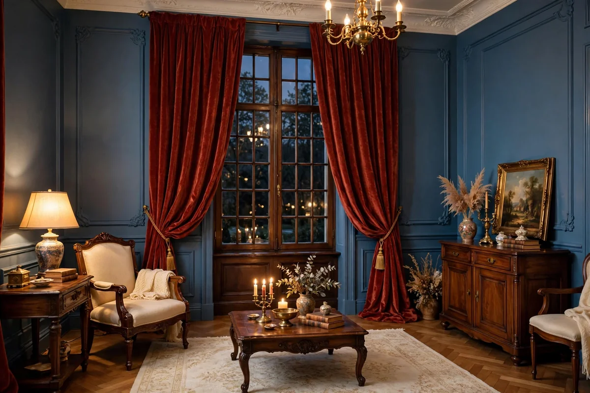
Rust red curtains against blue walls deliver rich, autumnal drama. Deeper and browner than burnt orange, rust feels grounded and sophisticated, perfect for traditional living rooms, libraries and dining rooms with character. The warm red-brown makes blue walls look deeper and more complex by contrast. Heavy fabrics like velvet or lined linen give rust the substance its richness deserves.
Let rust be the room’s confident color statement and keep companions quiet: creams, warm woods and black accents. A little rust goes a long way, so if full panels feel bold, consider rust curtains on one window paired with neutral panels elsewhere. Rust flatters wood furniture beautifully and looks wonderful in firelight or candlelight, making it ideal for cozy gathering rooms. Like all strong warm colors, it can dominate small spaces, so scale the commitment to the room size.
17. Ivory Sheers
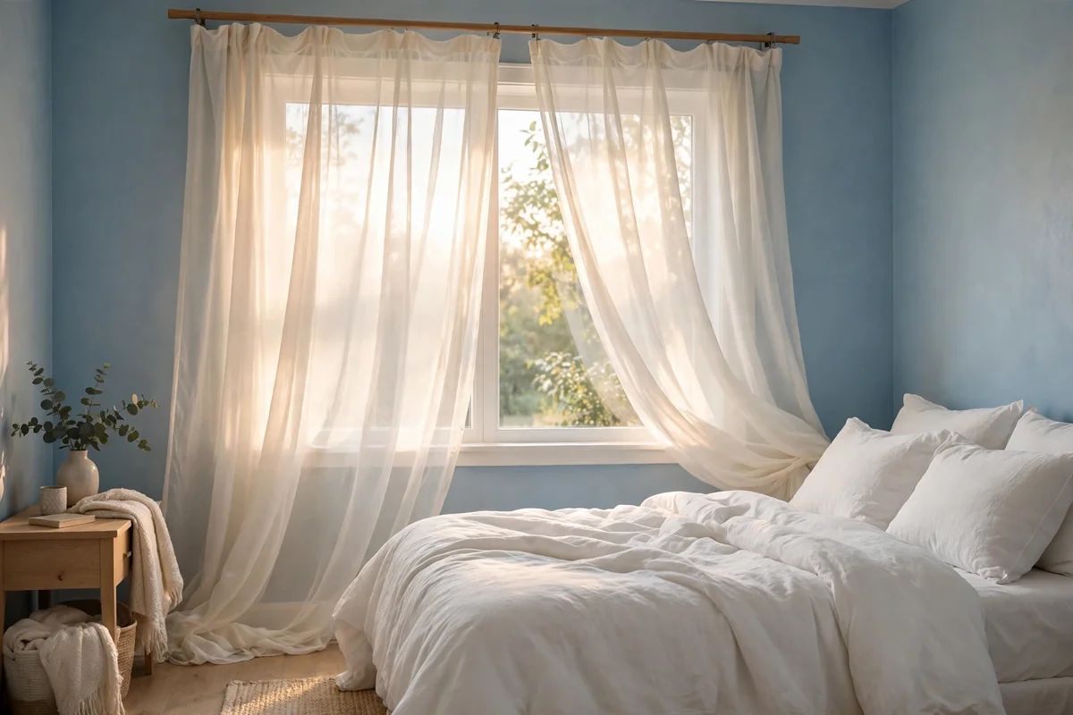
Ivory sheers are the gentlest way to dress blue walls. They filter daylight into a soft glow, provide daytime privacy, and add a whisper of warmth that pure white sheers lack. Against any shade of blue, ivory sheers feel romantic and effortless, perfect for bedrooms and living rooms where you want light without exposure. Hang them on a slim rod inside the window frame for simplicity, or layer them behind heavier panels.
Sheers need regular washing to stay luminous; plan on laundering them every few months since they collect dust visibly. Choose a slightly textured sheer, like a linen-look weave, for more interest than flat polyester. Ivory sheers alone offer little nighttime privacy or insulation, so pair them with blinds, shades or lined drapes where needed. Their low cost makes them an easy update: a whole room of ivory sheers often costs less than one pair of lined drapes.
18. Versatile Taupe
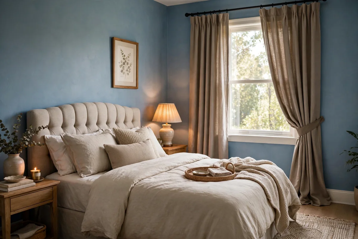
Taupe curtains are the diplomat of the curtain world, sitting between gray and beige to complement almost any blue. Against blue walls, taupe adds warmth without committing to a strong color, making it ideal if you like to change accent colors seasonally. A mid-tone taupe with visible texture works in living rooms, bedrooms and dining rooms alike, bridging traditional and modern styles.
Choose your taupe carefully: too gray and it cools the room, too beige and it may clash with cool blues. Hold swatches against your wall in both daylight and evening light before deciding. Taupe is wonderfully practical, hiding dust and pairing with every accent from mustard to blush. Keep the fabric matte and textured; shiny taupe can look dated. Because taupe is so adaptable, invest in good quality lined panels here and let cheaper seasonal accents do the color-changing work around them.
19. Teal and Turquoise
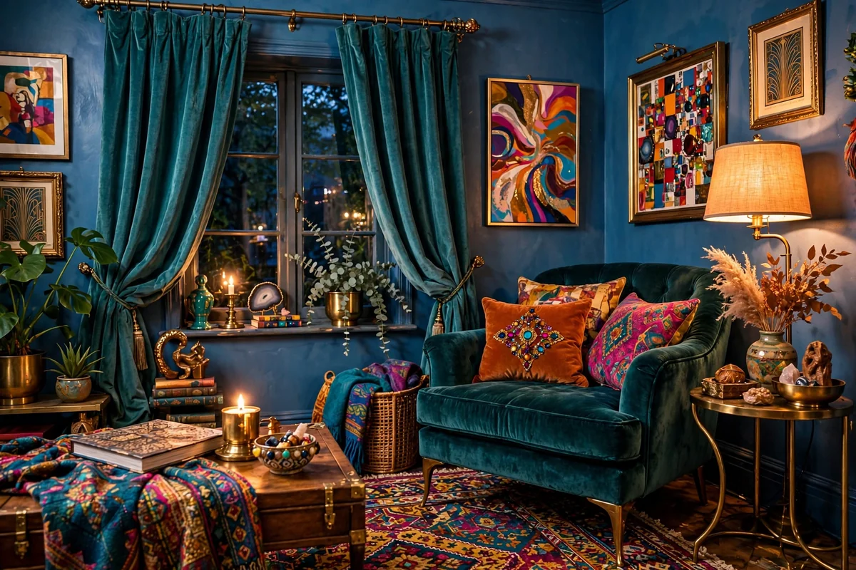
Teal and turquoise curtains with blue walls create a rich, jewel-toned layering that feels bold and artistic. These blue-green shades harmonize with true blues while adding a shot of tropical energy. The pairing suits eclectic, bohemian and coastal-modern rooms where color is celebrated. Against navy walls, teal curtains glow; against lighter blues, they add welcome depth and complexity.
Because the colors are closely related, texture becomes the differentiator: velvet, slubbed linen or an embroidered weave keeps the layering interesting. Add warm accents like brass, rattan or coral to keep the cool palette balanced. Teal shows fading in strong sun, so choose fade-resistant fabrics or protective lining for south-facing windows. This is a confident choice, so commit fully with generous, full panels; skimpy teal curtains can look like an afterthought rather than a statement.
20. Warm Chocolate Brown
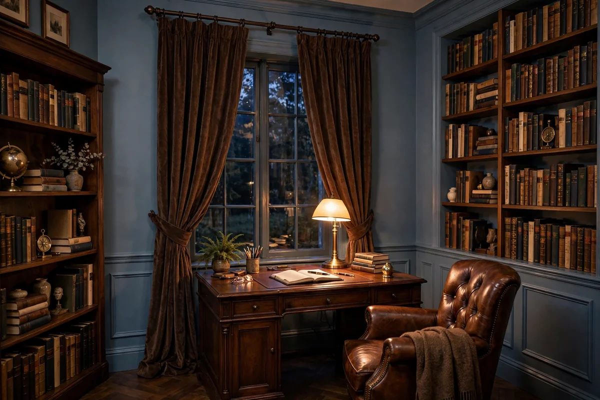
Chocolate brown curtains ground blue walls with deep, comforting warmth. The combination feels like a classic study or a cozy den, rich without being loud. Brown’s earthiness balances blue’s airiness beautifully, and the pairing suits traditional, rustic and craftsman interiors. Choose a warm, reddish chocolate rather than a flat dark brown, and favor textured fabrics like linen, wool or velvet that catch the light.
Lighten the room around the dark curtains: cream walls elsewhere, a light rug, warm lamps and natural wood keep the mood inviting. Chocolate curtains offer excellent light blocking when lined, making them smart for bedrooms. They are very forgiving with dust and wear. Avoid pairing chocolate with very dark navy walls in small rooms without strong lighting; the combination needs brightness to breathe. In larger rooms with good light, it is pure, enveloping comfort.
21. Lavender Gray Softness
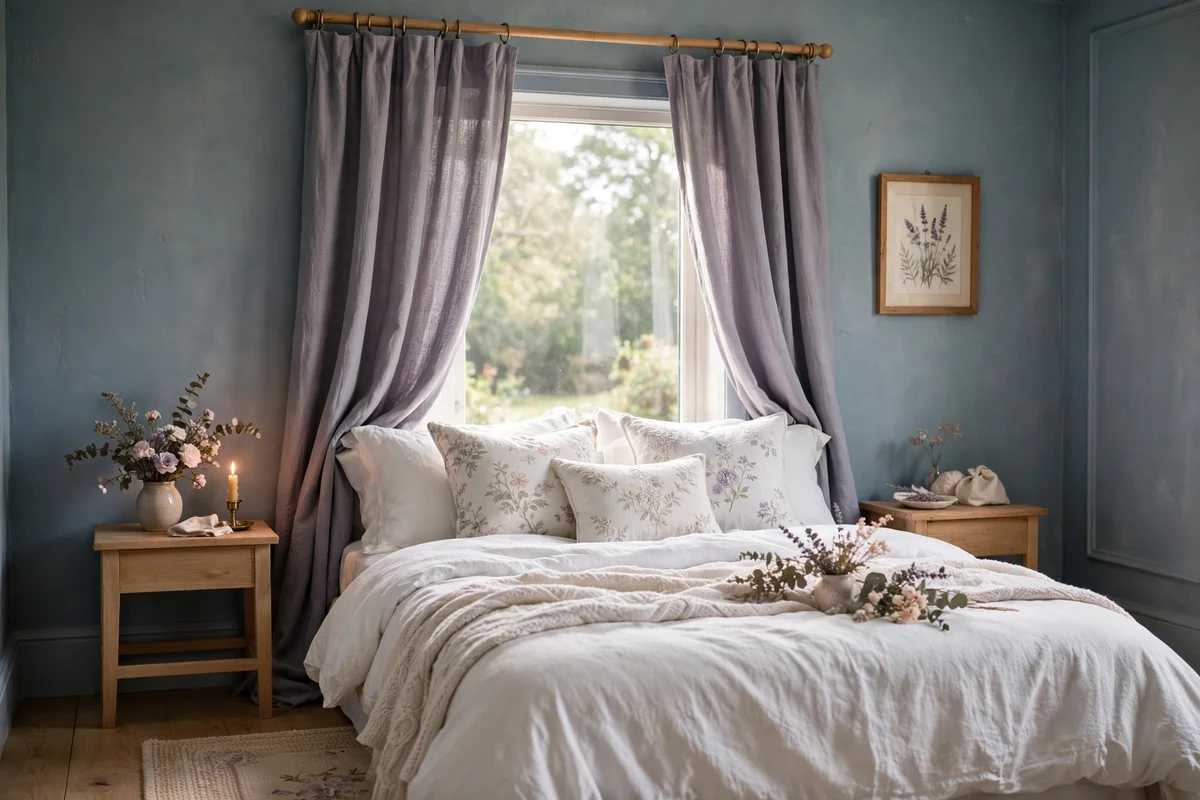
Lavender gray curtains add a whisper of purple-gray softness that flatters blue walls delicately. The pairing feels romantic and slightly vintage, lovely in bedrooms and dressing rooms. Because lavender gray is so muted, it works as a near-neutral, adding subtle color without demanding attention. Soft, flowing fabrics like washed linen or cotton voile suit its gentle character.
Keep the palette dreamy: whites, pale blues and silver accents harmonize, while too many strong colors would overwhelm the delicate curtain tone. Lavender gray looks best against soft, dusty blues rather than bright primary blues. It shows dust moderately, so regular gentle washing keeps it fresh. This is a wonderful choice if you find both gray and beige curtains a little boring but still want something calm; lavender gray is the quiet way to add personality to blue walls.
22. Patterned Neutrals
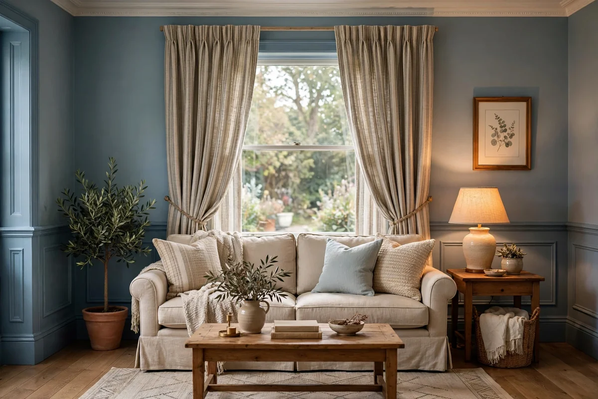
Patterned curtains in neutral tones give blue walls interest without introducing a competing color. Think subtle stripes, tone-on-tone damask, small-scale geometrics or classic ticking in beige, cream and soft gray. Pattern adds the visual texture that solid neutrals sometimes lack, and it helps curtains hold their own against a strong wall color. Choose patterns with a light background so they read as airy rather than heavy.
Scale the pattern to the room: small prints suit cozy rooms and lower ceilings, while larger motifs need space to breathe. Keep other patterns in the room minimal so the curtains do not compete; if the rug is bold, choose a quieter curtain pattern. Patterned neutrals hide minor marks better than solids, a practical bonus. When in doubt, a simple stripe is timeless: it adds rhythm, suits every style from farmhouse to modern, and never fights with blue walls.
Conclusion
Blue walls give you a gift: almost every curtain color looks good against them. The question is never whether a color works, but what mood you want. Choose warm tones for coziness, whites and creams for classic freshness, or tonal blues for serene depth. Hang panels high, wide and full, test swatches in your light, and your blue walls will look like they were always meant to wear those curtains.
Frequently Asked Questions
What is the safest curtain color for blue walls?
Crisp white or warm ivory. White curtains work with every shade of blue, from pale sky to deep navy, and they brighten the room. Choose a linen or cotton weave for texture so the white does not look flat against the blue.
Should curtains match the wall color or contrast?
Both work. Matching tones, like navy curtains on navy walls, create a calm, enveloping look. Contrasting colors, like mustard or terracotta against blue, add energy and personality. Choose based on whether you want the room to feel serene or lively.
How long should curtains be for blue walls?
Curtains should just kiss the floor or puddle slightly, around half an inch to an inch of pooling for a relaxed look. Hang the rod 4 to 6 inches above the window frame and extend it beyond the sides so the window looks larger.
Do sheer curtains work with dark blue walls?
Yes, beautifully. Ivory or white sheers soften dark blue walls and let daylight filter through, which keeps a navy room from feeling heavy. Layer sheers behind heavier panels for privacy at night.
What curtain colors should you avoid with blue walls?
Avoid muddy or clashing tones like murky brown-green or neon brights that fight with blue’s calm character. Very cool grays can also make blue walls feel cold, so lean warm unless your blue is a crisp, cool shade you want to emphasize.