Crafts
24 Pottery Painting Ideas That Turn Plain Clay Into Timeless Keepsakes
By Anna Wells · · 21 min read
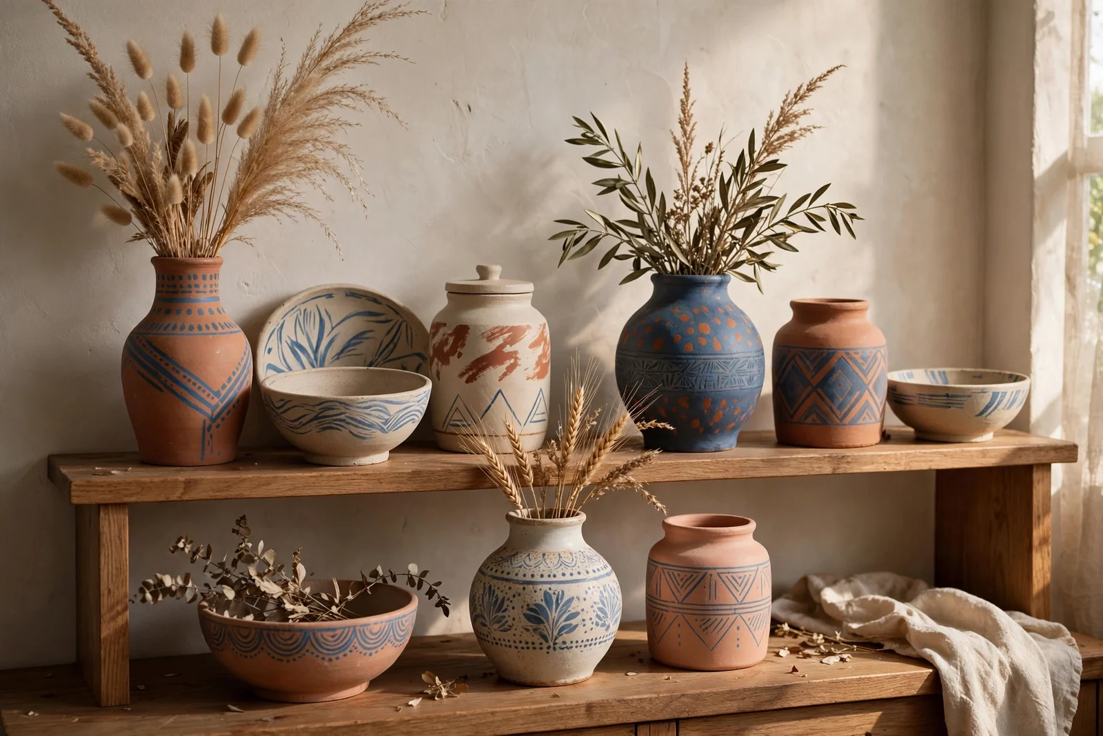
A plain clay pot is a quiet promise: with two coats of paint, one patient afternoon and a clear seal, it becomes a keepsake worth displaying for years.
Some of the most loved pieces in a home began as plain, inexpensive pottery: a charity shop vase, a garden centre pot, a bisque bowl waiting on a craft shelf. Paint gives these humble shapes a second life, and the designs that last are rarely the loudest ones. Calm colours, simple motifs and a well sealed finish turn everyday clay into something that looks collected rather than homemade.
Before any design begins, wash the piece in warm soapy water, dry it fully and wipe away dust, because paint clings poorly to grease and grit. Work in thin coats, let each one dry for at least an hour, and seal decorative pieces at the end. One safety note runs through everything below: ordinary craft acrylic is for decoration only, so keep painted surfaces away from food and drink unless you use certified food safe products exactly as directed.
1. Chalky Matte White, Dry Brushed at the Edges
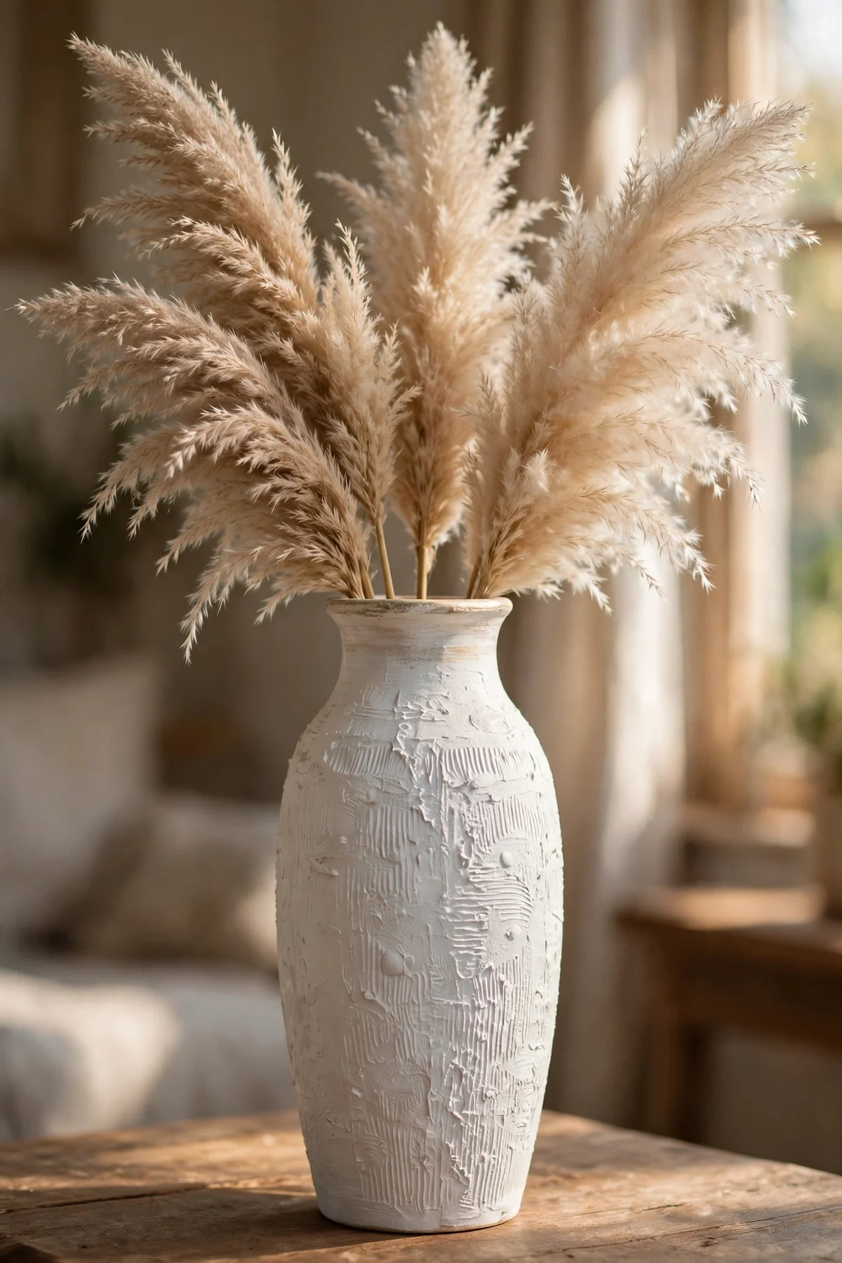
A chalky matte white coat is the most forgiving finish a beginner can choose, because it flatters almost every shape and hides small surface flaws. Use matte acrylic or mineral style paint and apply two thin coats with a soft flat brush, letting each coat dry for an hour. Full, streaky coverage in one coat always looks worse than two patient ones.
Once the base is dry, load a stiff dry brush with warm ivory, wipe nearly all of it off on a paper towel, and sweep what remains across raised rims, handles and carved details. The whisper of lighter colour catches the light and gives the piece depth. Style the finished vase with dried grasses or bare branches, and it will suit almost any calm room.
2. Cobalt Vines on a Ginger Jar
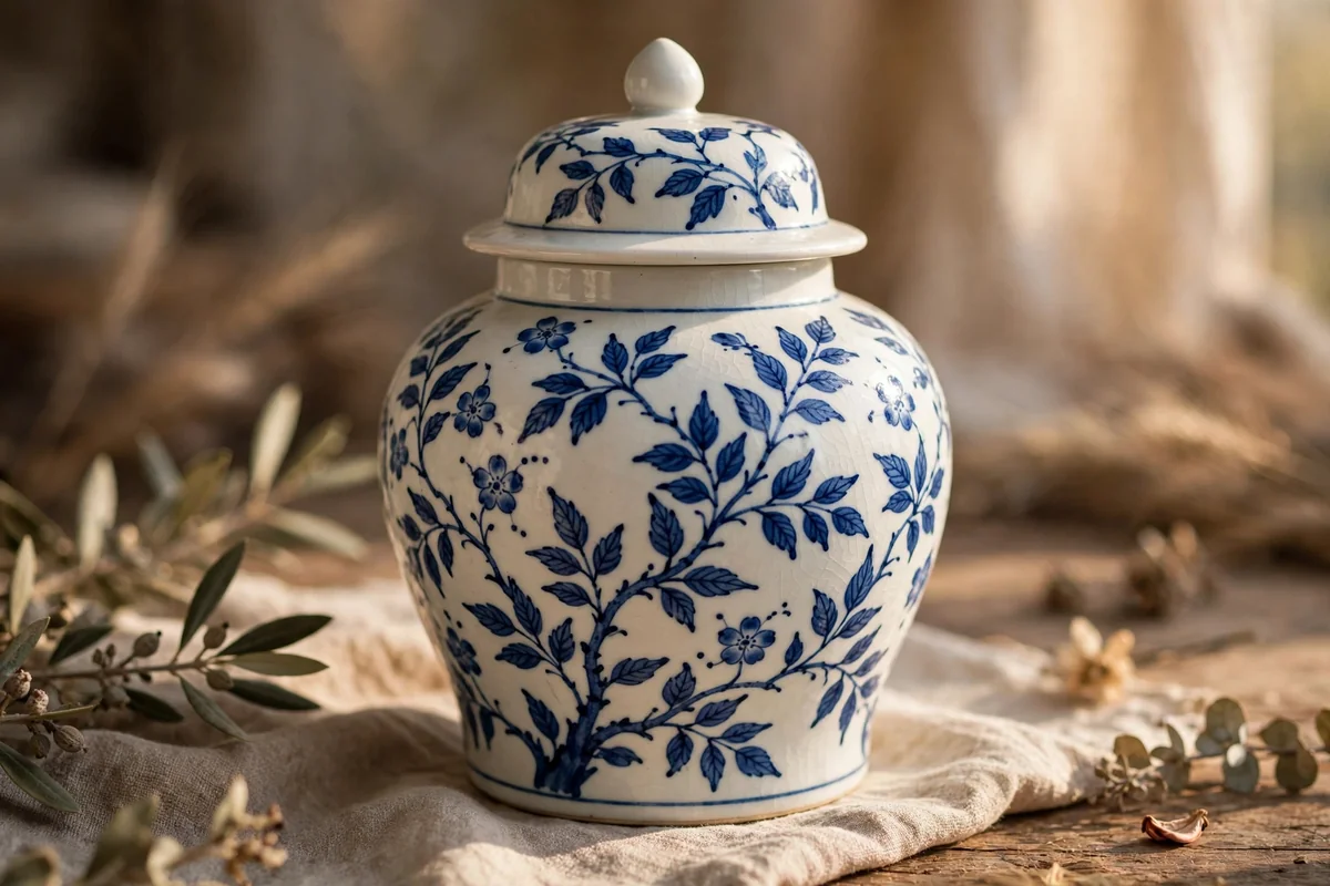
Blue on white pottery has been loved for centuries because it is fresh, calm and endlessly adaptable. Start with two coats of clean white, then sketch a loose vine in pencil, letting it wander around the jar rather than marching in straight lines. Paint leaves and small five petal flowers in cobalt with a fine round brush, size two or four.
Keep the blue slightly varied by mixing a drop of white into some leaves and a drop of black into others, because flat, identical colour looks printed rather than painted. Wonderful mistakes are part of the charm here: a wobbly stem reads as handcrafted, not wrong. Seal with a satin clear coat once the design has dried overnight, and display the jar where daylight can enjoy it.
3. Oatmeal Speckle That Imitates Stoneware
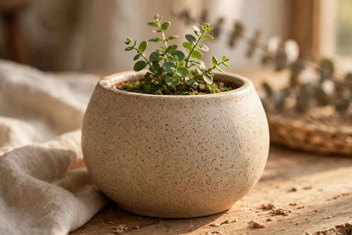
Handmade stoneware owes much of its charm to tiny dark speckles scattered through the clay, and you can borrow the effect with paint. Cover the piece in warm oatmeal or greige, two coats, then dip an old toothbrush in thinned dark brown paint. Run a thumb across the bristles a hand’s width above the surface to flick on a fine, uneven speckle.
Practise on paper first, because the difference between elegant speckle and accidental splatter is distance and a light thumb. Aim for a scattering you can count, not a storm. This finish is especially kind to planters, utensil crocks and bowls, and it hides everyday marks gracefully. Seal with a matte or satin coat so the stoneware illusion stays soft rather than shiny.
4. A Single Charcoal Line, Nothing More
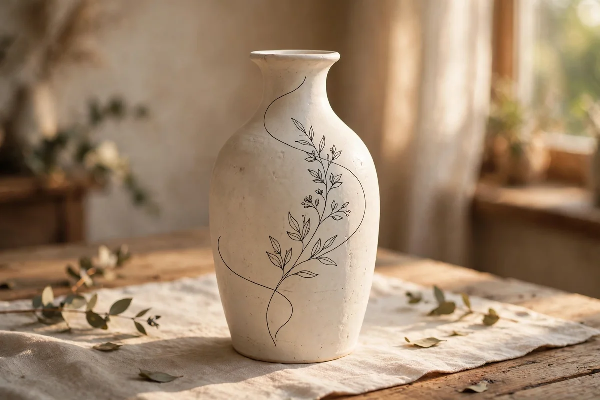
Restraint can be a whole design. Paint the piece soft off white or warm cream and let it dry completely, then draw one continuous charcoal line: a stem with three leaves, a gentle arch, a simple spiral. Use a fine liner brush or an acrylic paint pen, and work slowly in one confident pass, turning the pot rather than your wrist.
The secret is everything you leave empty. Bare space makes the single line feel deliberate and gallery calm, while a second and third line quickly turn it into a doodle. If the line wobbles badly, wipe it off with a damp cotton bud within a minute and begin again. This design suits tall vases and pairs beautifully with plain linen and light wood.
5. Bands of Clay, Sand and Olive
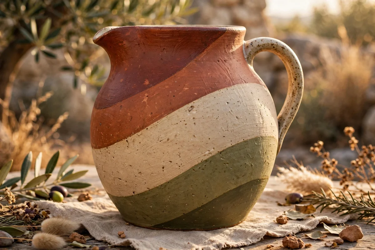
Colour blocking with earthy paint is modern without being cold. Choose three neighbours from the clay family, such as terracotta, sand and muted olive, and divide the piece into two or three broad, gently curved bands. Mark the boundaries lightly in pencil, following the pot’s own silhouette, then paint each band with a flat brush, two coats for an even matte depth.
Curved bands flatter round pottery far better than rigid geometry, because they move with the shape instead of fighting it. Keep the bands uneven in height, perhaps a deep terracotta base, a narrow sand middle and an olive shoulder. A single blocked pot looks handsome; a trio in the same three colours, arranged differently on each, looks like a collected set.
6. Tiny Meadow Flowers on a Cream Pot
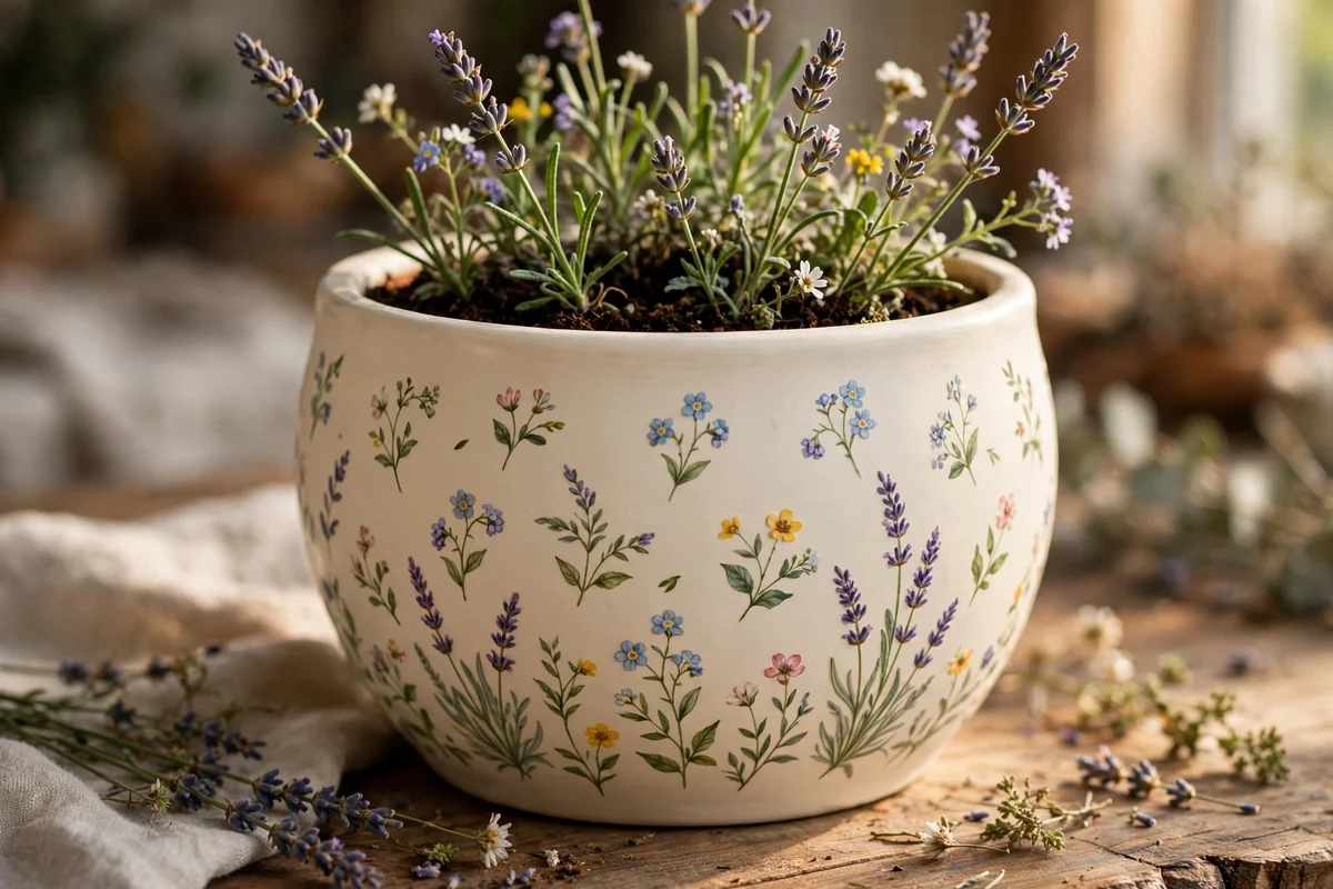
A cream flower pot scattered with tiny meadow blooms is spring in miniature. Paint the pot a warm cream and let it dry, then dot in miniature daisies, lavender spikes, buttercups and single leaves with the tip of a small round brush. Keep each flower no bigger than a fingernail, and space them unevenly, as if they grew rather than being arranged.
Leave generous cream space between clusters so the design stays airy and the pot itself remains part of the picture. Pastel petals with mustard centres and sage stems keep the mood gentle. This style is perfect for herb pots on a kitchen sill, and a matte seal protects it from watering splashes. Group three pots with different flower mixes for a small indoor meadow.
7. Feathered Faux Marble Veins
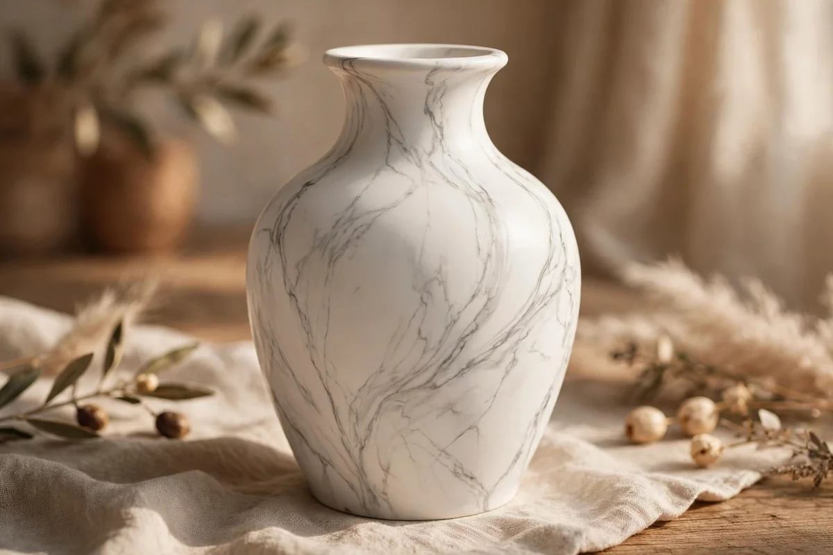
Marble veining rewards a light touch and punishes a heavy one. Begin with two coats of bright white with a satin finish. Thin soft grey paint with water until it behaves like weak tea, then draw a few wandering veins with the very tip of a fine brush, letting them branch, narrow and fade the way real stone does. Three to five veins per side is plenty.
While a vein is wet, soften its edges with a dry feather or a barely damp brush dragged alongside it; hard edges are what give faux marble away. Add one faint warm beige vein for depth if you like. Finish with a satin or gloss clear coat, since polish is part of marble’s character, and keep the piece for decoration rather than daily washing.
8. One Fine Gold Rim on Warm Ivory
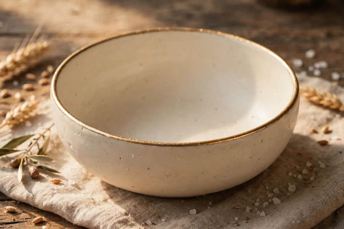
Sometimes a single line of gold does more than a whole pattern. Paint the piece warm ivory, stone or soft beige in a matte finish, two careful coats, and let it cure overnight. Then, with a steady hand and a fine liner brush, run one narrow band of metallic gold around the rim, turning the piece slowly on a lazy Susan if you have one.
Keep the gold to that one gesture. A rim, a foot line or a single stripe near the base is refined; gold patterns, dots and extra flourishes quickly turn theatrical. Metallic paint shows brush marks, so load the brush evenly and work in one direction. Bowls, mugs used for decoration, planters and vases all take this treatment gracefully, and the effect pairs with almost everything.
9. Washed Florals in Blush and Sage
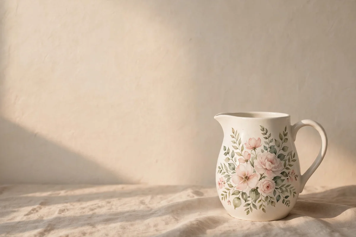
Watercolour style florals are painted with water as much as with pigment. Thin acrylic with water until it flows like milk, then lay loose petals in blush, dusty lavender and pale peach, letting colours bleed gently into each other while wet. Add sage leaves in the same washed manner, and stop long before the surface feels full.
Two rules protect the softness: work quickly while each flower is wet, and never outline anything. Hard edges turn washed florals into stickers. Leave wide breathing space around each cluster, especially on pitchers and vases, and let some petals stay pale ghosts of colour. A matte seal keeps the dreamy finish; gloss would sharpen what should stay gentle and faded.
10. A Tile Inspired Band Near the Rim
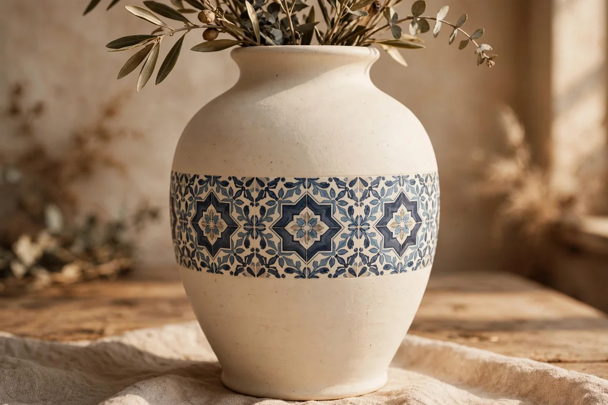
Old Mediterranean and European tiles offer endless small motifs: diamonds, four petal flowers, dots and scrolls. Borrow one or two motifs only, repeat them in a single band around the rim or belly of a cream pot, and paint them in muted navy, dusty blue or olive. A repeated band looks intentional and collected, while an all over pattern often overwhelms a small piece.
Measure the band with a strip of masking tape, divide its length into equal sections with pencil dots, and paint one motif per section. Slight unevenness is welcome; it is the signature of handwork. If a motif defeats you, simplify it to a diamond with a dot, which reads beautifully at shelf distance. Seal in satin so the band feels like part of the pot.
11. Broad Confident Strokes in Warm Neutrals
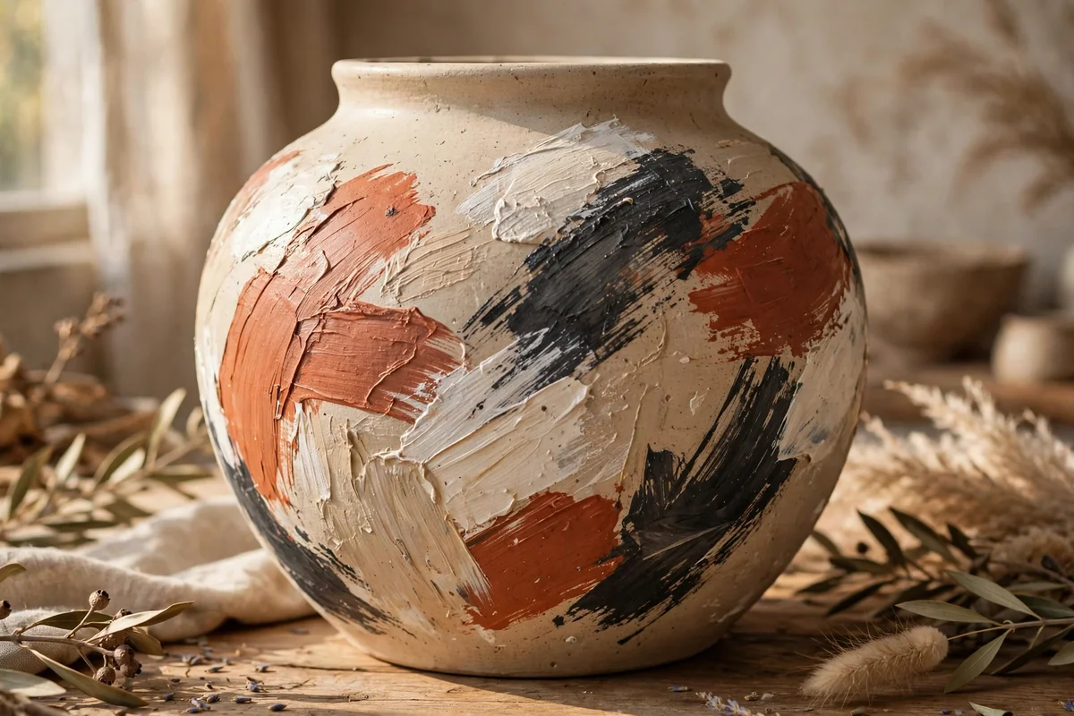
Abstract pottery is made with the arm, not the fingers. Load a wide flat brush with warm neutrals, beige, terracotta, ivory, a little charcoal, and lay down four to six broad, sweeping strokes that follow the curve of the piece. Let the brush texture stay visible and let colours meet without blending them into mud.
The discipline is stopping. Most abstract pieces are spoiled in the second half of the work, when every gap gets filled. Step back after each stroke, turn the pot, and ask whether it needs anything at all. Painted in one calm palette, several abstract pieces group beautifully on a shelf, each different, all related. A matte or satin seal keeps the painterly surface honest.
12. Sponged Layers That Fake a Kiln Glaze
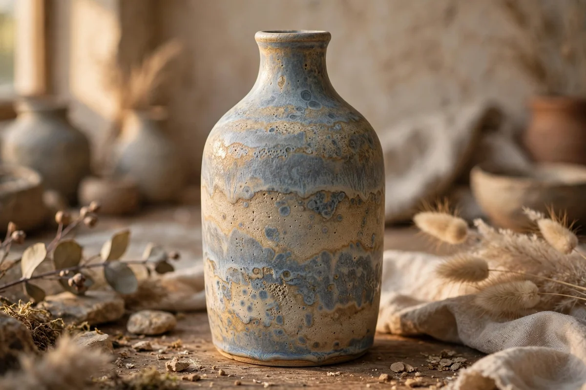
Kiln reactive glazes melt colours into each other, and sponging imitates the effect surprisingly well. Paint a deep base first, slate blue, deep sage or warm brown, and let it dry. Then tear a natural sponge, dip it in a lighter shade, blot most paint off, and dab thin, uneven veils of colour over the base, building two or three layers.
Work from dark to light and leave plenty of base showing in the recesses, because depth comes from contrast, not coverage. A final, very light dab of cream at the rim suggests the way real glaze thins at edges. Satin sealer completes the illusion. This method is wonderfully forgiving, which makes it a good choice for large floor vases and lamp bases.
13. Blue Leaf Motifs, Coastal and Calm
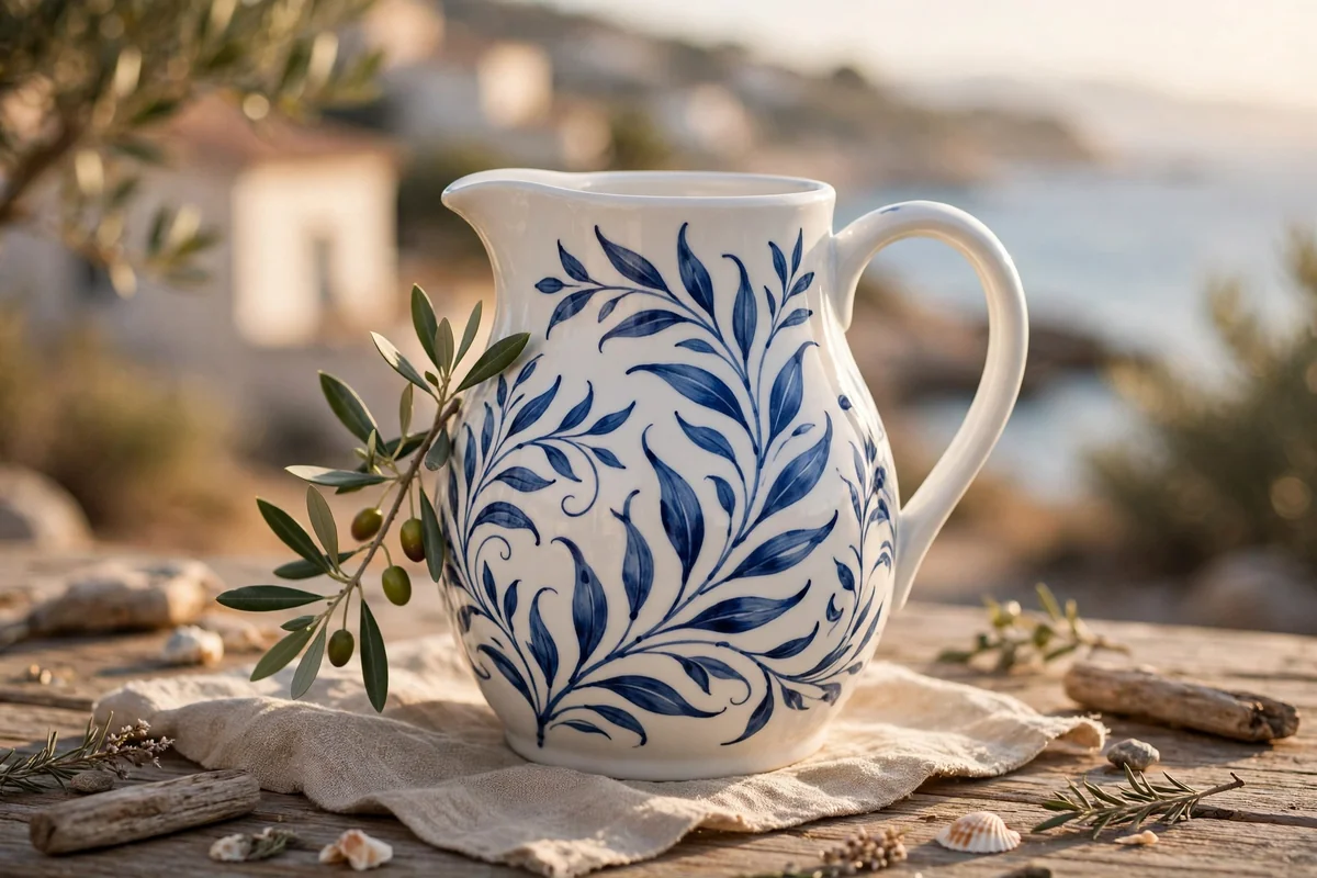
A white pitcher painted with flowing blue leaves feels like sea air in the kitchen. Keep the palette to two blues, a deep cobalt and a softer dusty blue, on a crisp white ground. Paint simple leaf garlands that drift from shoulder to base, alternating the two blues, and add one small olive branch in muted green as an accent if you wish.
Restraint keeps this style elegant: one motif, two blues, plenty of white. If the design starts competing with itself, it has too much in it. Coastal blue pottery sits happily beside natural wood, woven baskets and white linens, and it never really dates. Seal in satin, and remember that painted pitchers are for flowers and display, not for serving drinks, unless certified food safe systems are used.
14. A Slow Ombre from Cream to Stone
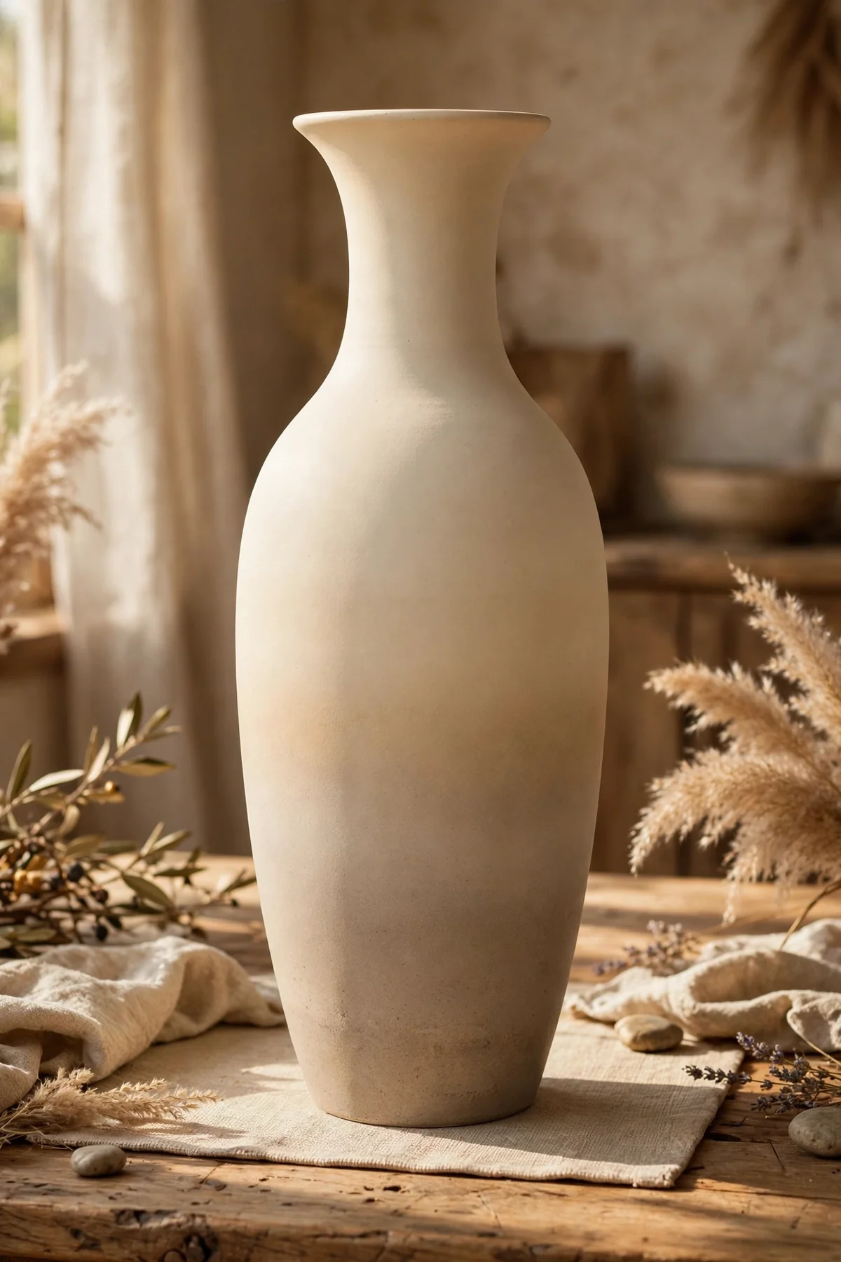
An ombre fade turns a plain tall vase into a quiet statement. Choose two neighbours, cream and stone, or white and pale grey, and paint the top third in the lighter shade and the bottom third in the darker. While both are wet, blend the middle third with a wide, slightly damp brush in horizontal strokes until no hard line remains.
Blend patiently and keep a spray bottle nearby to mist the surface if it dries too fast, since dried edges cannot be rescued. Working wet into wet is the whole technique. Matte finishes flatter ombre because gloss highlights every blend mark. This is a kind design for beginners: no drawing skill is needed, only timing, a wide brush and the confidence to keep stroking until the fade melts together.
15. Nordic Dots and Quiet Geometry
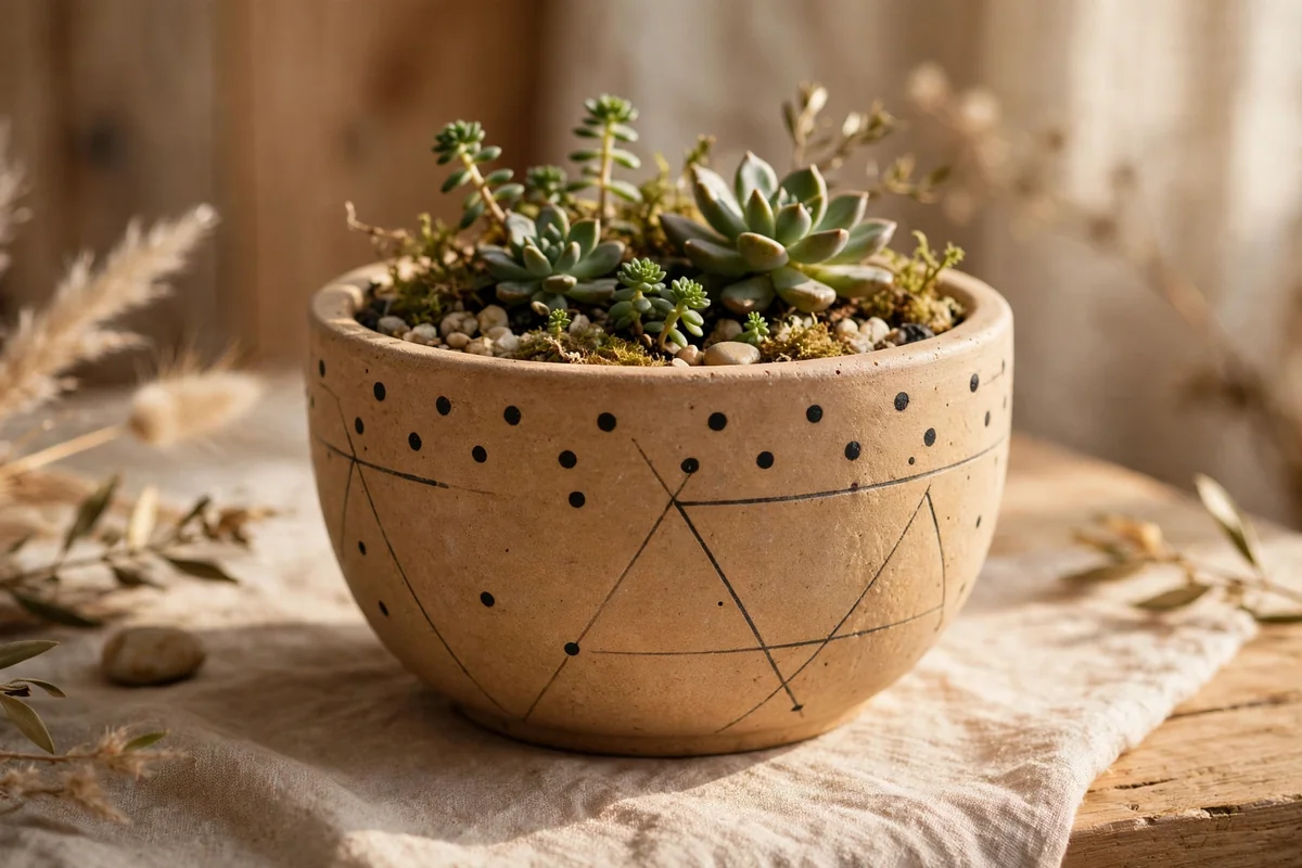
Scandinavian inspired pottery trusts a few marks placed with care. Paint the piece in warm stone, ivory or muted taupe, then add a sparse arrangement in charcoal: a row of small dots around the shoulder, three thin lines, a tiny half circle sun. Use a ruler and pencil to plan positions, but paint freehand so the marks stay human.
Every element needs air around it. If in doubt, remove half of what you planned; Nordic calm lives in the empty space. A paint pen in charcoal makes dots and short lines easier to control than a brush. These pieces settle beautifully into light, uncluttered rooms with pale wood and linen, and they are quick enough to paint as a matching set in one afternoon.
16. One Colour Over Raised Relief
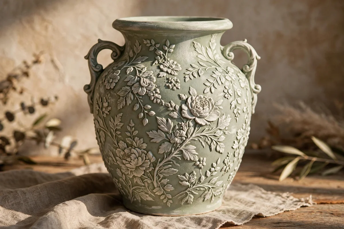
Pottery with raised patterns needs no added design at all; it needs one colour and light. Cover an embossed urn, jar or planter entirely in a single shade, sage, warm grey, soft ivory or muted clay, using two thin coats so paint does not pool in the details and drown them. The relief itself becomes the decoration.
When the colour is fully dry, dry brush a lighter tint of the same colour across the raised areas only, barely touching the surface. Light gathers on the pattern while the recesses stay deeper, giving a layered, carved look from a single pot of paint. This is the quickest transformation in this whole collection, and one of the most elegant on a mantel or shelf.
17. A Winding Olive Branch
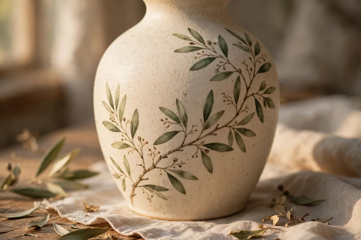
The olive branch is a forgiving motif, because its leaves are simple almond shapes along a curving stem. On a warm ivory or stone ground, draw one stem that winds slowly around the vase, then paint paired leaves in two muted greens, larger near the base of the branch and smaller towards its tip. Leave the spaces between branches empty and calm.
Paint the stem in soft brown with a liner brush, and do not worry about perfect symmetry; real branches are lopsided in the most graceful way. If a leaf lands wrong, wipe it away while wet and repaint it once. This design carries a timeless, gathered from the countryside feeling, and it pairs with natural linen, aged wood and terracotta like an old friend.
18. A Terracotta Dip at the Base
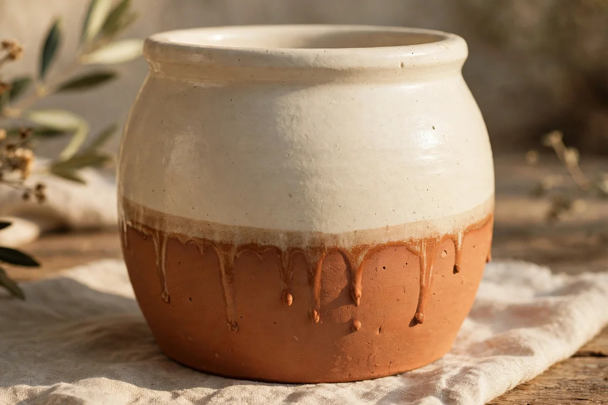
Dipping gives pottery a dipped in glaze look with almost no skill required. Paint the whole piece cream and let it dry thoroughly. Mark a line about a third of the way up with tape, then either dip the base into a deep container of thinned terracotta paint or paint the lower section with a fully loaded brush, letting one or two natural drips run upward.
Remove the tape while the paint is still slightly wet for a clean edge, or skip tape entirely and embrace an uneven, handmade drip line. The two tone effect suits crocks, planters and utensil holders, and it grounds pale pieces that otherwise float in a room. Seal the whole piece, since the dipped area will meet worktop splashes.
19. A Stencilled Border at the Neck
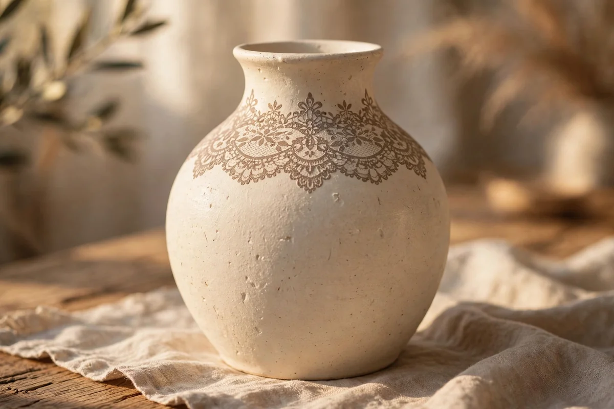
Stencils rescue anyone who loves pattern but distrusts their freehand. Choose a small repeating border stencil, lace inspired, geometric or leafy, and tape it firmly around the neck or rim of a painted pot. Load a stencil brush with soft taupe or dusty blue, blot nearly all the paint off, and pounce gently through the cut outs in thin layers.
A dry brush is the whole secret: wet paint bleeds under stencil edges and ruins the crispness you wanted. Lift the stencil straight up, reposition with a small overlap matched carefully, and continue around. One neat border near the top of an otherwise plain pot looks tailored and expensive, and the technique is just as happy on terracotta flower pots for the garden room.
20. Soft Checkerboard in Sage and Cream
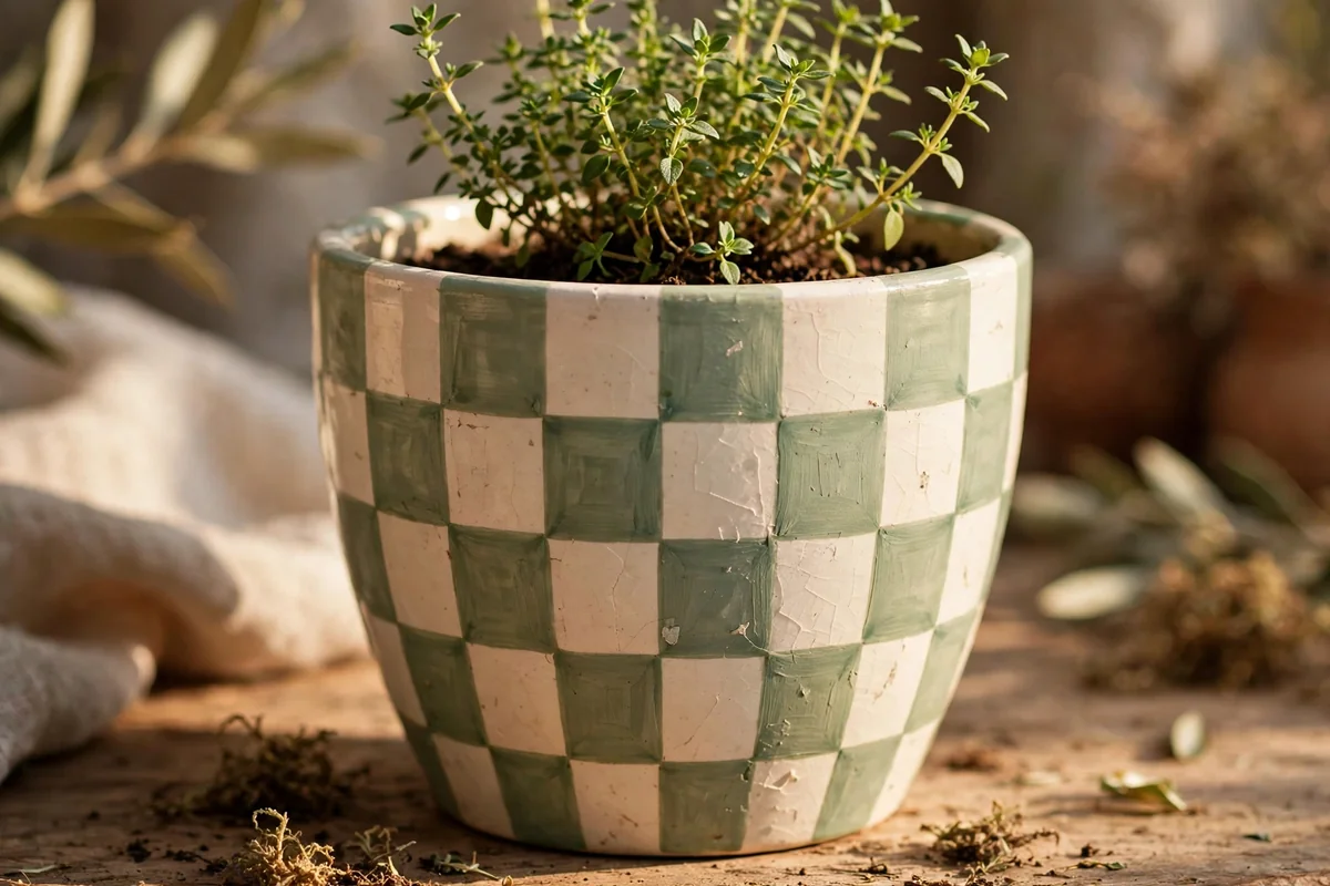
Checkerboard feels cheerful and a little bit country, and it is easier than it looks. Paint the pot cream all over. When dry, wrap two or three horizontal bands of masking tape around it to set your rows, then mark vertical divisions with a soft pencil at even intervals, roughly the width of the rows, so the squares stay honest.
Paint every other square in soft sage with a small flat brush, working row by row and removing tape while the paint is tacky for clean edges. Slight wobbles read as charm at this scale. Herb pots are the natural home for this pattern, and a pair in reversed colours, sage squares on one, cream squares on sage, makes a windowsill set worth smiling at.
21. Honest Stripes with Painter’s Tape
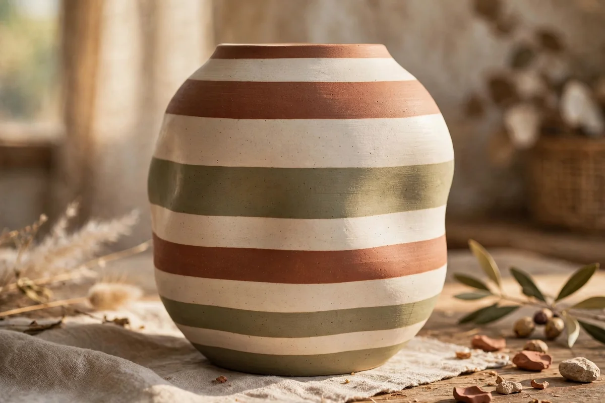
Stripes are the simplest way to give an awkward shaped pot a tidy, deliberate finish. Paint a cream base, then apply painter’s tape in horizontal rings, varying the gaps: wide cream spaces, narrow bands of clay, olive or charcoal. Press tape edges down firmly with a fingernail, especially on curved surfaces, because curves love to let paint creep underneath.
Paint each exposed band with two thin coats and peel the tape away slowly at an angle while the final coat is still slightly wet. Stripes forgive beginners and flatter almost any silhouette, from bud vases to big floor pots. Group striped pots in a shared palette with plain ones between them, so the pattern has room to be enjoyed.
22. A Small Lemon Branch for the Kitchen
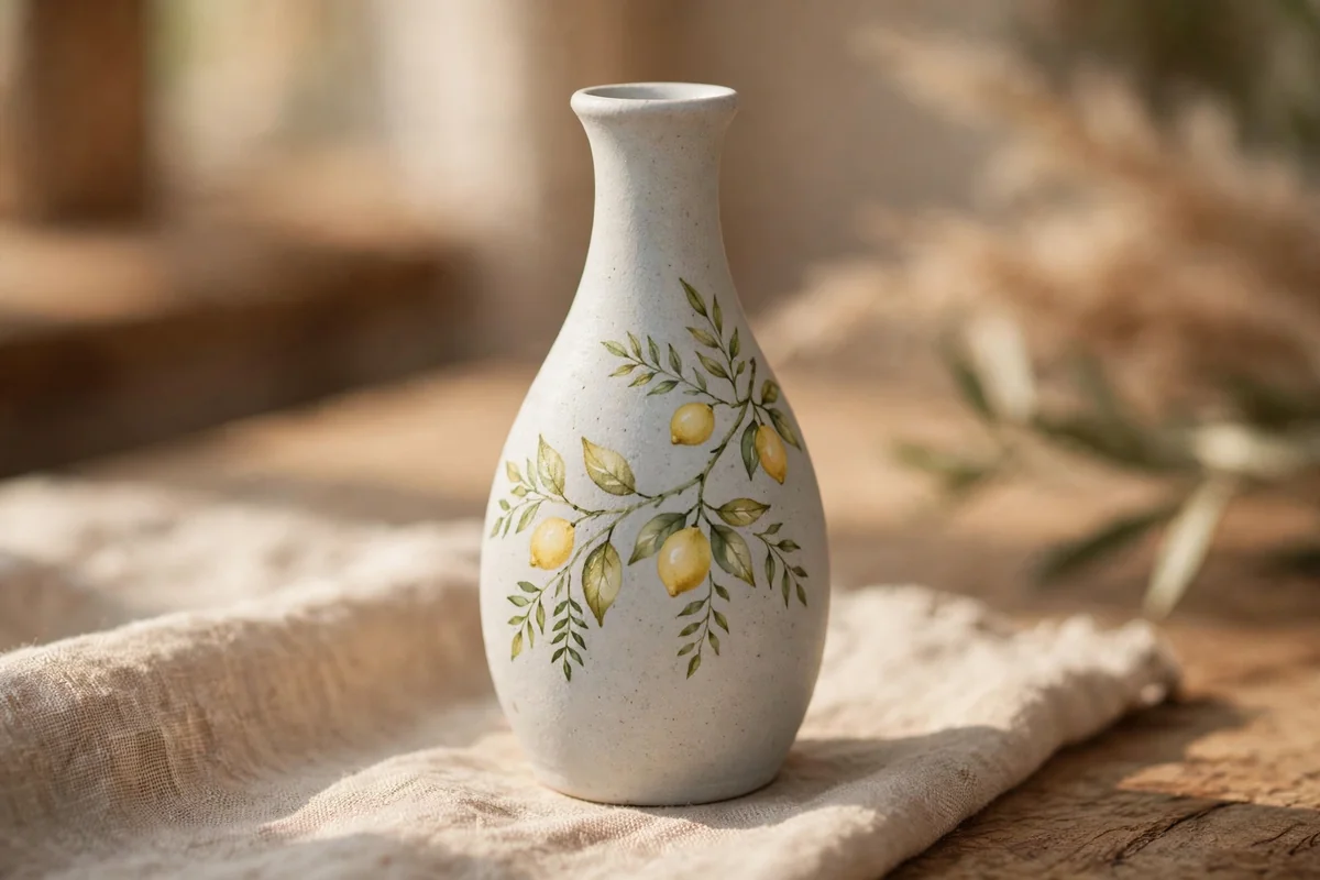
A single lemon branch, two fruits, a few leaves and one blossom, brings kitchen pottery to life without shouting. Work on a pale grey, white or cream ground. Paint lemons as simple ovals in warm yellow with a tiny darker dot at each end, leaves in fresh green, and keep the whole motif small, no larger than your palm, placed off centre.
Small and off centre is what makes fruit motifs look designed rather than decaled. This style suits bud vases, spoon rests used for display, and the front of a utensil crock. Remember the standing rule for kitchen pieces: standard acrylic paint is decorative only. For items that will hold food or drink, use certified food safe products and follow their curing instructions exactly.
23. A Two Tone Mug Pair for Giving
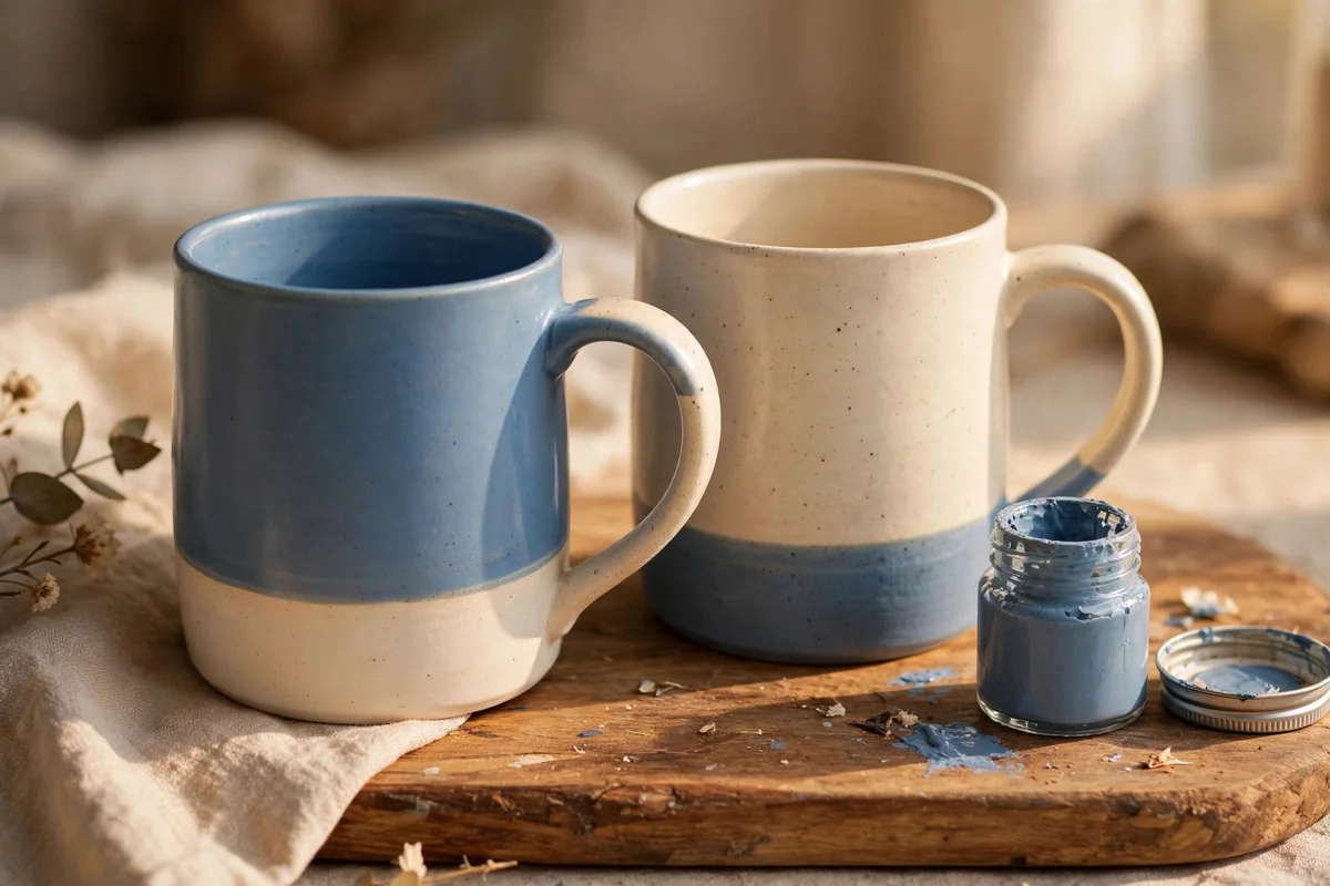
A pair of mugs painted in reversed two tones makes a thoughtful, inexpensive gift. Choose blank ceramic mugs and paint made specifically for ceramics, or use standard acrylic and present the mugs clearly as decorative or for wrapped treats only. Paint one mug dusty blue with a cream band, the other cream with a dusty blue band, so the pair clearly belongs together.
Keep paint away from the rim and the inside, whatever product you use, and follow its curing directions to the letter, whether that means air curing for days or baking at the stated temperature. Hand washing keeps painted mugs looking fresh. Tuck the pair into a small basket with coffee sachets or wrapped sweets, and you have a handmade gift that feels considered rather than costly.
24. Seal It Well and Style It Simply
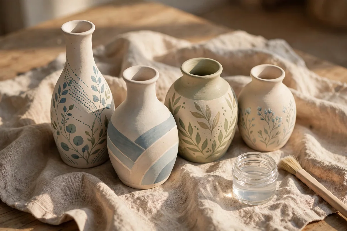
Every painted piece deserves a proper finish, because sealing protects months of pleasure. For decorative pottery, brush or spray on two thin coats of clear acrylic sealer, matte for chalky designs, satin for stoneware and marble effects, gloss only where a glazed look is wanted. Let each coat dry fully, and give the piece a week of gentle handling while the seal cures.
Then style with the same restraint you painted with. Group odd numbers together, three or five pieces, mix heights, and leave space around the group so each shape can breathe. Painted pottery looks its best against quiet backgrounds: linen, pale wood, woven baskets and green leaves. Cared for with a soft dry dusting cloth, your keepsakes will hold their calm for years.
A Few Final Thoughts
Plain clay is patient; it waits quietly on shelves for someone to notice its shape. With clean preparation, thin coats and one of these calm designs, you can turn the plainest pot into a piece that looks gathered over time rather than bought in a hurry. Start with one vase, seal it well, and let it keep you company while you plan the next.
Frequently Asked Questions
What paint works best on pottery?
For decorative pottery, matte and satin acrylics are the friendly workhorses: they cover well, dry quickly and come in every calm colour in this collection. Mineral and chalk style paints give the softest, most stone like finish and need a wax or sealer over them. Whatever you choose, thin coats beat thick ones, and a test patch underneath the base tells you how a colour truly dries before you commit the whole piece.
Do I need to prime pottery before painting?
It depends on the surface. Raw terracotta and unglazed bisque are naturally grippy, so a thorough wash and complete drying is usually enough, though sealing terracotta first stops it drinking your paint. Glossy glazed charity shop pieces are slippery, so scuff them lightly with fine sandpaper, wipe away the dust and use a multi surface primer. That small preparation is the difference between paint that lasts and paint that flakes by spring.
Is painted pottery food safe?
Treat ordinary craft acrylic as decoration only, always. It is not made or tested for contact with food and drink, and painted rims and interiors are especially unsuitable. If you want to paint mugs, bowls or plates for real use, buy products that are certified food safe for ceramics, keep designs where the maker allows, and follow the curing steps, often including baking, exactly as written. When in doubt, let the piece hold flowers instead.
How do I stop paint peeling off plant pots?
Moisture is the usual culprit, because terracotta breathes water from the soil outwards and pushes paint off. Start with a pot that is clean and bone dry, brush sealer over the inside and outside before painting, and use a saucer so the base never sits in water. After painting, apply two coats of sealer, keep the pot out of frost, and lift it rather than dragging it across rough surfaces.
How long should painted pottery dry before use?
Patience at the end protects everything you made. Let each colour coat dry at least an hour before the next, let the finished design rest overnight before sealing, and then give the sealed piece about a week of gentle handling while the finish cures to full hardness. Pieces displayed sooner usually survive, but rings, stacking and washing in that first week are how good work gets quietly damaged.