Living Room
24 Terracotta and Cream Room Ideas Full of Warmth
By Anna Wells · · 20 min read
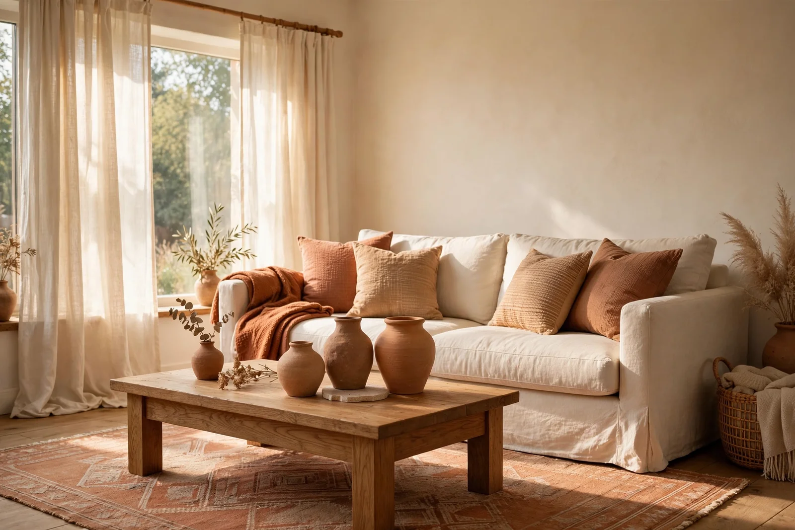
Terracotta and cream is the palette of sun-warmed rooms: baked clay warmth held in check by calm ivory. These 24 ideas show the exact ratio, the paint tricks and the styling moves that keep it rich but never loud.
Morning light moves across a cream sofa and catches the edge of a clay-coloured cushion, and the whole room seems to exhale. That is the quiet promise of terracotta paired with cream: a home that feels sun-warmed even on grey days, without one loud colour taking over. It is a palette that suits family life, quiet evenings and long conversations alike.
The pairing works because terracotta brings the warmth of baked earth while cream keeps the air light and calm. Used with restraint, the combination reads timeless rather than trendy, and it blends easily with oak, wool and linen that many homes already own. You do not need a renovation to begin.
Across these 24 ideas you will find the exact ratio that keeps terracotta an accent, room by room moves for living rooms, bedrooms and dining spaces, paint tricks like the single arch, and the mistakes that flatten the whole look, including the one shade to never mix in. Every idea names sizes, materials and budget-minded steps.
Start where you are. One clay pot, one throw or one painted arch can shift the mood of a room in a single weekend. Read through, mark the ideas that fit your home, and try the easiest one first.
1. Hold Terracotta to a 30 Percent Accent Across the Room
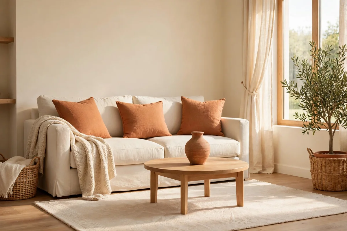
The 70/30 rule is the backbone of this palette. Let cream, soft white and wood cover roughly seventy percent of the surfaces the eye takes in, then spend the remaining thirty percent on terracotta. Judge it loosely by looking at walls, sofa, rug, curtains and the largest pieces, not with a calculator. A cream sofa, cream walls and a pale rug already fill most of the share, so restraint feels natural from the start.
The most common mistake is adding terracotta piece by piece until it silently climbs past half the room. Before buying anything new, list the clay accents you already own: cushions, throws, planters, art and the rug. If the count passes four or five, edit before you add. Budget tip: live with the current mix for a week and photograph the room in daylight, since photos reveal colour balance faster than standing in the space does.
2. Dress a Cream Sofa With Clay Toned Cushions and Throws
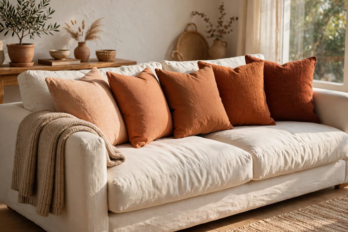
A cream sofa is the ideal canvas for this palette, and cushions do the heavy lifting. Choose three to five cushions in graduated clay tones, from pale apricot to deep baked red, in 45 cm and 50 cm squares, and arrange them from light at the ends to dark in the middle. A woven wool throw in rust, folded once over one arm, adds texture without crowding the seat.
Choose washable cushion covers if children or guests use the sofa daily, since terracotta hides dust but shows crumbs and spills. The mistake to avoid is buying cushions that match each other exactly; near-matching flat colours look staged, while varied tones look gathered over time. Budget tip: plain cream cushions from a charity shop plus new clay-toned covers usually cost less than one designer cushion.
3. Paint Terracotta on the Lower Walls With Cream Above
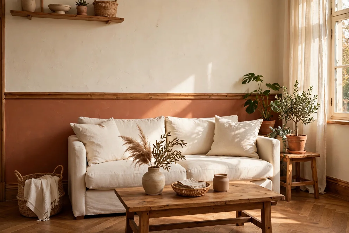
Painting terracotta below a chair rail or dado line, with cream above, gives a room heritage warmth without closing it in. Mark the line at 90 to 110 cm from the floor, mask carefully, and apply two coats of a muted clay paint in an eggshell or matt finish. The cream above keeps the ceiling feeling high, while the lower colour grounds the furniture and hides everyday scuffs beautifully.
This works best where the paint line can run unbroken around most of the room; short jogs at doorways can simply follow the nearest field. The mistake to avoid is choosing a bright, orange-leaning paint, which turns a heritage move into a loud one, so always test a large swatch in daylight first. Budget tip: one 2.5 litre tin usually covers the lower half of an average living room wall run.
4. Frame a Single Painted Arch Behind the Sofa in Clay
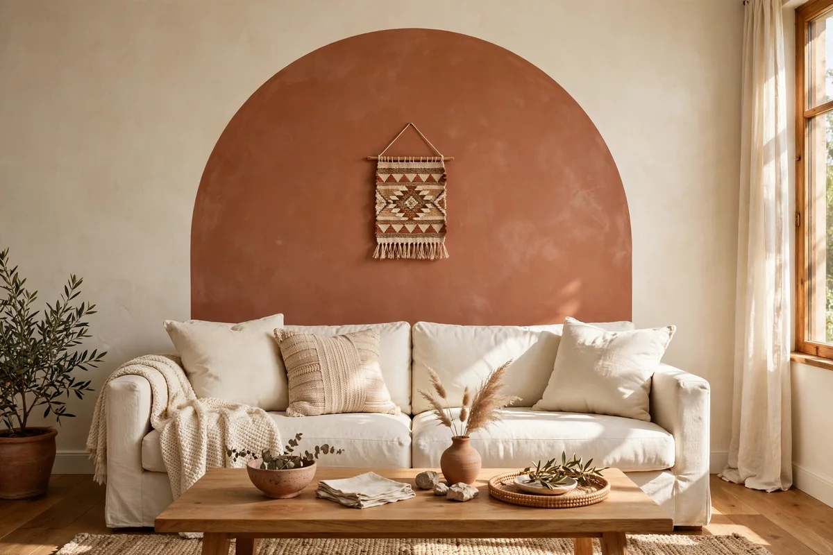
A painted arch behind the sofa is the gentlest way to commit to terracotta on the wall. Use a pencil on a string to draw a soft arch roughly 150 to 200 cm wide, rising to about 30 cm above the sofa back, then fill it with a muted clay paint. The curve softens boxy rooms and draws the eye to the seating, which makes the whole arrangement feel intentional rather than accidental.
Hang one small piece of art or a woven round wall hanging inside the arch rather than across its edge, so the paint reads as a frame. The mistake to avoid is painting the arch too small; a tight arch that hugs the sofa looks like a sticker, while a generous one reads as architecture. Two coats over one weekend, plus a morning to cure, finish the project.
5. Repeat Natural Clay Pots as the Room’s Signature Object
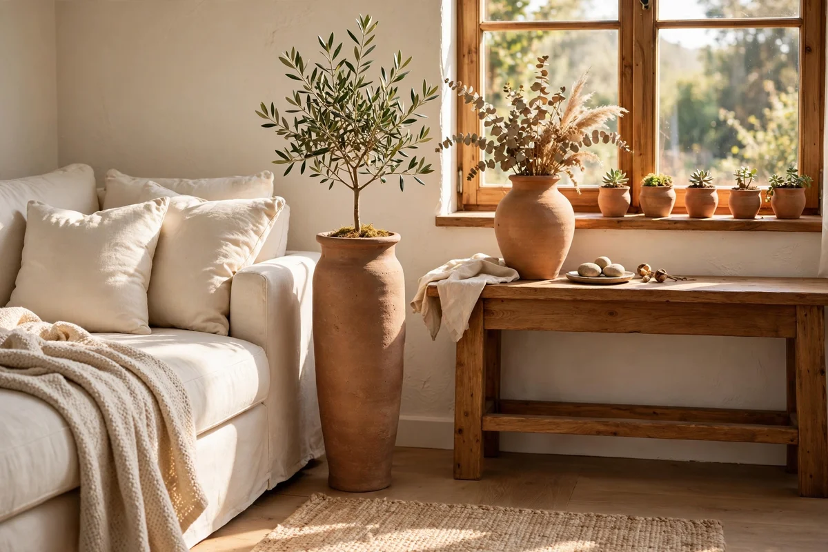
Unglazed clay pots and vases in two or three sizes are the signature object of this palette, and repetition is what makes them read as style rather than clutter. Place a tall floor pot beside the sofa, a medium vase on the console, and small pots on shelves or the windowsill, all in natural terracotta without glaze. The shared material ties the room together more strongly than any single piece could.
Mix heights so the pots read as a rhythm: 60 cm, 40 cm and 25 cm is a pleasing run. Fill some with dried grasses and leave others empty; both work, but avoid filling every pot with live green plants or the warm palette drifts toward botanical. Budget tip: garden centres sell unglazed terracotta far cheaper than decor shops, and a little sanding softens any sharp factory edges.
6. Hang Cream Curtains That Keep the Light Soft
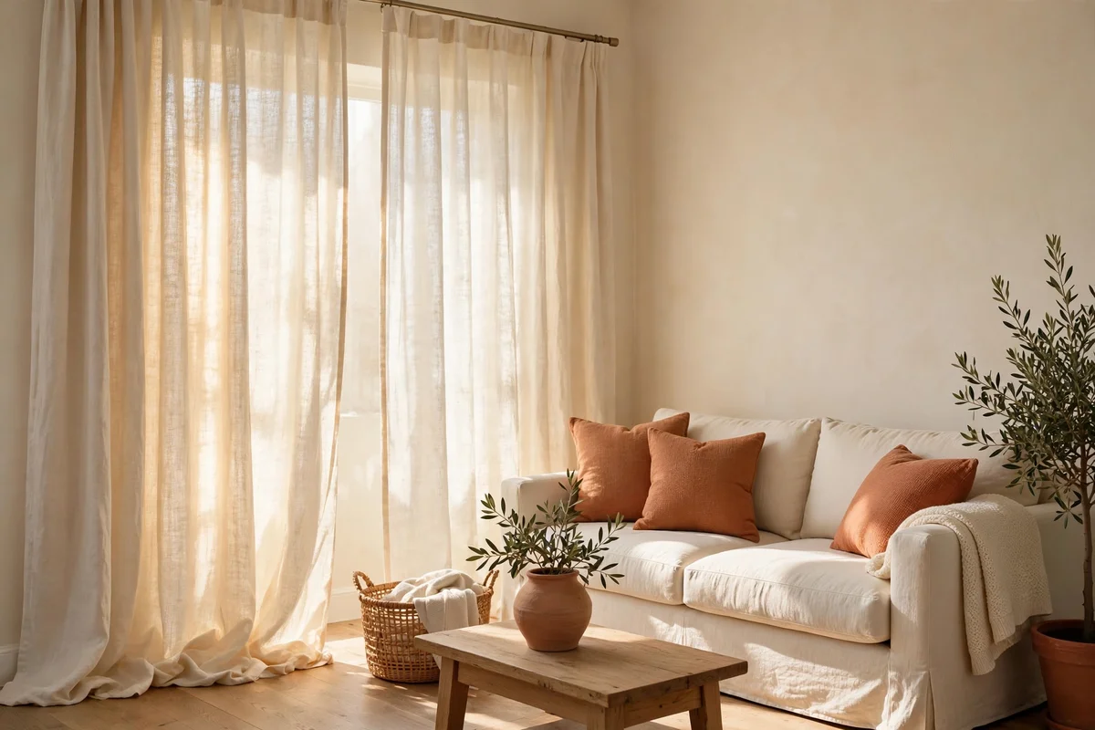
Cream curtains filter daylight into the soft, warm glow this palette needs. Choose linen or a linen blend in warm ivory, hung from a rod 10 to 15 cm above the window frame and extending 15 cm beyond each side, with panels pooling 2 to 3 cm on the floor. The generous width matters: panels drawn half open should still cover the frame edges, which reads calm and finished rather than skimpy.
Washable curtains are worth the small extra cost in family rooms, since cream shows dust and fingerprints sooner than darker fabric. The mistake to avoid is pairing them with stark white walls and cool bulbs, which turns cream grey and dull; warm white bulbs around 2700K keep the fabric luminous. Budget tip: plain cream linen panels are easy to find second hand and steam into shape quickly.
7. Choose Wood Tones That Bridge Terracotta and Cream
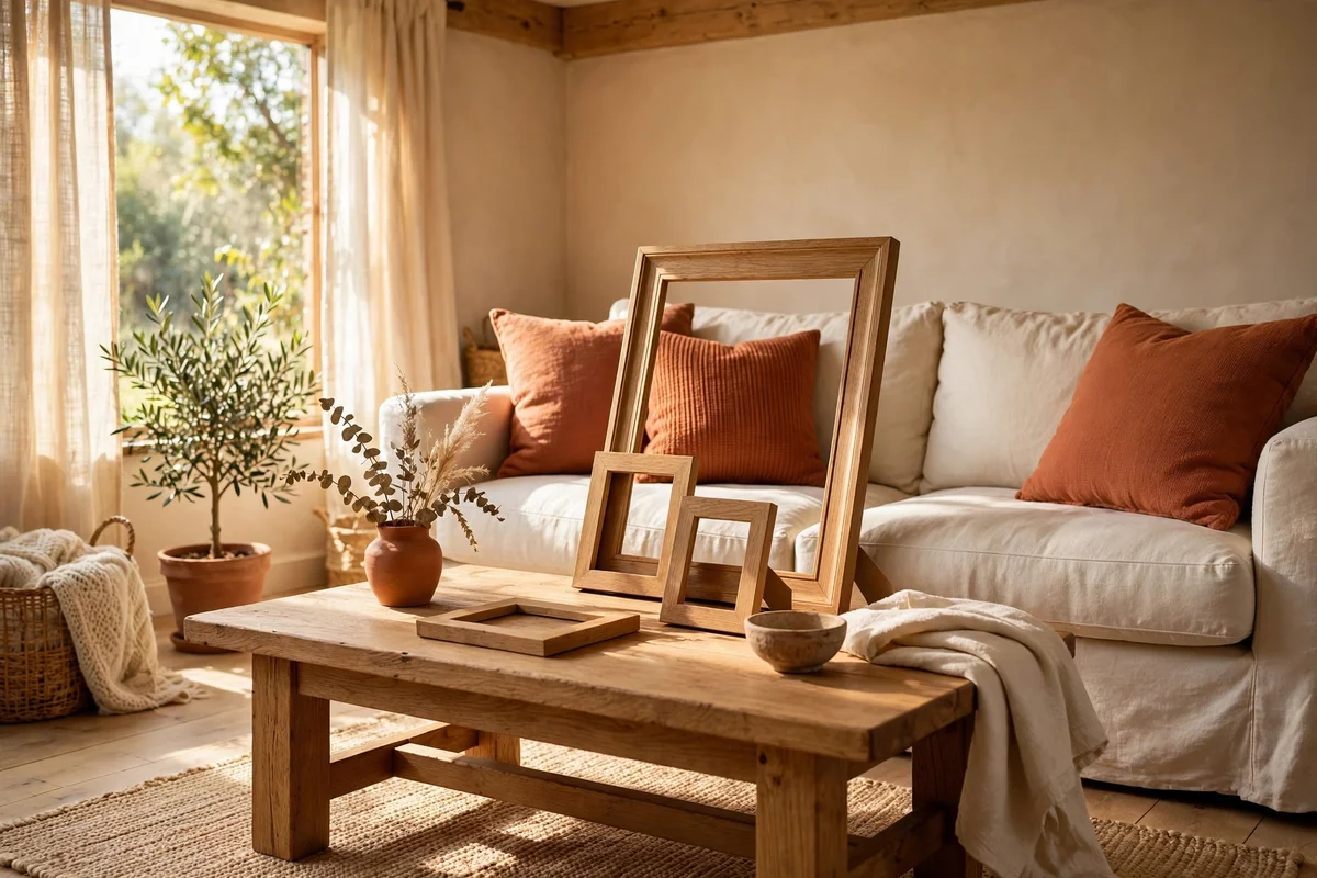
Wood is the bridge that keeps terracotta and cream from feeling like two separate ideas. Medium tones such as oak, walnut and acacia carry honeyed warmth that echoes clay while staying light enough to pair with cream. A coffee table, one shelf and a couple of picture frames in the same wood family give the room a quiet structure, which lets the colours relax against something solid.
Keep to one wood family rather than mixing pale pine with dark walnut, since two strong wood tones fight the same battle the colours are meant to win. The mistake to avoid is orange-stained wood, which doubles the orange in the room and cheapens the whole palette; sand and oil second-hand pieces instead. Budget tip: a clear matt oil revives tired oak for very little money.
8. Anchor the Floor With a Flatweave Rug in Warm Terracotta
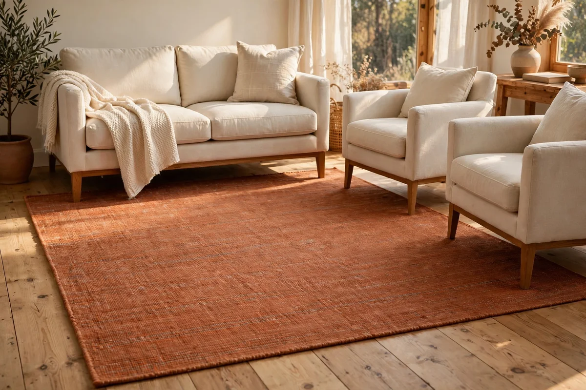
A flatweave rug with a warm terracotta field anchors a cream sofa and cream floor beautifully. Size it so the front legs of the sofa and armchairs sit on the rug, which usually means 160 by 230 cm for a two-seat arrangement or 200 by 300 cm for a larger one. Flatweave is thin, easy to vacuum and forgiving in family rooms, and the pattern can carry cream and clay together in one textile.
Leave at least 30 cm of floor visible around the rug so the room breathes; wall to wall colour under the furniture feels heavy. The mistake to avoid is a rug whose terracotta runs bright orange in daylight, which happens often under shop lighting, so view it at home before removing the tags. Budget tip: cotton flatweaves cost a fraction of wool and wash far more easily.
9. Layer Terracotta Cushions and Throws Over Cream Bedding
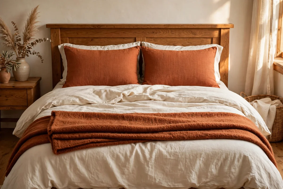
In the bedroom, cream bedding plus two terracotta cushions and one folded throw gives warmth without repainting anything. Start with cream or ivory sheets and a duvet, add two 50 cm clay-toned cushions against the pillows, and fold a rust wool throw across the foot of the bed. The result reads restful rather than decorative, which matters in a room meant for sleep and quiet mornings.
Keep the terracotta to the top layer so it never touches skin directly, since cream cotton sheets stay coolest and most comfortable next to the sleeper. The mistake to avoid is matching the throw exactly to the cushions; one shade deeper or lighter looks collected and calm. Budget tip: changing only cushion covers each season refreshes the whole room cheaply.
10. Style the Mantel With Clay Vases and Cream Candles
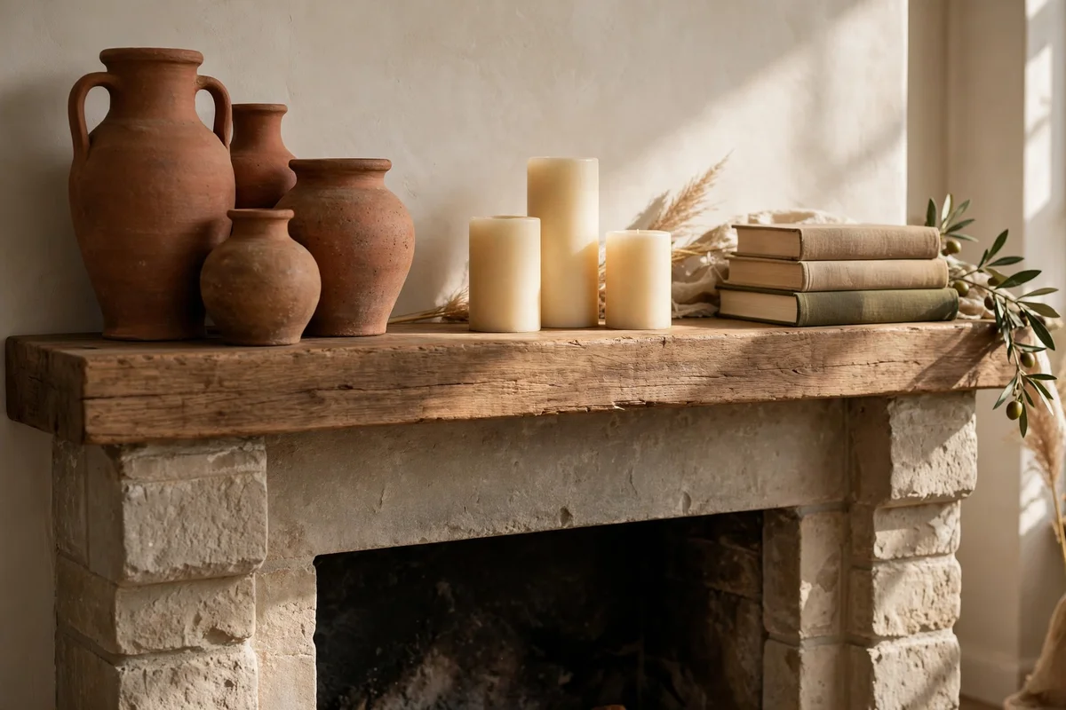
A mantel styled in thirds keeps this palette elegant: clay vases on one side, cream pillar candles of mixed heights in the middle, and a small stack of books or a bowl on the other end. Choose vases 25 to 40 cm tall so they clear the mirror or art above, and keep candle scents subtle for calm evenings. The asymmetry of odd numbers always reads more natural than a mirrored row.
Never leave lit candles unattended, and keep flames at least 10 cm from the shelf above or any dried decoration. The mistake to avoid is crowding the mantel with every clay piece you own; five to seven objects is the comfortable maximum for a 120 cm mantel. Budget tip: unglazed vases from craft markets cost little and look handmade in the best way.
11. Set a Clay Planter Group Beside the Reading Chair
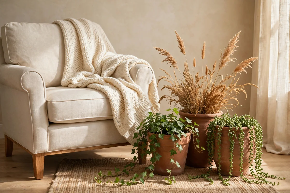
A reading corner gains instant warmth from three clay planters clustered beside the chair. Use pots of 20, 28 and 36 cm in plain terracotta, one with a trailing plant, one with dried grasses and one left empty to vary the texture. Sit them on a small wooden stool or a woven mat so the floor stays clean, and keep the group tight: the outer edges should span no more than 60 cm for a composed cluster.
If the chair sits near a radiator, choose heat-tolerant plants or dried stems, since constant warmth dries soil fast. The mistake to avoid is scattering single pots around the room instead of grouping them; one pot reads as a leftover, while three read as a decision. Budget tip: divide one healthy plant into three pots rather than buying three new ones.
12. Warm the Dining Table With a Terracotta Runner and Cream Linen
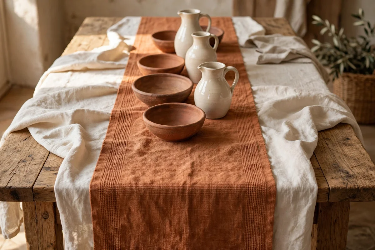
A terracotta table runner down the middle of a wooden dining table brings the palette into the dining space with zero commitment. Choose a runner 30 to 40 cm wide that overhangs each end by 20 to 30 cm, and layer it over a cream or natural linen tablecloth. The runner carries clay down the centre while cream linen softens the edges, which looks beautiful set for family gatherings.
Pick a washable cotton or linen runner if the table hosts daily meals, since terracotta shows oily marks clearly. The mistake to avoid is a runner so wide it crowds the place settings; diners need about 60 cm of width each for plates and glasses. Budget tip: a length of clay-coloured linen from a fabric shop, hemmed at home, costs less than a ready-made runner.
13. Line Open Shelves With Clay Bowls and Cream Jugs
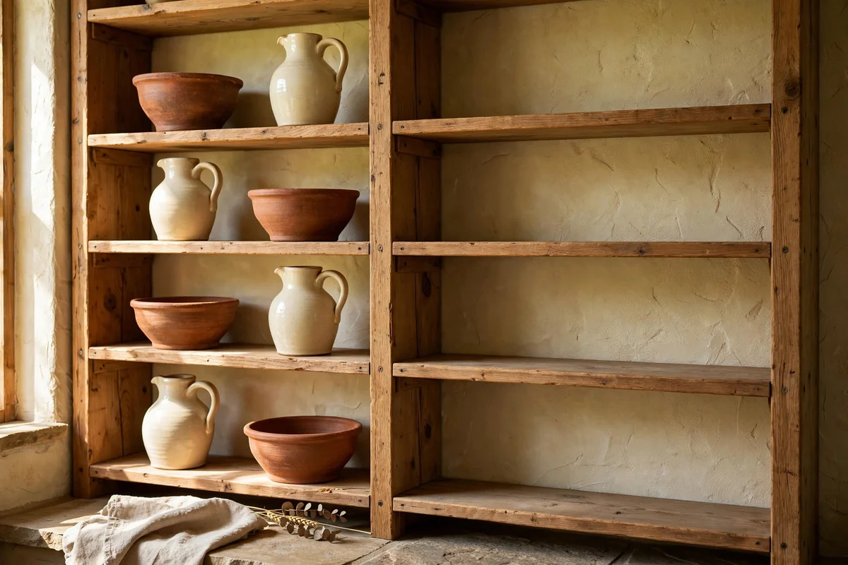
Open kitchen or dining shelves look collected when clay bowls and cream jugs alternate along them. Place everyday bowls in warm terracotta at arm’s reach and reserve the top shelf for a cream jug or two, which draws the eye upward and lightens the display. Leave a third of each shelf empty; breathing room is what separates a styled shelf from a crowded cupboard with its doors removed.
Stack bowls no more than four high so the lowest stays reachable and the stack stays stable. The mistake to avoid is mixing bright orange bowls into the run; they break the muted rhythm and cheapen the clay pieces beside them. Budget tip: handmade-look bowls from discount home stores mix happily with one or two genuine artisan pieces.
14. Paint a Single Terracotta Arch in the Dining Alcove
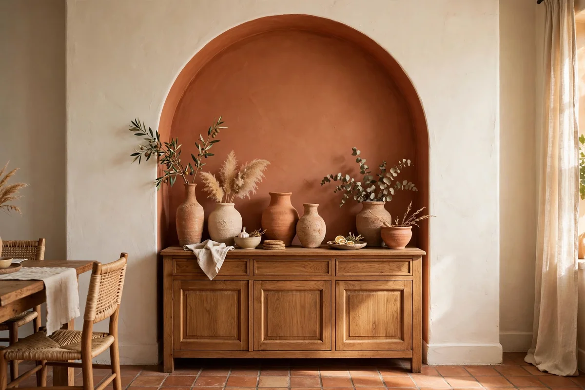
A dining alcove or the wall behind a sideboard takes a painted arch especially well, since the furniture below anchors the shape. Draw the arch to rise just above the tallest item, usually 160 to 180 cm, and fill it with a soft clay paint in a wipeable finish, which matters near food. The curve turns a plain alcove into a backdrop for shared meals, and it needs no art at all to feel finished.
Keep the rest of the dining walls cream so the arch stays the hero; a second painted shape nearby splits attention and weakens both. The mistake to avoid is painting before the sideboard is in place, which risks an arch that sits off centre; position the furniture first, mark the arch around it, then paint. A weekend project, with a small brush for the edges.
15. Drape a Terracotta Throw Over a Cream Armchair
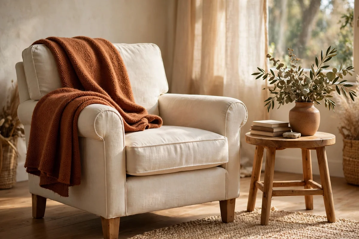
A single rust or clay throw folded over the back of a cream armchair is the quickest win in this whole set. Choose a throw roughly 130 by 180 cm in wool or a wool blend, fold it in thirds lengthwise, and lay it so it drapes evenly over one side of the chair back. The asymmetry looks relaxed and inviting, and the chair becomes the warmest seat in the room in about thirty seconds.
Wash throws before first use, since new wool can shed onto cream upholstery. The mistake to avoid is a throw that matches the wall colour exactly; let it be one shade deeper than the cushions for layered depth. Budget tip: a good throw moves with you from chair to sofa to bed, so spend on the one you will touch daily.
16. Style the Coffee Table With a Clay Tray and Cream Coasters
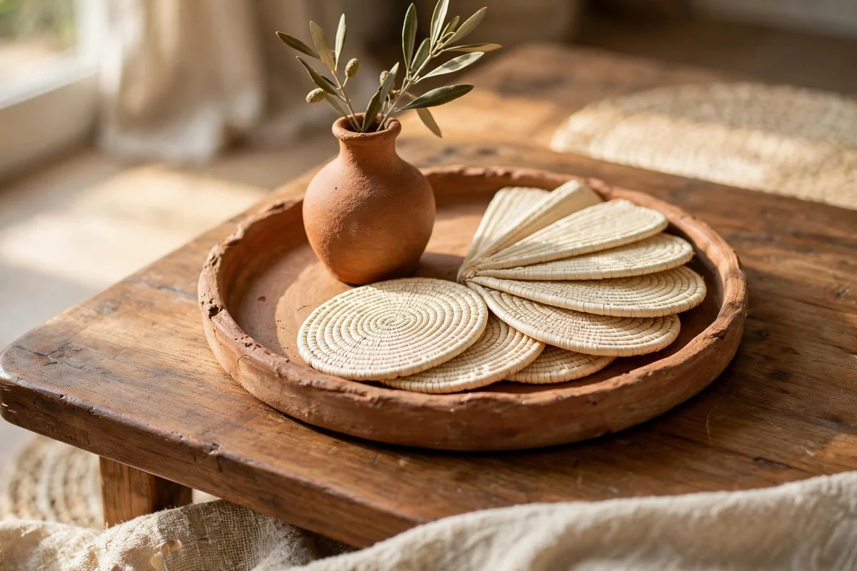
A round clay or wooden tray on the coffee table gathers the palette in one tidy zone. Choose a tray 35 to 45 cm across, set a small terracotta vase or candle on it, and fan four cream coasters beside it. The tray corrals remote controls and small items too, so the table stays calm between uses, which is the real test of a living room that is actually lived in.
Keep the tray’s contents to three items maximum; a tray that overflows becomes a shelf rather than a styling moment. The mistake to avoid is a glass tray, which disappears visually and lets the table look cluttered again; an opaque clay or wood tray holds the composition together. Budget tip: a simple wooden tray finished with clear oil pairs with everything.
17. Hang Double Layered Cream Linen Curtains

Two layers of cream linen, a sheer voile behind a heavier weave, give windows a softness one panel cannot manage. Hang both on a double rod or a rod plus a tension wire, with the sheer 5 cm shorter so it never shows below the main panel. By day the sheers diffuse bright sun into a warm haze; by evening the heavier layer closes for privacy and calm.
This layering suits bedrooms and living rooms where the sun hits directly, since it protects floors and upholstery from fading. The mistake to avoid is mixing a cool white sheer with warm cream linen; the mismatch shows in daylight and muddies the palette. Budget tip: ready-made voiles are inexpensive, so spend the budget on the heavier linen layer.
18. Place Terracotta Pots Along the Fireplace Hearth
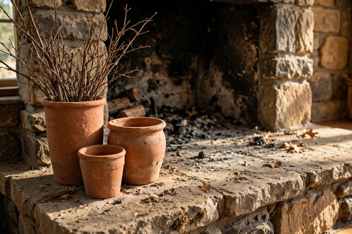
The hearth takes clay beautifully because fire and terracotta share the same earthy language. Set two or three unglazed pots of different heights on one side of the hearth, 35 to 50 cm tall, filled with dried branches or left empty. Keep everything at least 60 cm from the fire opening and clear of the direct heat zone, so soot and sparks never reach the pots.
In summer the same pots hold fresh greenery and keep the fireplace from looking abandoned. The mistake to avoid is symmetrical pairs flanking the firebox, which reads formal and stiff; an odd-numbered group on one side feels relaxed and lets the fire stay the focus. Budget tip: large floor pots are often cheapest at garden centres in spring.
19. Frame Wall Art With Warm Clay Tones on Cream Matting
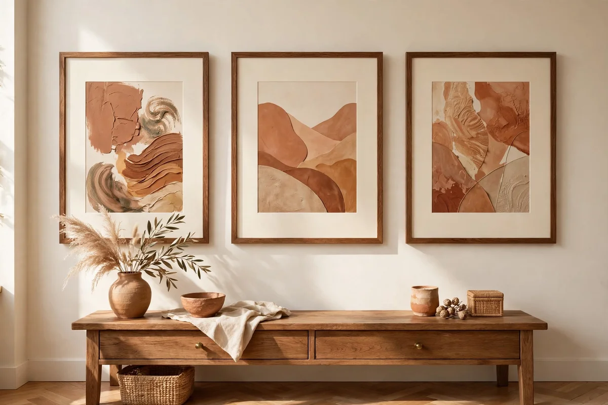
Art with warm clay, ochre or sienna tones, set in wide cream matting, ties the walls to the room’s palette without repainting. Choose frames in medium wood and hang the centre of each piece at 145 to 155 cm from the floor, which suits seated sightlines. The cream mat gives the artwork air and echoes the sofa and curtains, so the wall feels part of the same conversation.
Group three smaller prints in a row with 8 to 10 cm between frames rather than buying one large piece, if the budget is tight; small originals from local makers cost little and feel personal. The mistake to avoid is black frames, which punch holes in a warm palette; wood or brass frames keep the glow. Budget tip: print your own photos of clay landscapes and frame them simply.
20. Style a Terracotta Sideboard With Cream Objects
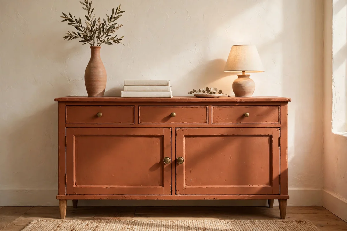
A sideboard painted or stained in muted terracotta becomes a confident anchor in a cream room. Style its top in three zones: a tall clay vase on one end, a low stack of cream books or a bowl in the middle, and a small lamp or candle cluster on the other end. Leave the wall above for one piece of art or a mirror, since the sideboard already carries plenty of colour.
If painting a sideboard feels bold, test the weight of the colour first: style a natural wood sideboard with terracotta objects and cream linen for a week. The mistake to avoid is filling every shelf and surface; a styled sideboard needs one calm zone to let the colour breathe. Budget tip: a second-hand sideboard plus a tin of clay paint transforms for under a hundred.
21. Light Evenings With Terracotta Glass Candle Holders
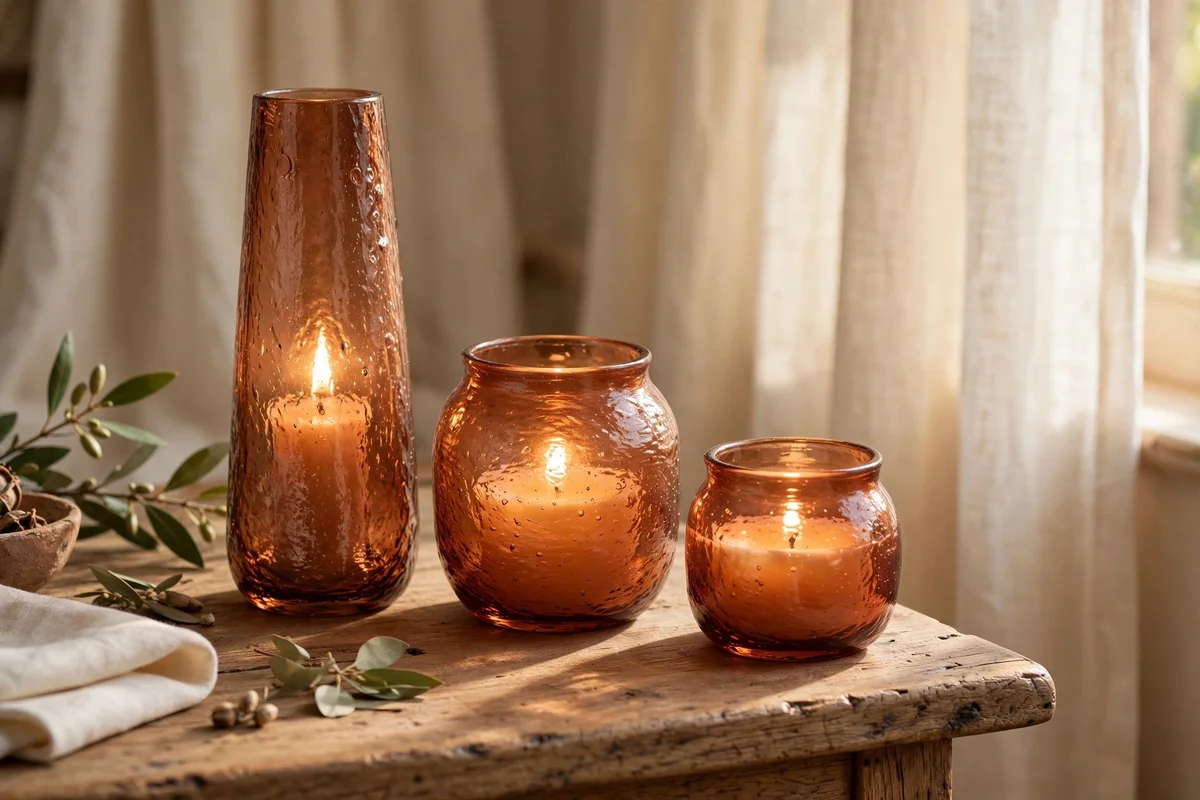
Terracotta-tinted glass holders turn candlelight into a warm amber glow that flatters the whole palette. Group three holders of 10 to 15 cm in different heights on a side table or windowsill, and use real wax candles or good quality flameless ones for safety around children. The tinted glass softens the flame and casts gentle colour onto nearby cream walls, which is evening magic for very little money.
Keep holders away from curtain edges and at least 15 cm from anything flammable when using real flames. The mistake to avoid is mixing the tinted holders with bright orange candles, which pushes the glow from amber to garish; cream or honey-coloured candles keep it refined. Budget tip: small tinted glass holders are among the cheapest ways to change a room’s mood.
22. Keep Bright Orange Out of a Terracotta and Cream Room
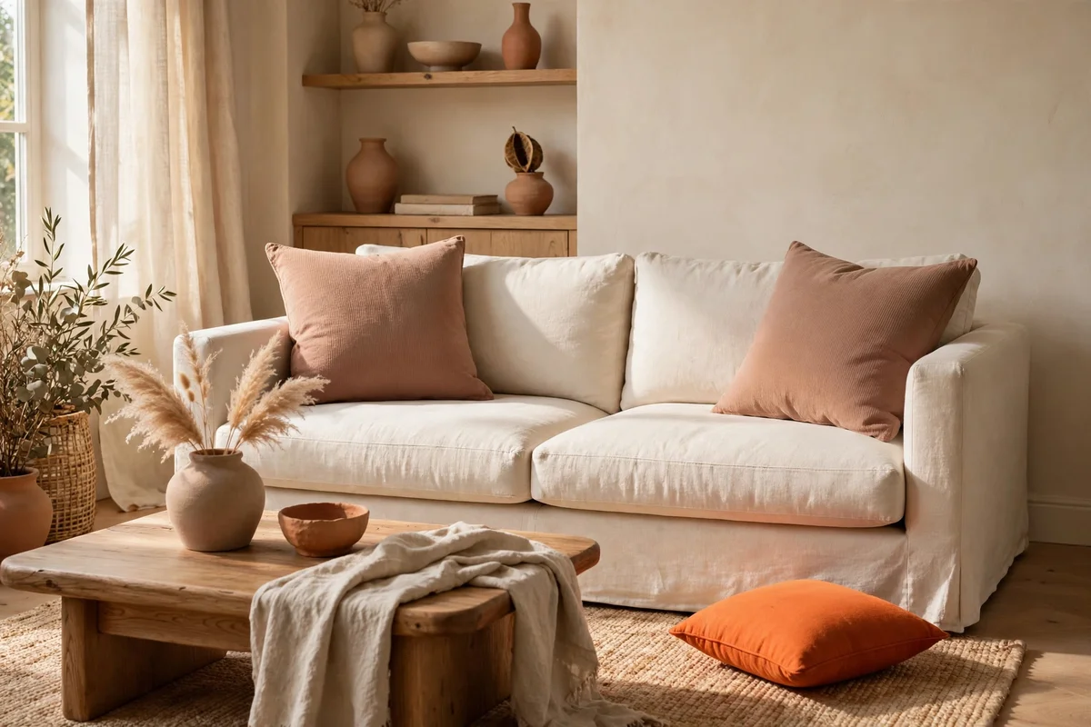
The single fastest way to flatten this palette is letting bright orange in beside terracotta. True terracotta carries brown and rose undertones, while bright orange is pure and vivid; side by side, the orange makes the clay look muddy and the room look loud. Audit cushions, art, books and children’s toys in shared spaces, and relocate the brightest pieces to another room where they can shine on their own.
When shopping, compare new pieces against an existing terracotta item in daylight, not under shop lights, which lie about undertones. The mistake to avoid is assuming one small orange object cannot matter; a single vivid cushion on a cream sofa pulls every eye and resets the whole palette. Budget tip: cream throws and covers hide loud pieces you cannot replace yet.
23. Tune Bulbs and Shades So Terracotta Glows Warm
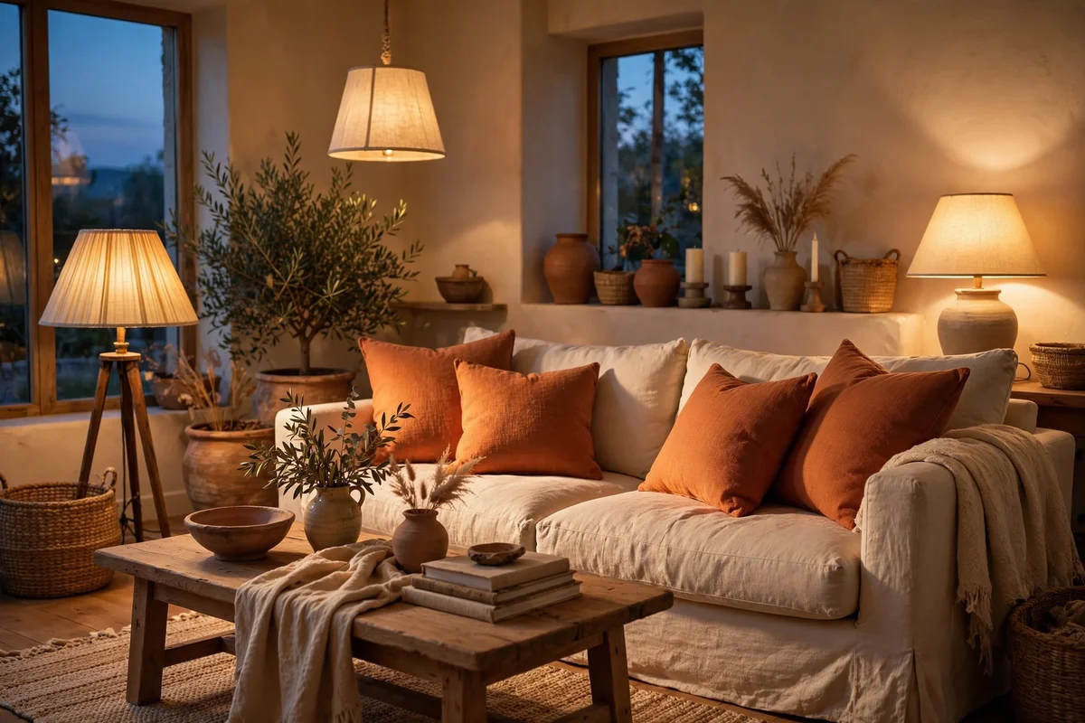
Terracotta only glows when the light is right. Choose bulbs at 2700K or warmer for living and dining spaces, and pair them with cream or linen shades that diffuse the light softly. Test one bulb in the evening before changing them all: under warm light, clay tones deepen and cream stays luminous, while under cool white bulbs the same room can look grey and flat.
Add light at two heights, a floor or table lamp around 120 to 150 cm and a low accent like candles or a small lamp, so the warm colour wraps the room rather than glaring from the ceiling. The mistake to avoid is mixing warm and cool bulbs in one room, which makes neither palette work; change every bulb in the space at once. Budget tip: warm LED bulbs cost little and last for years.
24. Refresh the Room Each Season With Clay and Cream Textiles

The beauty of a textile-led palette is how easily it shifts with the seasons. In autumn, deepen the terracotta with a rust throw and amber cushions; in spring, lighten toward apricot and blush clay while keeping the cream base constant. Store the off-season textiles in a breathable cotton bag in the wardrobe, and the whole room changes mood in an afternoon without spending anything new.
Wash and air throws and cushion covers before storing so they come out fresh next season. The mistake to avoid is buying a whole new set each season; two new cushion covers and one swapped throw are enough to mark the change. Budget tip: end-of-season sales are the moment to buy next year’s heavier wool pieces at half price.
Terracotta and cream ask for restraint more than money. A muted clay accent at about thirty percent, cream doing the quiet work around it, one shared wood tone and a repeated clay object carry the whole look. Whether you painted an arch, hung softer curtains or simply dressed the sofa in clay tones, the rooms that work best are the ones where every piece earns its place.
This week, try the easiest move first: fold one terracotta throw over the cream chair or sofa and live with it for a few days. Notice how the light changes it from morning to evening, and how the room settles around it, then add the next idea only if the room still feels calm. Warm rooms are built one honest layer at a time.
Frequently Asked Questions
What ratio of terracotta to cream works best in a living room?
Aim for roughly 70 percent cream and light neutrals to 30 percent terracotta, counted loosely across walls, furniture and textiles. The cream sofa, walls and curtains carry the space, while terracotta appears in cushions, a throw, the rug and a few clay objects. More than 40 percent terracotta starts to feel heavy, especially in rooms under 200 square feet.
Does terracotta paint work in a small bedroom?
Yes, if you keep it to one feature, such as the wall behind the bed or a painted arch, and leave the other walls cream. Choose a muted, clay-toned paint rather than a bright one, and let daylight do the warming. A 2.5 litre tin usually covers one feature wall in two coats and costs far less than a full room repaint.
How do I stop terracotta from looking like bright orange?
Buy paint and fabric in muted, earthy tones with a brown or rose undertone, and check samples in daylight before committing. Keep bright orange out of the room entirely, since even one vivid cushion can drag the palette toward loud. If a cushion already looks too orange, layer it behind a cream throw so only hints show.
Which wood tones pair best with terracotta and cream?
Medium woods like oak, walnut and acacia bridge the two colours beautifully, since their honey tones echo terracotta without copying it. Very dark stained wood can feel heavy next to clay, while pale pine can wash the room out. Repeat one wood tone two or three times, in a coffee table, frames and a shelf, for a connected look.
Can renters try this palette without painting walls?
Absolutely. Textiles and objects carry the look: clay cushions, a terracotta throw, a cream rug layered over the floor, and groups of clay pots on shelves. A fabric wall hanging or a leaning framed print gives a colour block without touching the walls. When you move, every piece travels with you.