Crafts
25 Cozy Cottage Painting Ideas That Capture Slow Country Mornings
By Anna Wells · · 23 min read
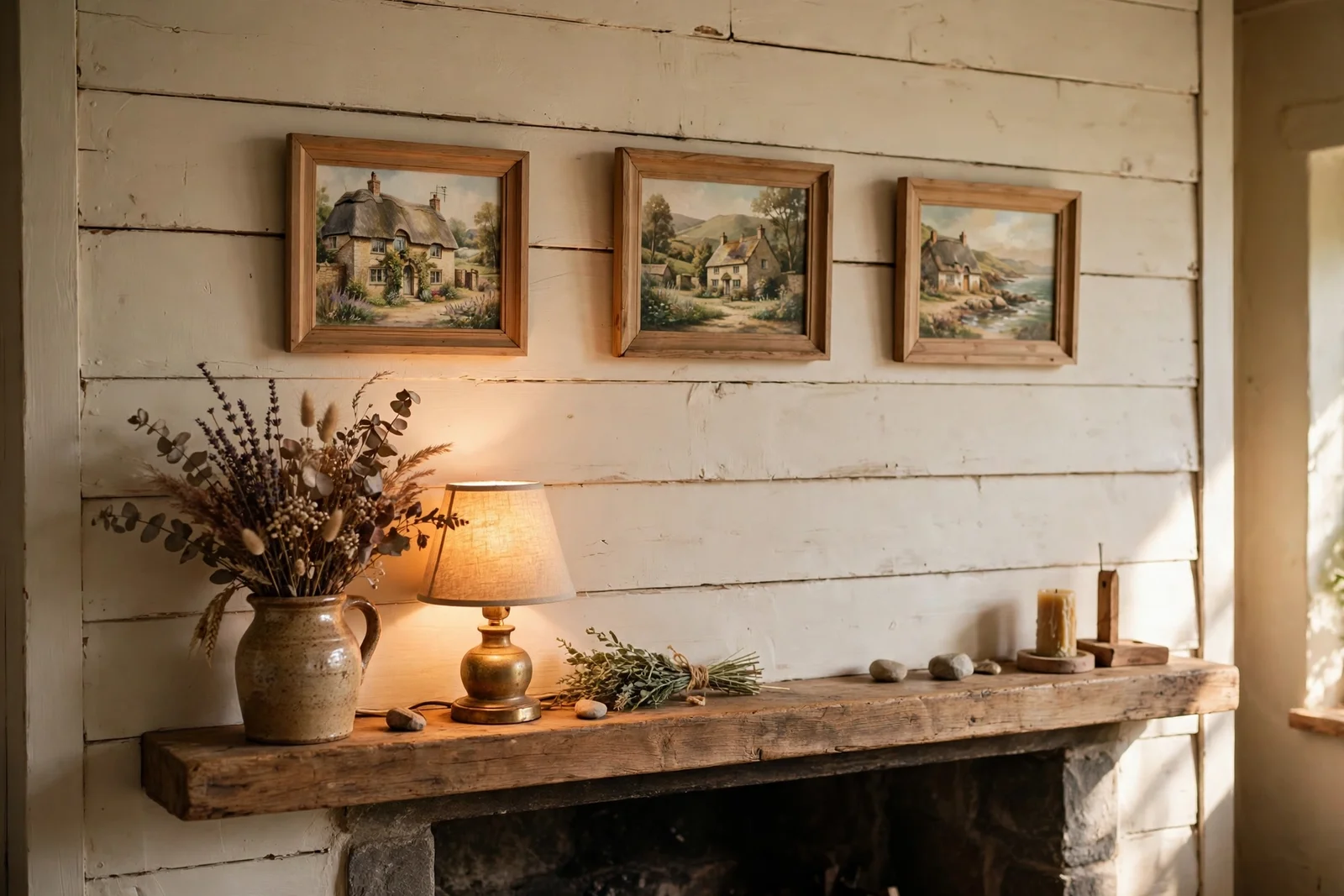
Twenty-five cozy cottage painting ideas, from thatched cottages and kitchen gardens to paint-splattered still lifes, with beginner-friendly palettes, sizes and plain-wood framing.
There is a particular hush on a country morning, when the lane is still empty and the cottage garden holds its breath before the day begins. These 25 painting ideas are built around that feeling. Each one gives you a small, completable scene: a thatched roof, a half-open gate, a jar of brushes on a pine table. Nothing here needs a studio, an easel the size of a door, or years of practice.
The palette stays deliberately narrow. Soft greens for hedgerows and kitchen plots, cream for walls and window frames, dusty rose for climbing blooms. With eight tubes and two brushes you can paint almost everything below. The sizes are shelf-friendly too; most panels measure 20 by 25 cm or 8 by 10 inches, so finished work slips straight into plain wood frames and onto mantels.
Beginners get extra help. Several sections explain compositions you can copy from your own garden or a phone photo: a three-value landscape, a single cottage face-on, a gate cropped close. Others cover the practical side, like which board warps least and how far apart to hang a pair. Work slowly, one idea at a time, and let each small painting teach you the next.
Keep a rag and a jar of water beside you, pick up the largest brush you own, and start with the cottage you can already see in your mind. By the last idea you will have a shelf of finished pieces and the confidence to paint the lane outside your own window.
1. Paint a Small Thatched Cottage With a Crooked Chimney in Watercolour
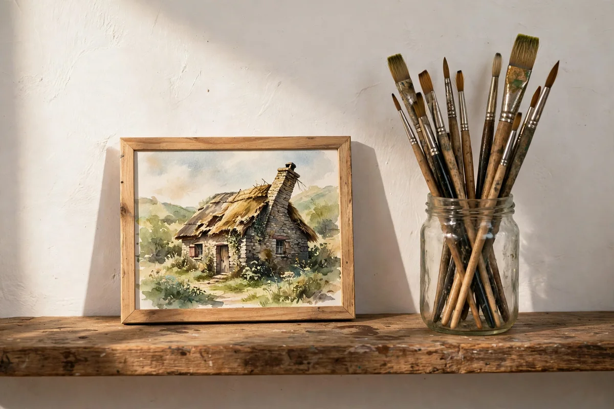
Start with a paper no larger than 30 by 40 cm, roughly 12 by 16 inches, so a beginner finishes in one sitting of about two hours. Sketch the cottage lightly in pencil, keeping the thatch as one big soft shape rather than fussy detail. Mix burnt umber with yellow ochre for the roof and lay a pale wash of sap green behind the walls for foliage. Let layers dry fully between glazes or the cottage will look muddy.
Add the chimney with a slight lean, which is the characterful detail that makes cottages feel real instead of flat. Use a fine round brush, size 4 or 6, for window frames and the door, painting them in cream rather than white so they glow against shadow. Leave one small highlight on the glass unpainted. The mistake to avoid is outlining everything in dark brown first; wash the shapes in gently and lift edges with a damp brush, then frame it in plain pine.
2. Block In a Cottage Garden Border of Hollyhocks and Roses
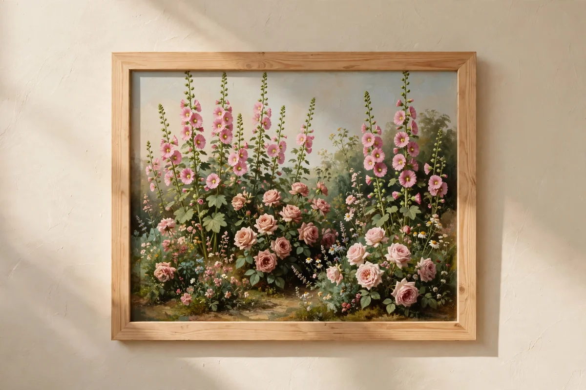
A border study works beautifully at 25 by 30 cm, tall enough for hollyhock stems without shrinking the roses below. Begin with the darkest darks, a mix of sap green and burnt umber for the back hedge, then work forward toward the light. Block roses in with dusty pink dabs of permanent rose mixed with titanium white, using a flat brush turned on its corner. Keep the sky a thin strip at the top, no more than a fifth of the panel, so the planting owns the picture.
Layer three passes on each flower: a soft middle tone, a darker shadow side, then one small lit edge. This three-step rhythm keeps a beginner garden from going flat or overworked. The common mistake is painting every bloom in full detail; leave the outer flowers as simple colour notes and save detail for the central cluster. Acrylic studies can go straight into an open pine frame, while watercolours need glass.
3. Paint a Winding Country Lane With Overhanging Hedgerows
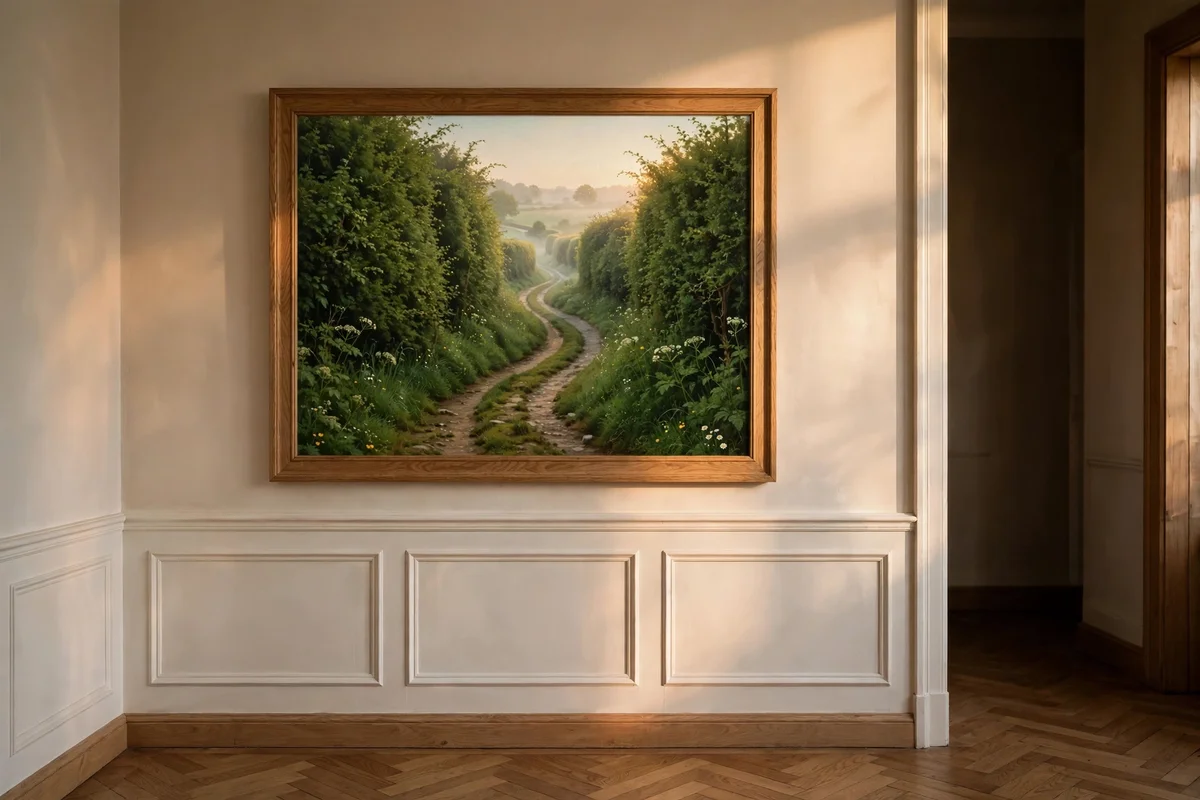
Draw the lane as a pale ribbon that widens toward the viewer, occupying the lower third of a 30 by 40 cm panel. Mix raw sienna with cream for the sunlit track and add burnt umber where wheels have worn darker ruts. Flank it with two hedgerow masses in different greens, one cool and one warm, so the lane reads as a corridor of light. A distant pale gap at the bend pulls the eye gently through the scene.
Keep the far end of the lane almost the colour of the sky, which is how distance works on a misty morning. Use a dry brush dragged sideways for hedge texture rather than dotting hundreds of leaves. The mistake to avoid is centring the lane; offset it to one side for a natural, unposed feel. Hang this one at eye level in a hallway, where the winding path invites a pause, framed in plain oak.
4. Sketch a Kitchen Garden of Neat Vegetable Rows and Bean Wigwams
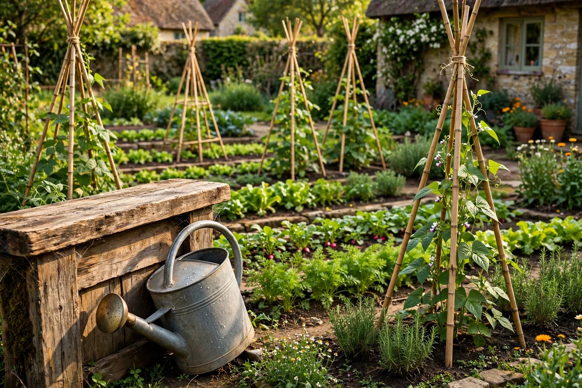
A kitchen garden suits a wide 40 by 30 cm landscape format, giving the rows room to run. Sketch three or four bamboo wigwams as simple tripods first, since they anchor the composition, then rule faint pencil lines for the vegetable rows converging gently toward the horizon. Paint soil in warm burnt sienna washes and keep the greens varied: lettuce rows pale and yellow-green, bean leaves deep and blue-green. A low stone edging along the front adds honest cottage character.
Add small repeated marks for seedlings rather than painting each plant fully, which saves an hour and looks more natural. A watering can left at the row end, painted in soft grey-green, tells a story without a single figure. The mistake to avoid is making every row identical; vary the spacing and let one row wander slightly. This scene needs only earth tones and two greens, so student-grade tubes are plenty.
5. Render a Mossy Dry Stone Wall With Soft Grey Washes
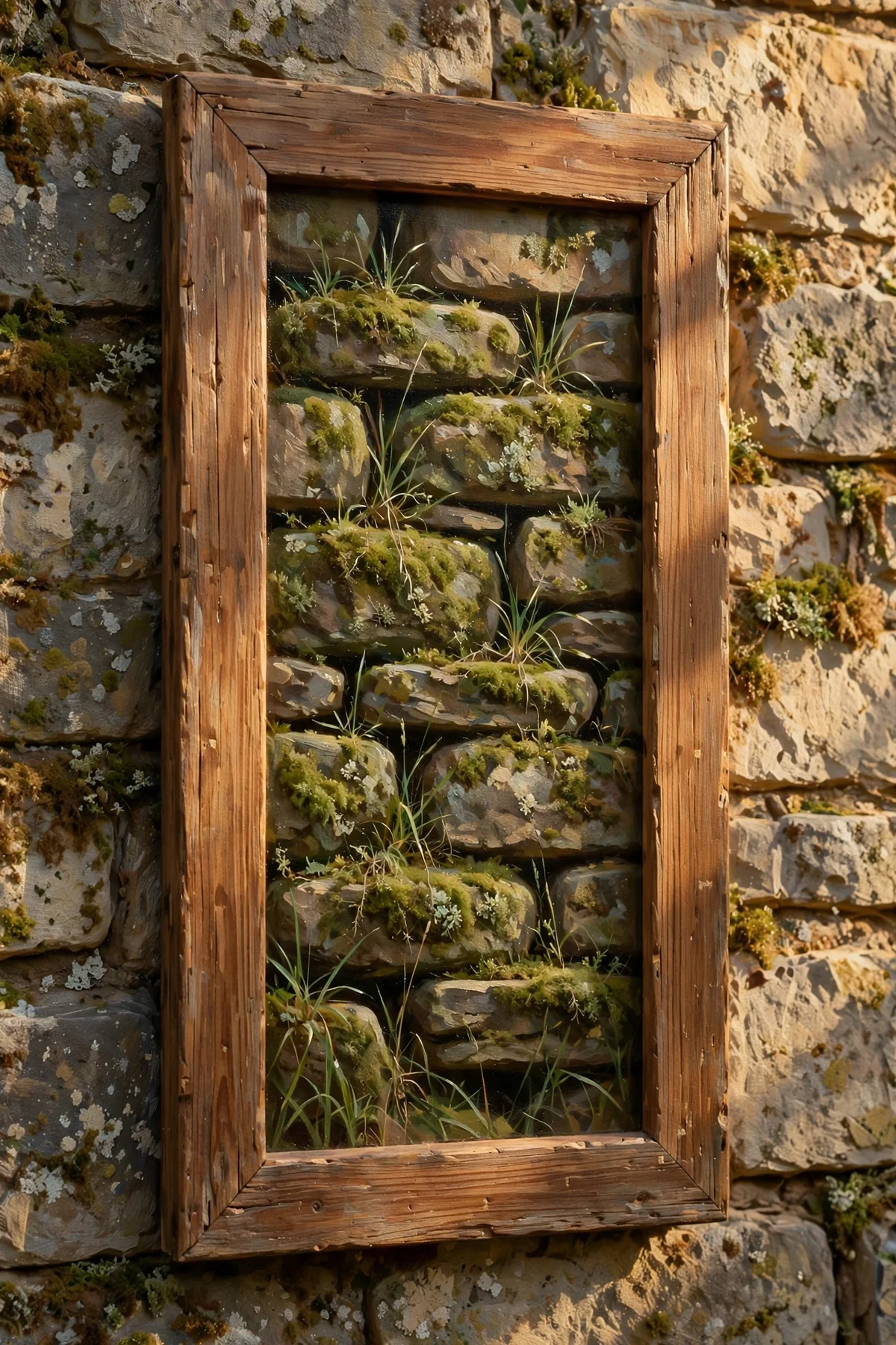
Dry stone walls are a study in patience and a single mixed grey. On a 25 by 35 cm board, lay horizontal courses of stones using a flat 12 mm brush, each stone a short rounded rectangle with a slightly darker gap line beneath. Mix your grey from ultramarine, burnt umber and cream, varying the ratio per course so no two stones match. Dab moss into the crevices with sap green lightened with yellow ochre, keeping it sparse near the top.
Work from the bottom course upward so wet washes never drag down over finished stones. A rigger brush, fine and long, picks out the occasional tall grass blade leaning from a gap. The mistake to avoid is outlining each stone in black; the gaps should stay soft so the wall feels held together by gravity, not mortar. This study frames beautifully in a narrow 3 cm pine moulding.
6. Paint a Weathered Wooden Garden Gate Half Open
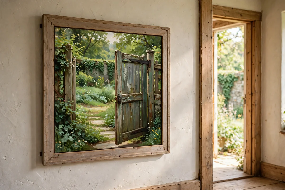
Crop the gate close so it fills the frame at 30 by 30 cm; square formats suit doors and gates perfectly. Paint the weathered wood in layers: a base of warm grey, then dry-brushed streaks of pale cream along the rails where weather has worn it smooth. Leave the gate half open, showing a sliver of brighter garden green beyond, which adds instant depth. The iron hinges and latch go in last, in near-black with one rust-coloured edge.
The diagonal brace across a ledged gate is your compositional gift; it leads the eye from corner to corner. Keep the wood tones quiet and let the garden glimpse carry the colour. The mistake to avoid is painting the gate perfectly straight and new; slight sag, uneven gaps and worn edges are what make it read as a cottage gate. Hang it near an entryway for a welcoming, honest note.
7. Capture a Quiet Rural Scene of Fields at First Light
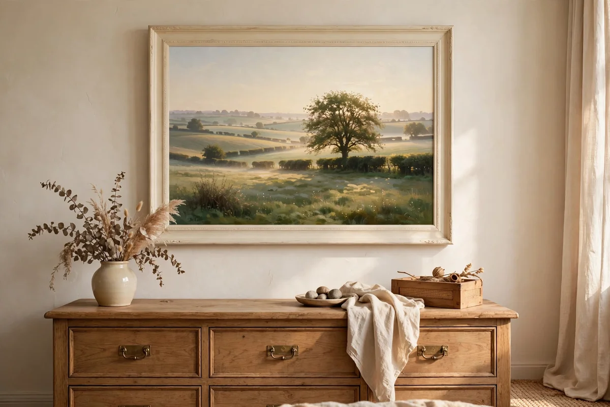
Paint this one from the memory of an early walk, on a wide 40 by 25 cm panel that suits the sweep of fields. Divide the land into three horizontal bands: a pale gold foreground, a mid green middle, and a blue-grey distance, with the lightest tone at the horizon line where the sun is rising. Mix a whisper of permanent rose into the sky wash for that first-light blush. Keep every edge soft by working wet into wet.
A single hedgerow tree, painted as a loose dark mass with a dry-brush canopy, gives the eye one place to rest. Resist adding fences, animals or buildings; the emptiness is the subject. The mistake to avoid is reaching for strong colour; first light is pale by nature, and pushing saturation turns dawn into midday. This quiet piece suits a bedroom wall in a plain cream frame.
8. Compose a Cottage Under Apple Blossom in Spring
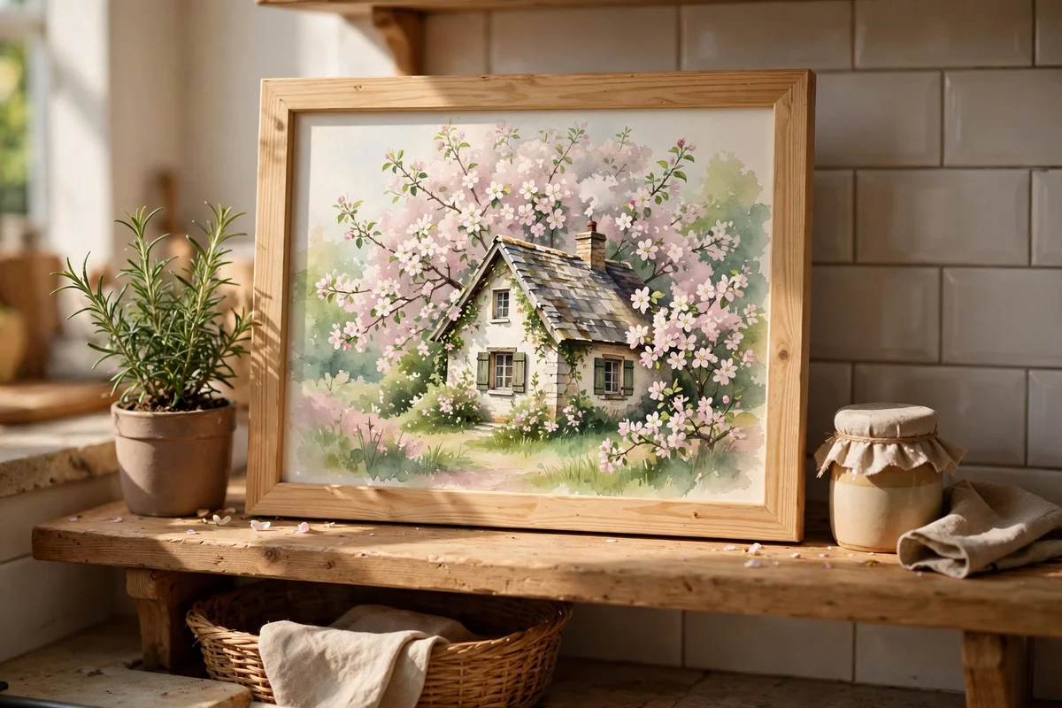
Place the cottage low in the frame, taking only the bottom half of a 35 by 28 cm board, and let the blossom canopy fill the rest. Paint the tree as a cloud of pale pink dabs, permanent rose plus plenty of white, over a loose grey branch structure that you paint first and let dry. Nestle the cottage walls in cream against the blossom so the building glows through the flowers. A few fallen petals on the path, tiny pink flecks, finish the story.
Paint the branches before the blossom, because pale petals will not cover dark lines drawn afterward. Vary the pink from nearly white at the canopy edges to deeper rose in the shadowed centre for volume. The mistake to avoid is making the blossom an even pink blanket; leave gaps of soft blue sky so the tree breathes. This spring scene brightens a kitchen shelf in a light pine frame.
9. Paint Stone Cottage Windows With Cream Frames and Rose Climbers
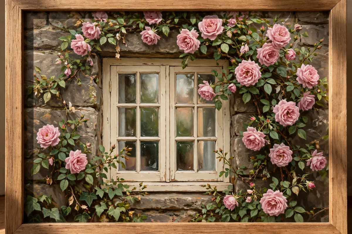
Zoom in tight on one window for a 25 by 30 cm study, cropping the cottage walls at the edges so the window owns the picture. Paint the stone surround in warm greys with a sponge for texture, then set the frame in warm cream, lighter on the top rail where light catches it. Climbing roses weave around the frame in dusty pink, with leaves in two greens. Reflect a hint of sky blue in one pane for life.
Keep the window slightly off-centre, following the rule of thirds, so the climber has room to sprawl. Paint the glass dark first, then add the pale reflection, which is easier than the reverse. The mistake to avoid is making the stone surround too dark; it should read as sunlit limestone, not a dungeon wall. Small and glowing, this study works in pairs along a staircase.
10. Set Up a Still Life of Canvases, Brushes and Paint Tubes on a Table
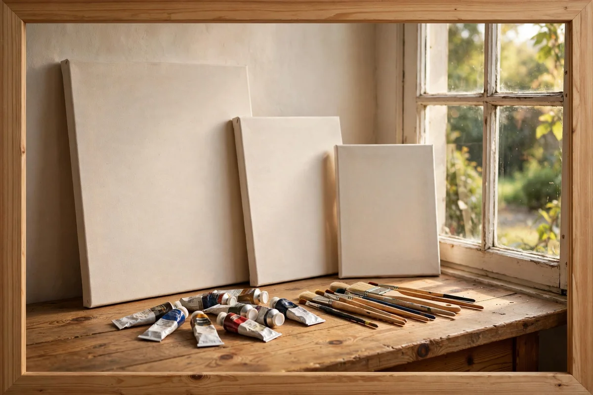
Clear a pine table near a window and arrange the subject exactly as you will paint it, on a 30 by 40 cm canvas. Lean two small blank canvases against a stack of books at the back, lay three paint tubes in the middle ground with labels facing out, and rest brushes across a folded rag in front. Light it from the left with daylight and keep the background a plain warm wall. Sketch the big shapes in thinned burnt umber first.
Paint the tubes with one highlight stripe each, which instantly reads as metal, and let the warm brown brush handles lead the eye across the table. Keep cast shadows soft and blue-grey rather than black. The mistake to avoid is tidying the arrangement too much; a squeezed tube and a paint-smudged rag make it feel like a real working table. This studio scene suits a craft room wall.
11. Paint a Cottage Door Framed by Wisteria in Dusty Rose
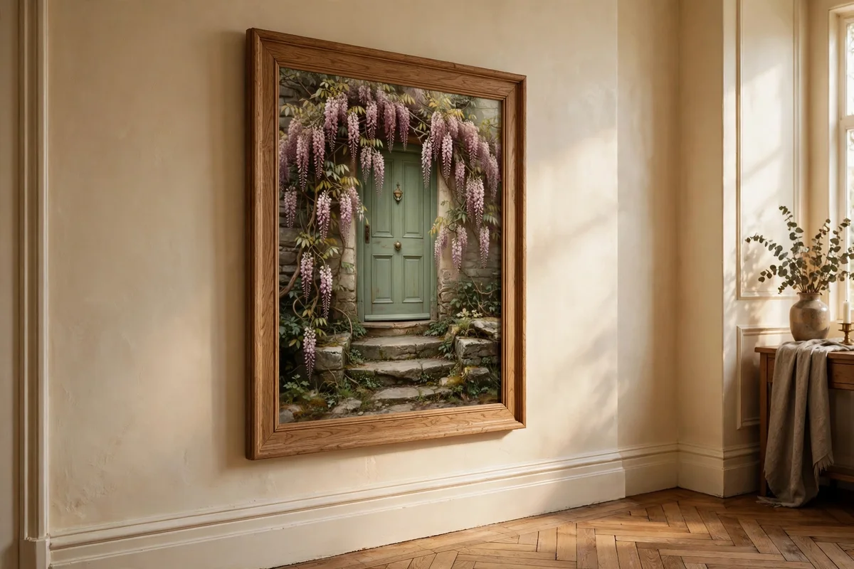
A door portrait at 25 by 35 cm is one of the most forgiving cottage subjects, since it is nearly symmetrical. Paint the door in a muted sage or dusty blue, then hang wisteria over it in trailing clusters of dusty rose and mauve, built from small vertical dabs. Stone steps lead up in two warm grey slabs, and a simple iron lantern beside the door adds a focal point. Keep the wall wash behind pale so the flowers sing.
Vary the wisteria clusters, longer and looser at the edges, tighter near the top, so they feel grown rather than placed. A worn doormat in muted terracotta grounds the bottom edge. The mistake to avoid is painting every wisteria bloom the same pink; mix some clusters toward mauve and others toward pale rose for natural variety. This welcoming piece suits a hallway in a plain oak frame.
12. Hang a Finished Cottage Painting Above a Farmhouse Mantel
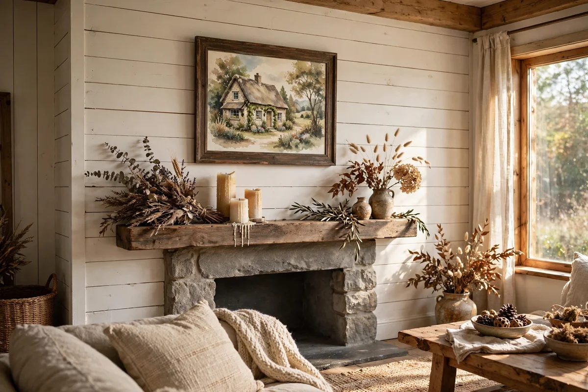
A mantel display starts with measuring: leave 10 to 15 cm between the mantel shelf and the frame bottom edge so the art breathes above any candles or garlands. Choose one hero painting, around 40 by 50 cm, or a pair of 25 by 30 cm studies hung side by side with 8 cm between them. Centre the arrangement on the chimney breast, not on the furniture below, and check the top does not crowd the ceiling in low rooms.
Use two D-rings and a wire rated for the frame weight, or a slim picture ledge for a relaxed layered look. Keep the palette of the painting in conversation with the room: soft greens and cream above a wooden mantel, dusty rose accents echoed in a small jug of dried flowers. The mistake to avoid is hanging too high; the centre of the piece should sit near eye level, about 145 cm from the floor.
13. Style a Shelf Ledge With Three Small Cottage Studies in Plain Wood Frames
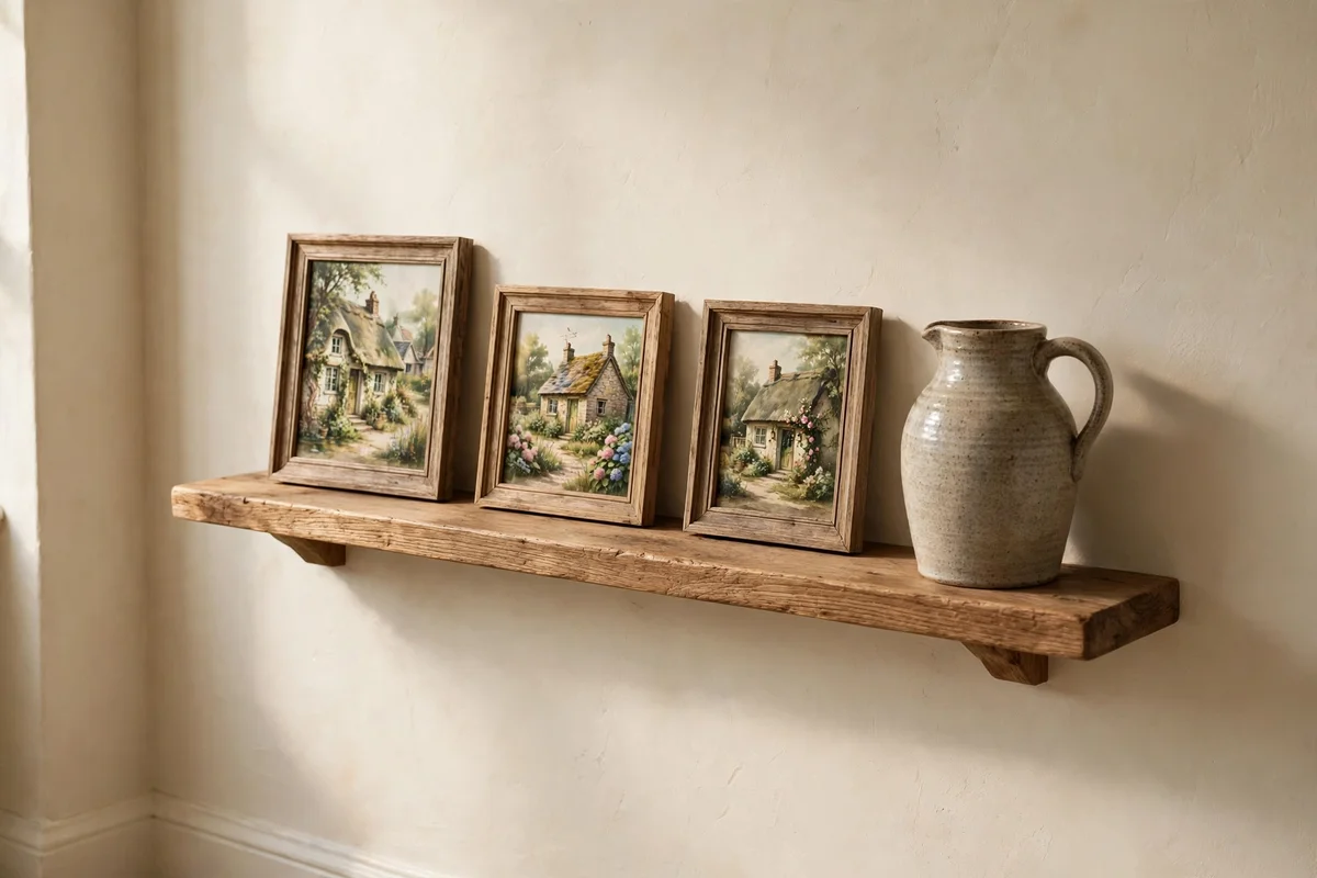
A picture ledge 90 to 120 cm long holds three small studies, each around 20 by 25 cm, with 5 to 8 cm of breathing room between frames. Vary the heights by overlapping the front edges slightly and tilting one frame back against the wall. Keep all three frames in the same plain wood, pine or oak, so the set reads as one collection even when the subjects differ: a gate, a lane, a garden border.
Anchor the ledge with a small object at one end, a stoneware jug or a stack of two art books, so the display feels styled rather than stored. Hang the ledge at about 150 cm from the floor in a hallway, or lower it to 120 cm above a desk. The mistake to avoid is mixing frame finishes; one black frame among wood ones breaks the calm. Dust frames monthly with a soft dry cloth.
14. Choose Soft Greens, Cream and Dusty Rose for a Calm Cottage Palette
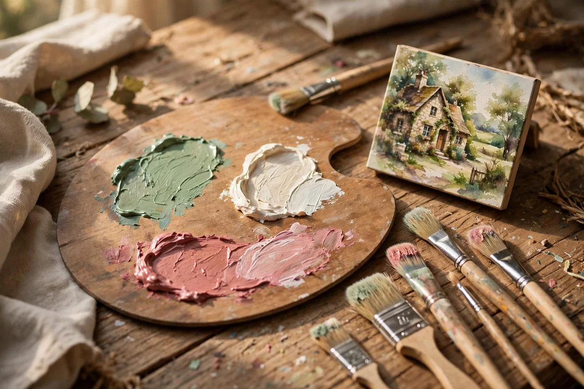
The classic cottage trio works because it mirrors a real garden: foliage green, limewashed cream, climbing rose. Build it from five tubes: sap green, yellow ochre, titanium white, permanent rose, and burnt umber for grounding. Keep greens soft by always mixing in a touch of their complement; a whisper of rose in a green keeps it from going electric. Cream replaces stark white everywhere: walls, clouds, highlights.
Test the palette on a small swatch card before committing to a full painting: three strokes of green, one cream wash and two rose dabs should look harmonious at arm’s length. If the rose shouts, add more white; if the green feels cold, warm it with ochre. The mistake to avoid is buying twelve pretty tubes before learning these five; restraint teaches colour mixing faster than abundance. This palette suits every subject here.
15. Mix a Beginner’s Limited Palette of Eight Tubes

Eight tubes cover every cottage scene in this collection: titanium white, yellow ochre, burnt sienna, burnt umber, sap green, ultramarine blue, permanent rose, and raw sienna. Lay them in the same order on your palette every time, light to dark, so your hand finds colours without looking. A common beginner set costs 15 to 30 pounds or dollars for student grade, which is plenty while you learn. Squeeze only a pea-sized amount of each.
Mix a small puddle of your three workhorse neutrals first: warm grey, moss green, and dusty rose, each blended from the tubes above. These three mixtures appear in nearly every scene in this collection. The mistake to avoid is mixing every colour from scratch each session; premix your neutrals and keep a lidded palette so they stay usable for days. Consistency beats variety at the start.
16. Paint a Small 20 by 25 cm Board Study for the Kitchen Shelf
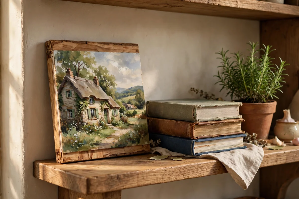
A 20 by 25 cm board, about 8 by 10 inches, is the sweet spot for shelf art: big enough to hold a cottage and garden, small enough to finish in an evening. Choose a cradled wood panel or thick 300 gsm watercolour paper mounted on board so it stands upright on a shelf without a frame. Paint the subject, a single cottage face or a potted rose by a door, with the bottom third as foreground and the sky kept to a thin band.
Seal acrylic studies with one coat of satin varnish so kitchen steam wipes off; keep watercolours behind glass. Lean the finished board against the backsplash or a stack of cookbooks, where it catches morning light. The mistake to avoid is painting shelf art too dark; small pieces viewed up close need lighter, clearer values than big wall paintings. Make three in a weekend and rotate them monthly.
17. Try an 8 by 10 Inch Canvas Panel Sized for Narrow Mantels
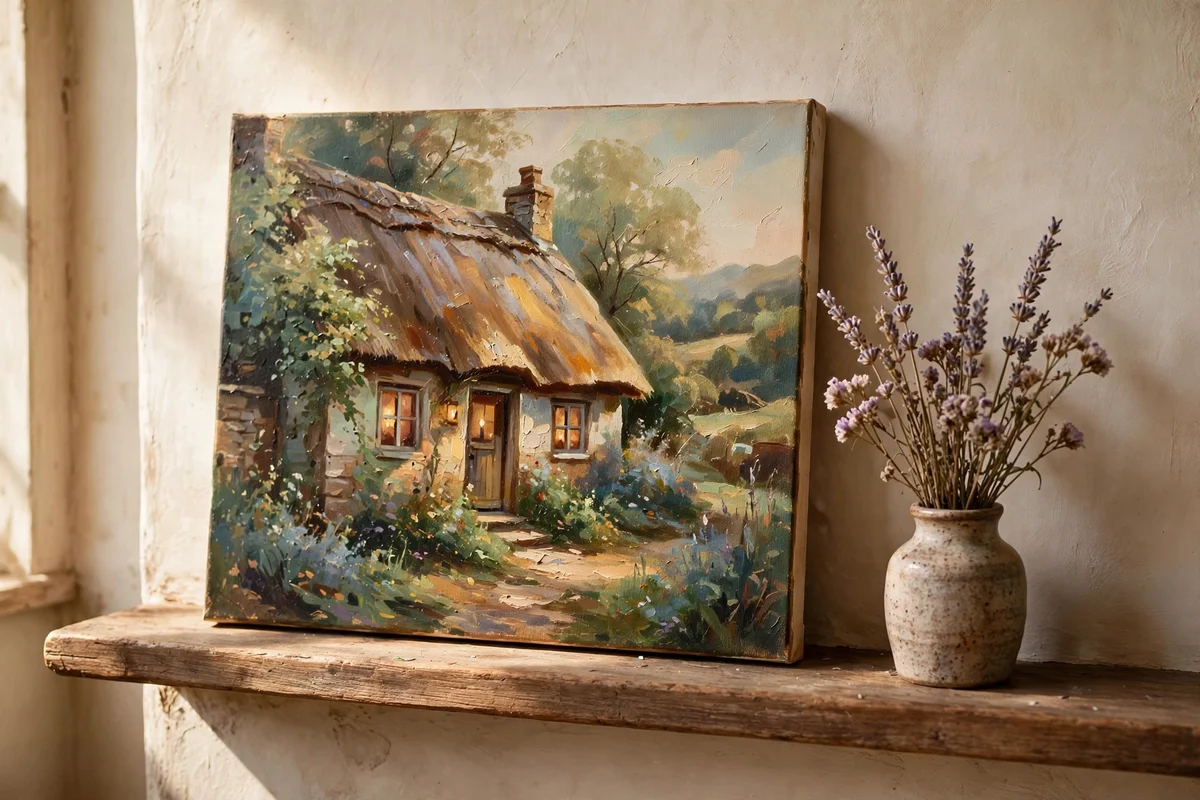
Narrow mantels, many measuring only 15 to 20 cm deep, need art with a slim profile, and an 8 by 10 inch canvas panel sits perfectly without overhang. Paint the composition with a strong horizontal read: a cottage stretching across the width, or a lane running left to right, so the wide format feels intentional. Keep the focal point, the door or the brightest window, one third in from either edge. Two small panels hung as a pair also suit a mantel.
Canvas panels cost a fraction of stretched canvas, often under 2 pounds or dollars each in multipacks, so beginners can paint freely without preciousness. The mistake to avoid is leaving the panel edges raw white; paint the sides in a tone taken from the picture, usually a soft grey-green, so the piece looks finished from an angle. Rest it on a small easel or lean it against the wall.
18. Paint a Cottage Garden Scene You Can Copy From a Photo of Your Own Garden
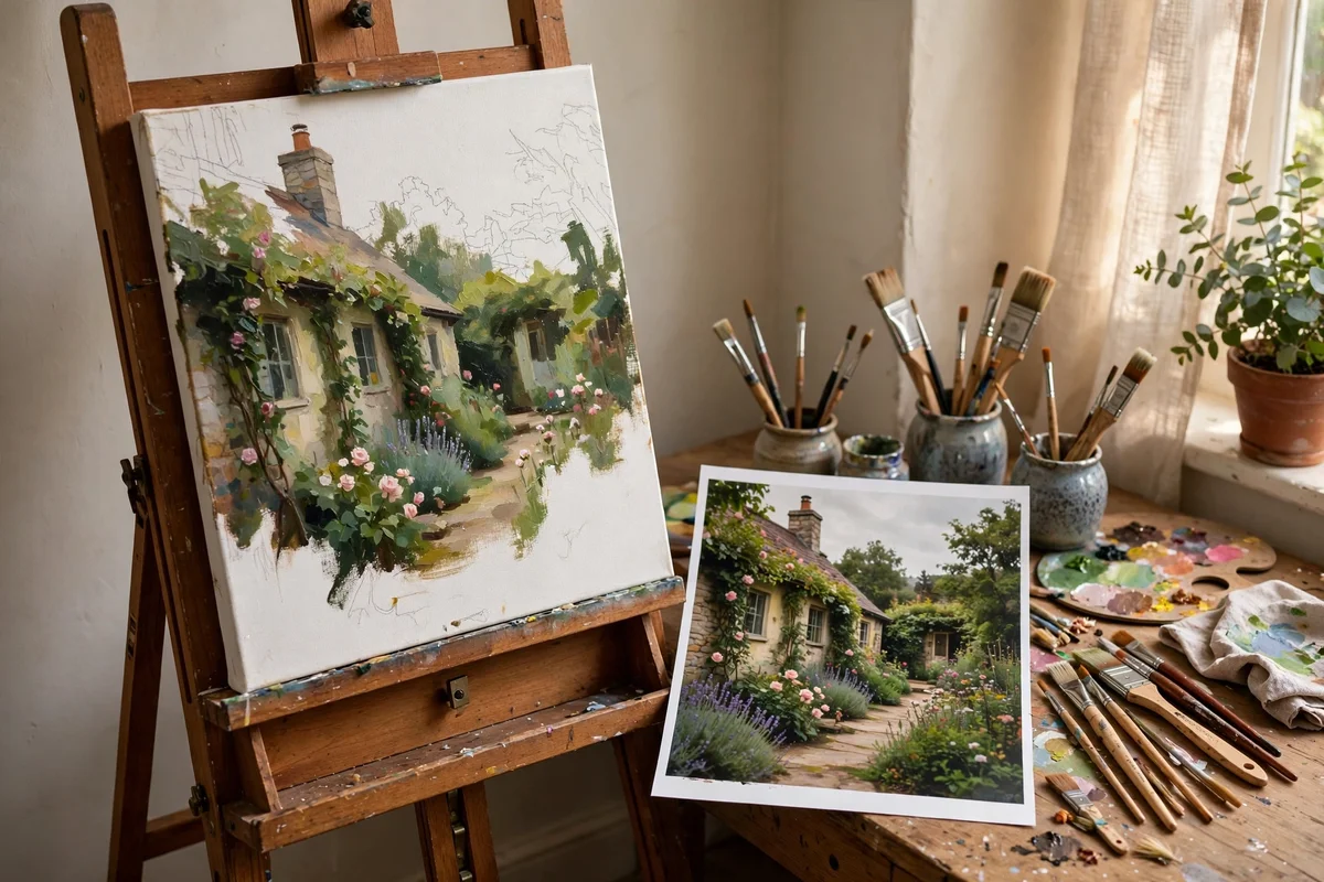
Take your reference photo on an overcast morning, when soft light flattens harsh shadows and colours photograph truly. Stand back and include a clear foreground, middle and background: a path or lawn edge, the planting, then the cottage or fence behind. Print the photo at A5 or view it on a tablet at arm’s length so you paint the big shapes instead of copying every leaf. Squint at the photo to find its three or four main value masses.
Translate the photo by simplifying ruthlessly: merge all the small plants into three colour notes and keep only one detailed flower cluster. Shift the cottage slightly off-centre even if the photo centres it. The mistake to avoid is painting what you know instead of what you see; check each colour against the photo with a dab on scrap paper first. Dating the finished study turns it into a garden diary.
19. Copy a Simple Three-Value Composition From a Nature Sketch
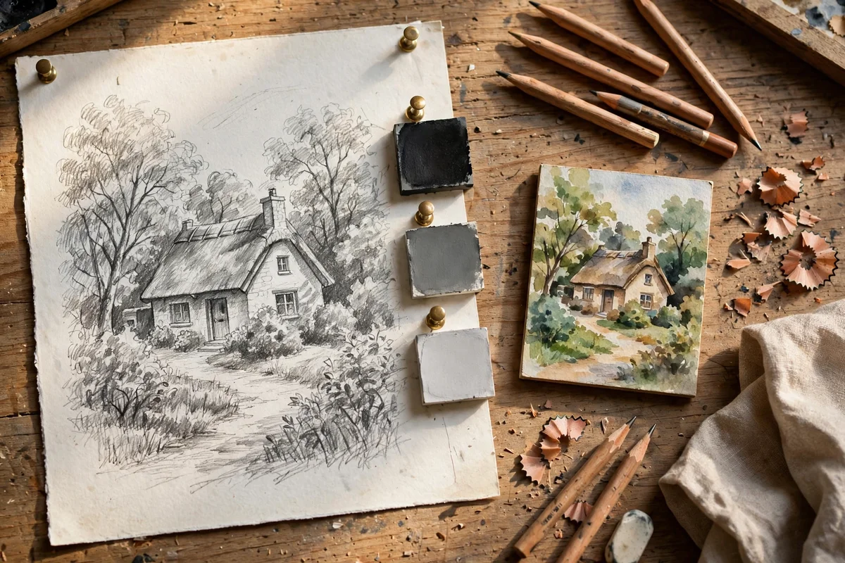
The three-value method divides any scene into light, mid-tone and dark, and it is the fastest way to make a beginner painting read correctly. On a scrap of paper, block your cottage view into just three flat tones with a soft pencil: sky and sunlit walls as light, foliage and shaded roof as mid, window openings and deep shadow as dark. Aim for roughly 60 percent mid-tone, 30 percent light and 10 percent dark. This tiny map becomes your painting plan.
Transfer the plan to your panel and paint each area in its single flat tone first, before adding any detail. If the flat version reads clearly from across the room, the finished painting will too. The mistake to avoid is adding detail before the values are right; no amount of careful brushwork saves a painting whose darks and lights are muddled. Keep the sketch pinned beside your easel as a reference.
20. Frame Finished Work in Plain Oak or Pine Moulding
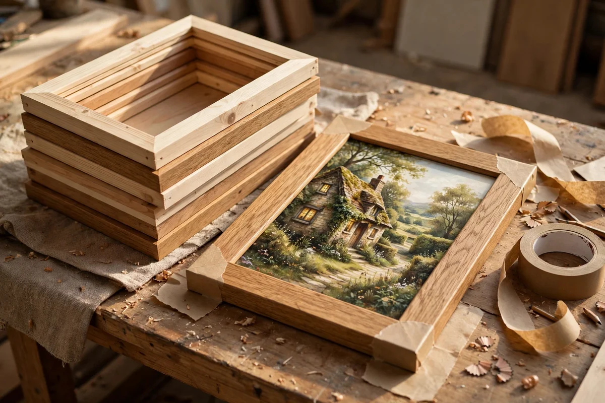
Plain wood moulding, 2 to 4 cm wide with a simple square profile, suits cottage art better than ornate gilt because it echoes the subject’s honesty. For a 30 by 40 cm painting, a 3 cm moulding adds a calm border without overwhelming the image; smaller studies take a 2 cm profile. Choose oak for warm rooms and pale pine for cool, light spaces. Ready-made frames in standard sizes cost 8 to 20 pounds or dollars.
Fit the work with glass only for watercolours; oils and acrylics breathe better unglazed. Use acid-free mount board behind paper pieces and seal the back with kraft tape to keep dust out. Hang with the frame centre at about 145 cm from the floor. The mistake to avoid is choosing a frame wider than the art deserves; when the moulding shouts, the painting whispers. One plain frame lets the cottage do the talking.
21. Paint a Moonlit Cottage Window Glowing Warm Amber
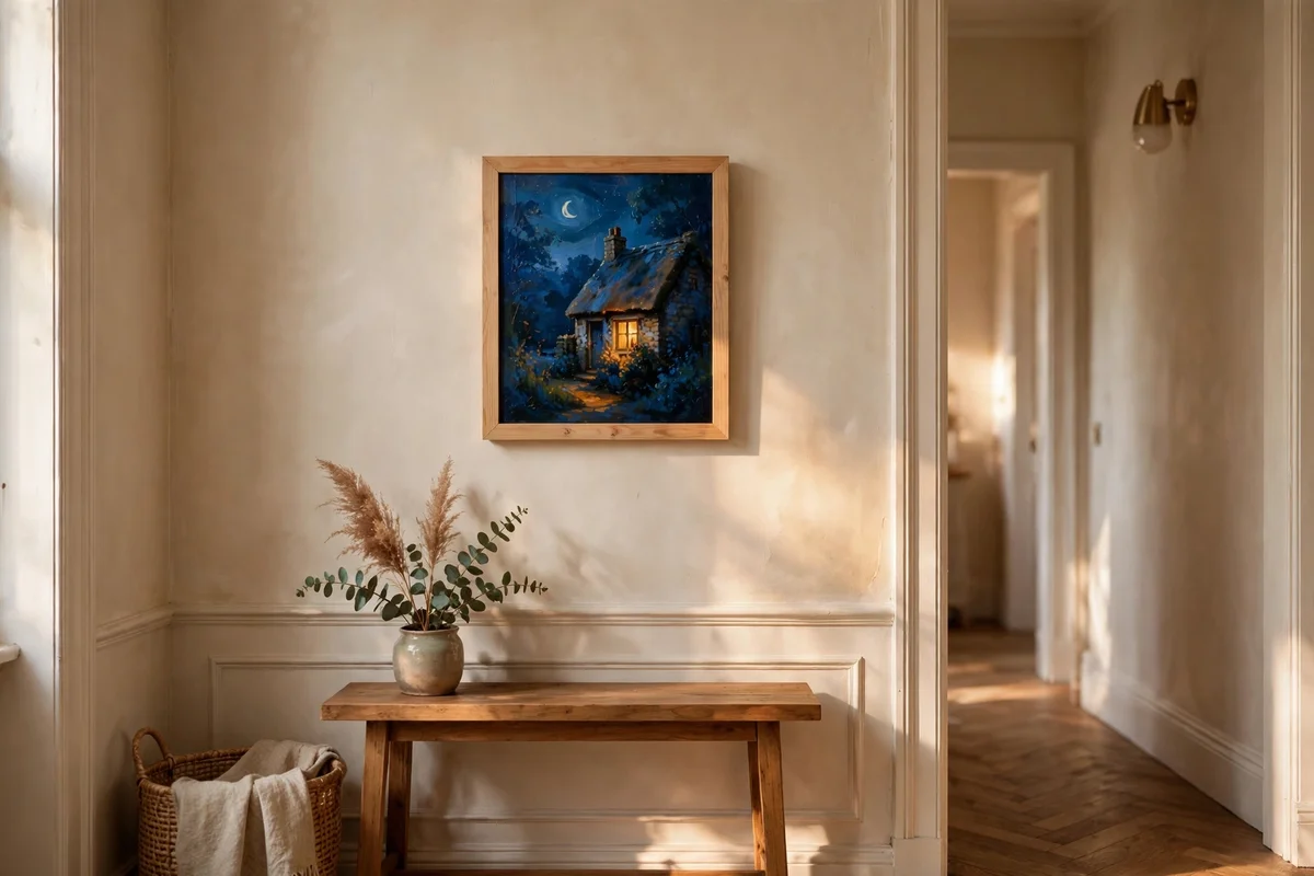
A night scene is simpler than it looks because the palette shrinks to three players: deep blue-grey sky, near-black foliage masses, and one warm amber window. Paint the whole panel in cool washes first, ultramarine plus burnt umber for the darks, then lift the window shape out and glaze it with a warm amber mixed from yellow and burnt sienna. Keep the window small, no more than a tenth of the picture, so the glow feels precious against the dark.
Add a soft halo around the window by dry-brushing the amber outward into the surrounding dark while it is still tacky. A pale moon, a simple cream disc with a soft edge, balances the composition in the opposite corner. The mistake to avoid is making the night too black; keep the darks transparent enough that the foliage shapes still read. This small glowing piece is lovely in a hallway.
22. Create a Cottage Courtyard With Terracotta Pots and Climbing Vines
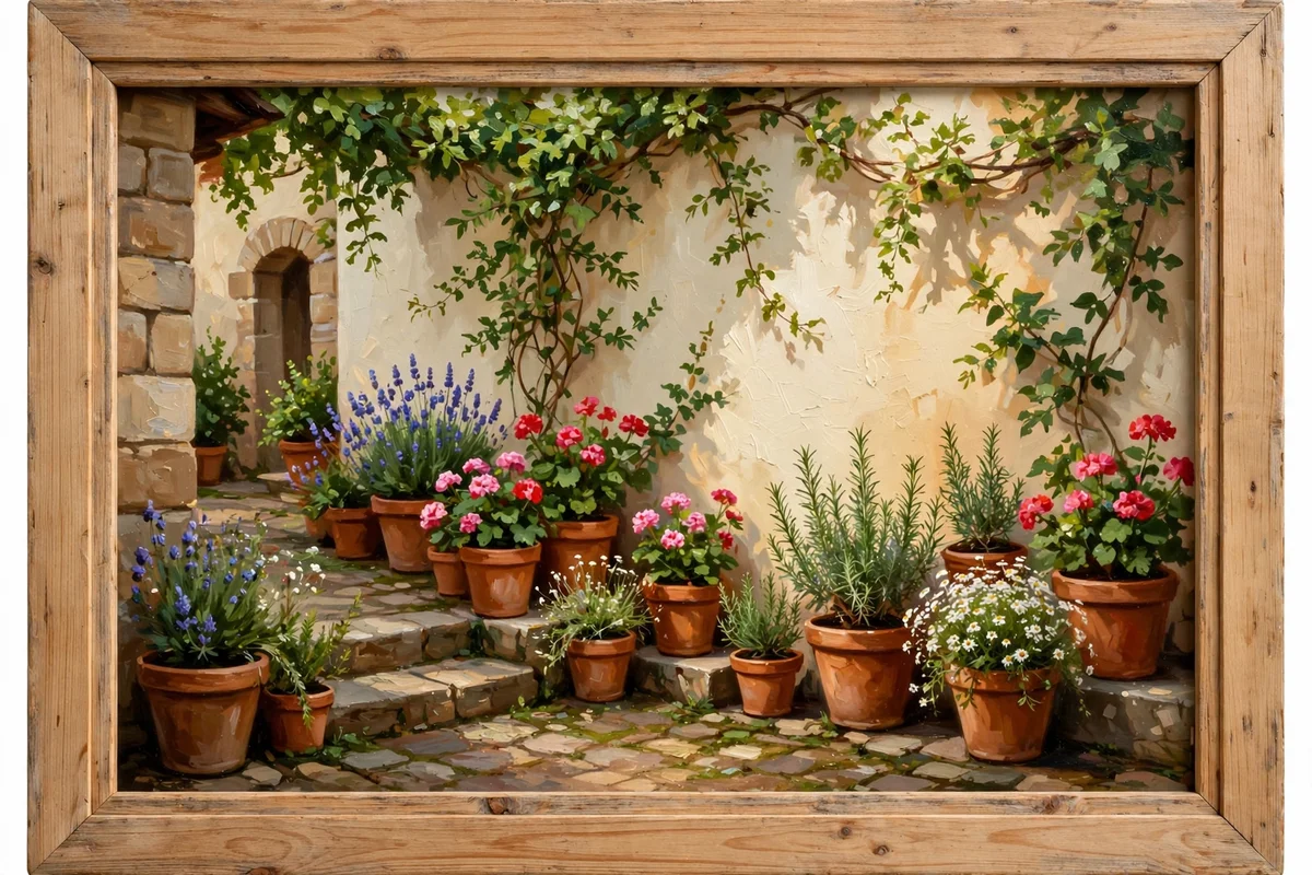
A courtyard study at 30 by 40 cm gives you architecture plus planting in one cheerful scene. Paint the cottage wall as a large warm cream plane, then group terracotta pots along its base in threes of different heights, mixing burnt sienna with a touch of permanent rose for the clay. Let a climbing vine, sap green darkened with ultramarine, scramble up one corner and across a simple wooden trellis. A stone flag floor in pale grey anchors the bottom.
Vary the pot shapes, round, tapered and one tall olive jar, so the row feels collected over years rather than bought in a set. Keep the wall lighter than you think; it is the light source of the whole picture. The mistake to avoid is centring the door; push it to one side and let the pots own the composition. This sunny study suits a kitchen or conservatory wall.
23. Paint a Pair of Matching Lane Paintings for Either Side of a Mirror
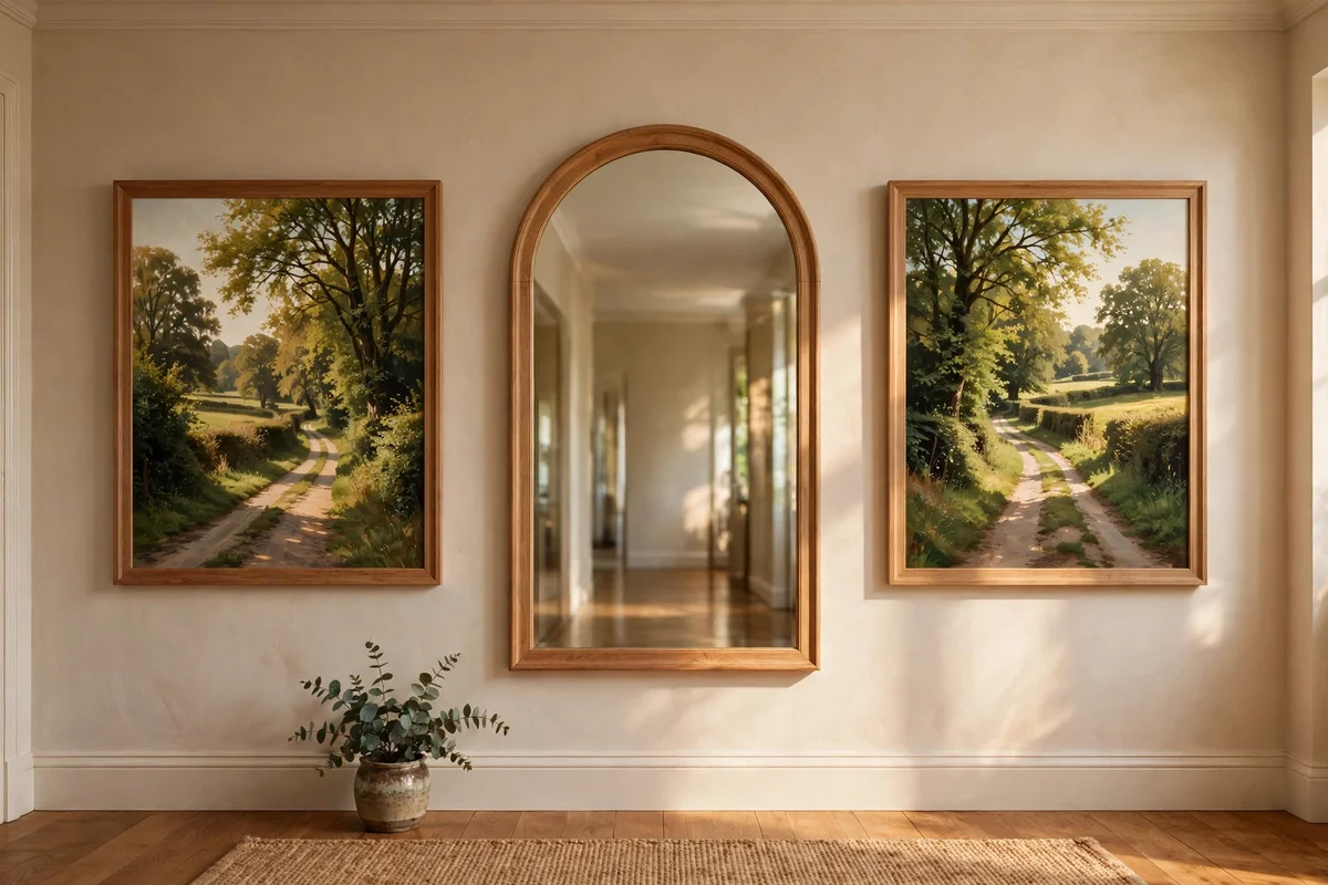
Pairs hang beautifully flanking a mirror, and lanes are ideal because their diagonal lines can mirror each other. Paint two 25 by 30 cm panels as companions: on the left, the lane curves in from the right edge; on the right, it curves in from the left, so both paths seem to lead toward the mirror. Keep the palette identical across both, same greens, same sky wash, so they read as one idea in two frames.
Hang the pair with their inner edges 10 to 15 cm from the mirror frame and their centres level with the mirror’s centre. Use identical plain wood frames and matching mount widths, or the symmetry falls apart. The mistake to avoid is painting the two lanes at different times of day; keep the light consistent so the pair feels like one walk seen twice. This arrangement doubles the sense of light in a hallway.
24. Style a Painted Still Life of Brush Jars and Tubes on a Pine Table
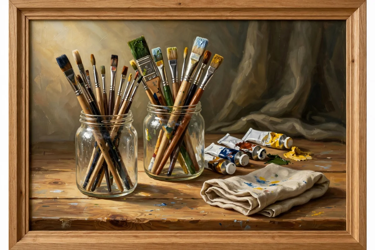
Set two glass jars of brushes upright at the back of a pine table, their handles fanning at different angles, with four or five paint tubes lying in front. Paint the glass with a pale grey wash and one bright vertical highlight, letting the brush handles show through softly. The pine table takes a warm wash of raw sienna with long horizontal grain lines dragged through while wet. Keep the background a single muted wall tone so the tools take centre stage.
Arrange the tubes with labels turned at different angles, as if mid-session, and squeeze one tube slightly open with a bead of paint at its mouth. A folded rag with a few colour smudges adds honest studio evidence. The mistake to avoid is lining the jars up in a perfect row; offset them and vary their heights for a natural, worked-in feel. This still life belongs in a craft room or studio corner.
25. Hang a Gallery Row of Small Cottage Paintings Along a Hallway
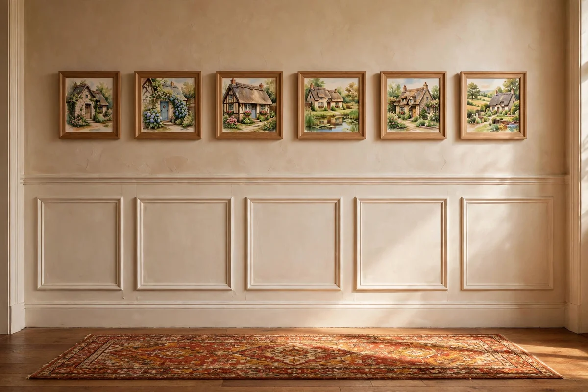
A hallway gallery turns a year’s worth of small studies into a proper display. Choose five to seven pieces in matching plain wood frames, sizes between 15 by 20 cm and 25 by 30 cm, and lay them on the floor first to plan the row. Hang the centres along one level line at about 145 cm from the floor, spacing frames 6 to 10 cm apart. Start with the strongest painting at eye level in the middle and build outward.
Mix subjects for rhythm: a gate, a lane, a garden, a window, a night scene, so the eye travels. Keep every frame the same wood and similar width, which unifies different palettes. The mistake to avoid is hanging the row too high; hallways are viewed up close, so slightly lower than gallery standard feels right. Label nothing; let visitors discover each small country morning.
The thread running through all 25 ideas is restraint: a narrow palette, small panels, plain frames, and scenes drawn from ordinary country corners rather than grand views. When every painting fits on one shelf, finishing becomes the habit, and the habit becomes the style. Keep your greens soft, your creams warm, and your compositions simple enough to sketch in pencil in under ten minutes.
If you take one idea into this week, make it the small 20 by 25 cm board study of your own garden gate or cottage door. It costs almost nothing, takes a single evening, and the plain pine frame you slip it into will teach you more about presentation than any course. Hang it where you see it at breakfast, and let that quiet country morning start your next painting.
Frequently Asked Questions
What size canvas works best for cottage paintings on a mantel?
Panels around 20 by 25 cm or 8 by 10 inches suit most mantels, since many mantel shelves are only 15 to 20 cm deep. One hero piece near 40 by 50 cm also works if the chimney breast is wide. Keep the centre of the art near 145 cm from the floor and leave 10 to 15 cm of breathing room above any candles or garlands.
Which paint colours make a good starter palette for cottage scenes?
Start with eight tubes: titanium white, yellow ochre, burnt sienna, burnt umber, sap green, ultramarine blue, permanent rose and raw sienna. From these you can mix the classic cottage trio of soft greens, cream and dusty rose. Student-grade sets costing 15 to 30 pounds or dollars are plenty while you are learning.
I am a beginner. Which cottage scene should I paint first?
Paint a single cottage door framed by wisteria, or a close-cropped garden gate. Both are nearly symmetrical, need only five or six colours, and fit a 25 by 35 cm board you can finish in one evening. Avoid wide landscapes first; they demand distance handling that is easier once you have painted a few small, simple subjects.
How do I frame a small painting cheaply without it looking cheap?
Use ready-made plain wood frames in standard sizes, usually 8 to 20 pounds or dollars, in pine or oak with a simple 2 to 3 cm square profile. Match the frame wood across a set so the collection reads as one. Add glass only for watercolours; oils and acrylics look better unglazed and save you the glazing cost.
How can I copy a composition from my garden photo without it looking flat?
Simplify ruthlessly: squint at the photo, find three or four main value masses, and merge small plants into three colour notes. Keep one detailed flower cluster and leave the rest soft. Shift the cottage off-centre even if the photo centres it, and check each mixed colour against the photo with a dab on scrap paper before it touches the panel.